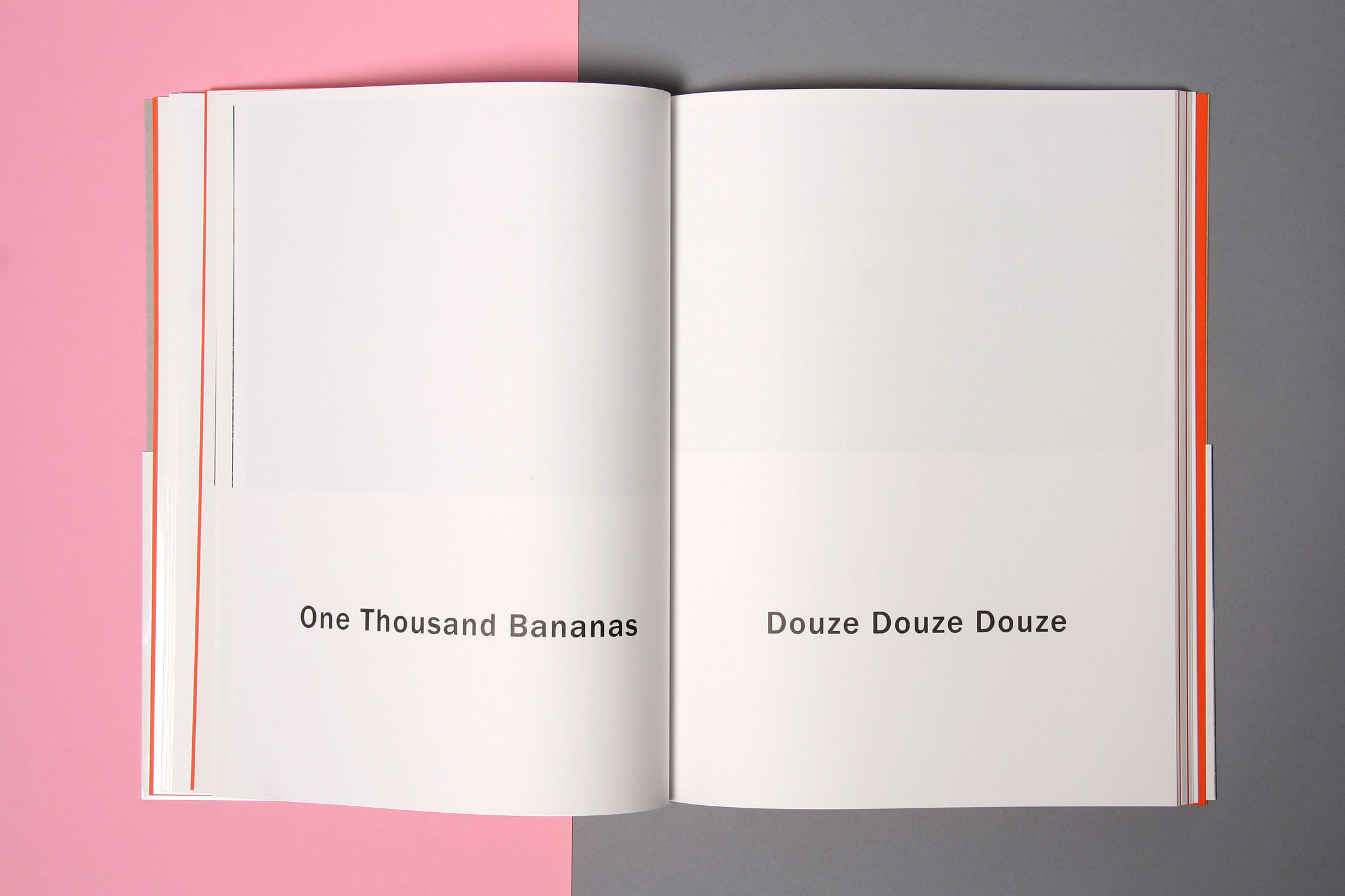
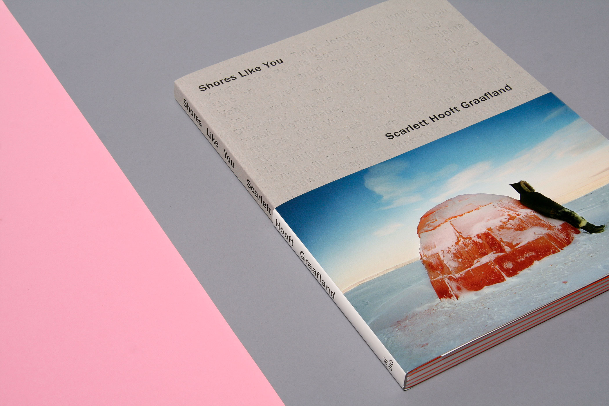
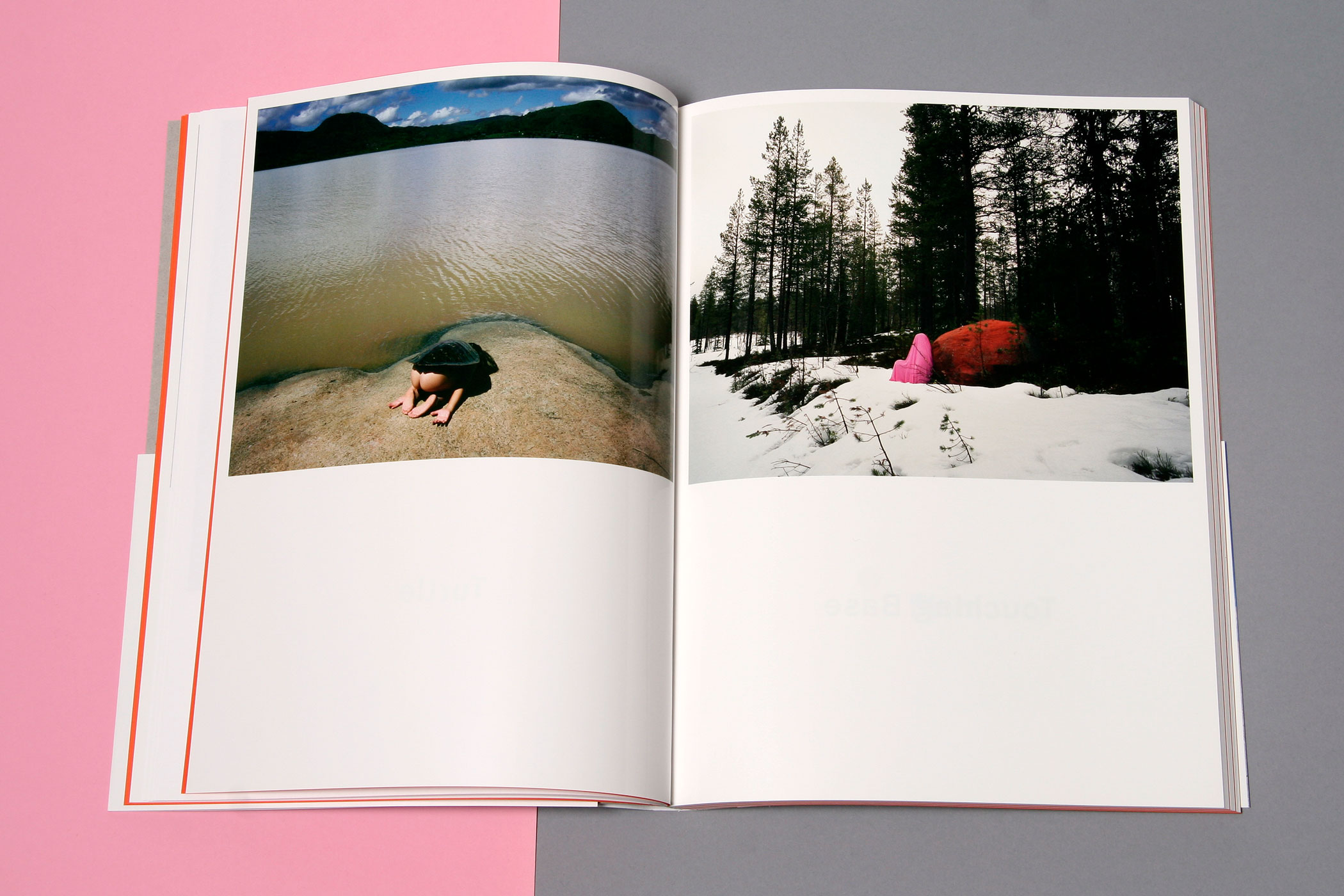

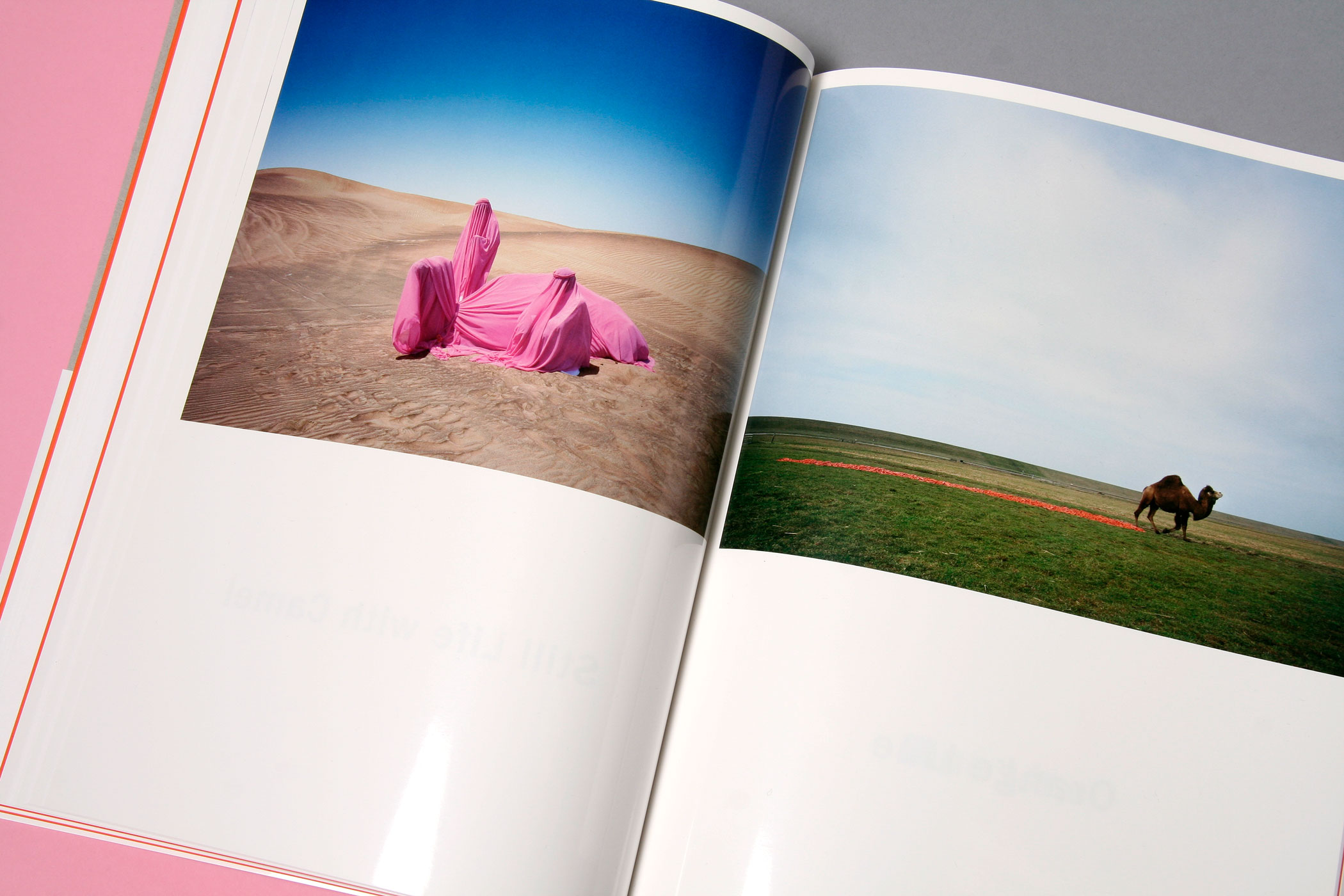
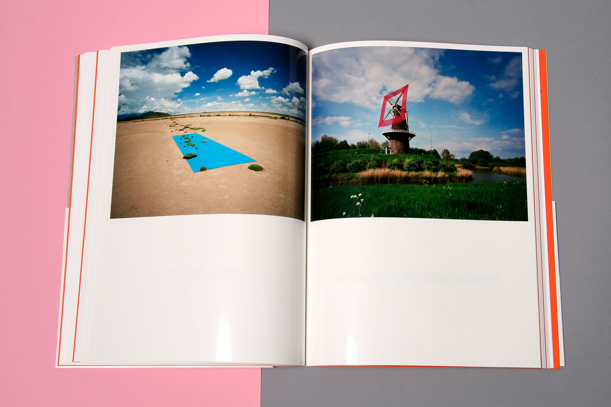
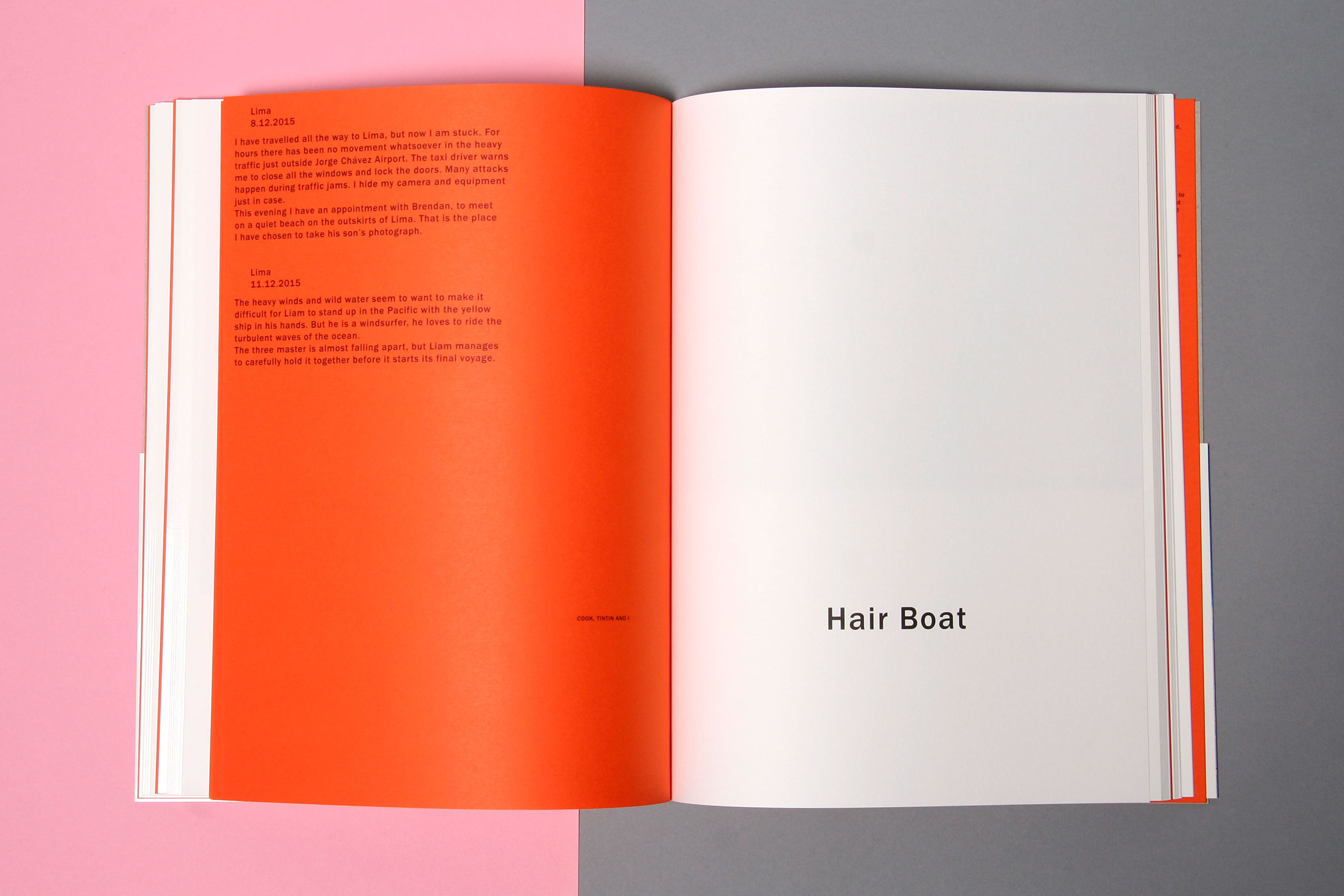
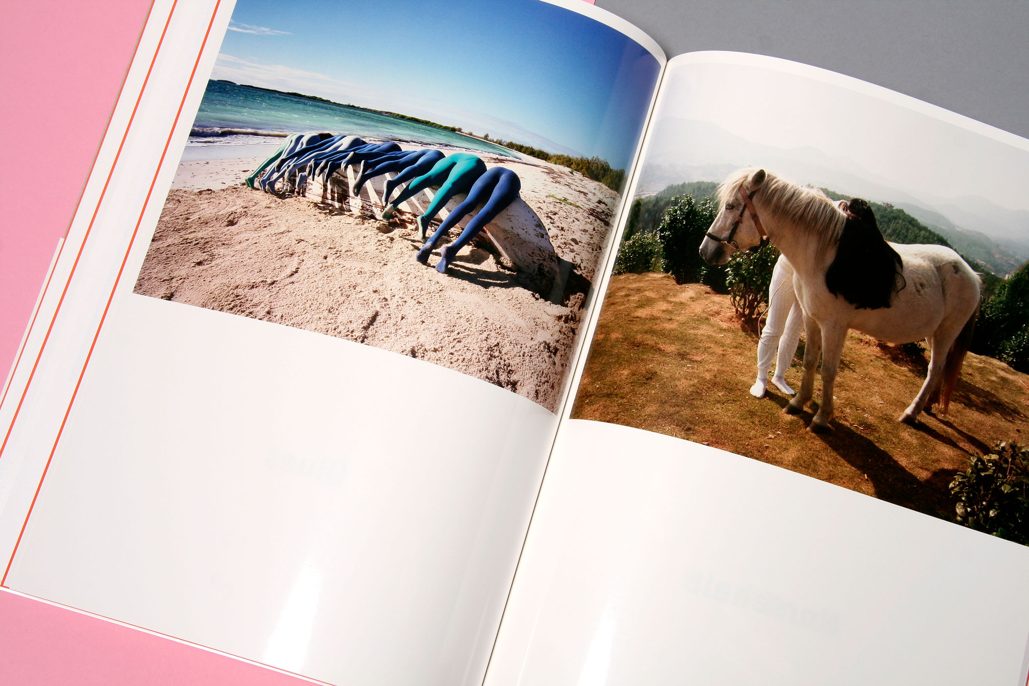
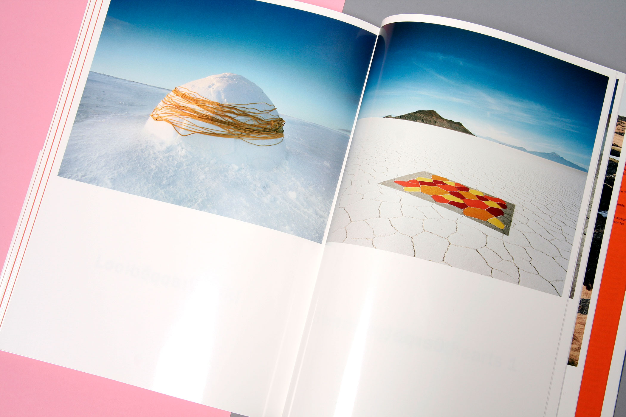
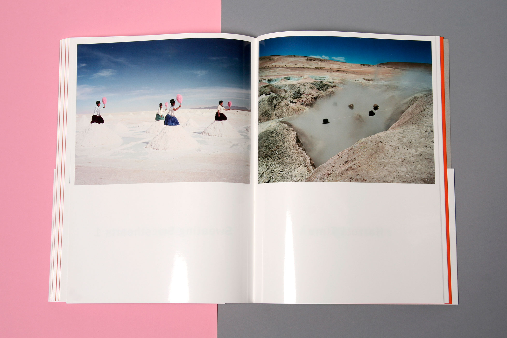
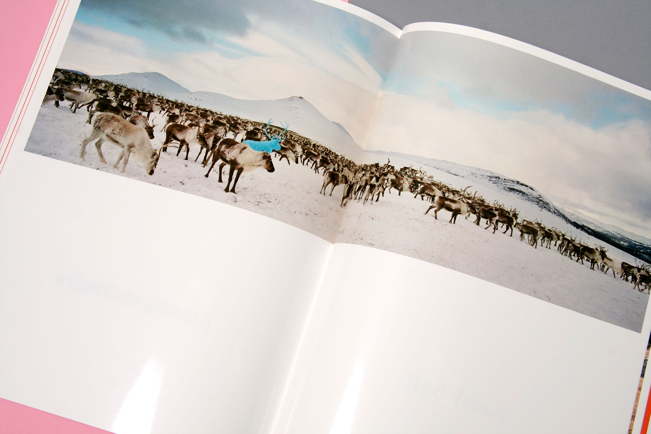
Book design 'Shores Like You' for Dutch photographer Scarlett Hooft Graafland. There are two distinctive storylines to be found in this book: the first follows the images of Hooft Graafland's oeuvre, the second storyline is formed on every other spread, by the combinations formed by the titles of the individual works. Design in collaboration with Irma Boom.
--------------------------------------
--------------------------------------
--------------------------------------
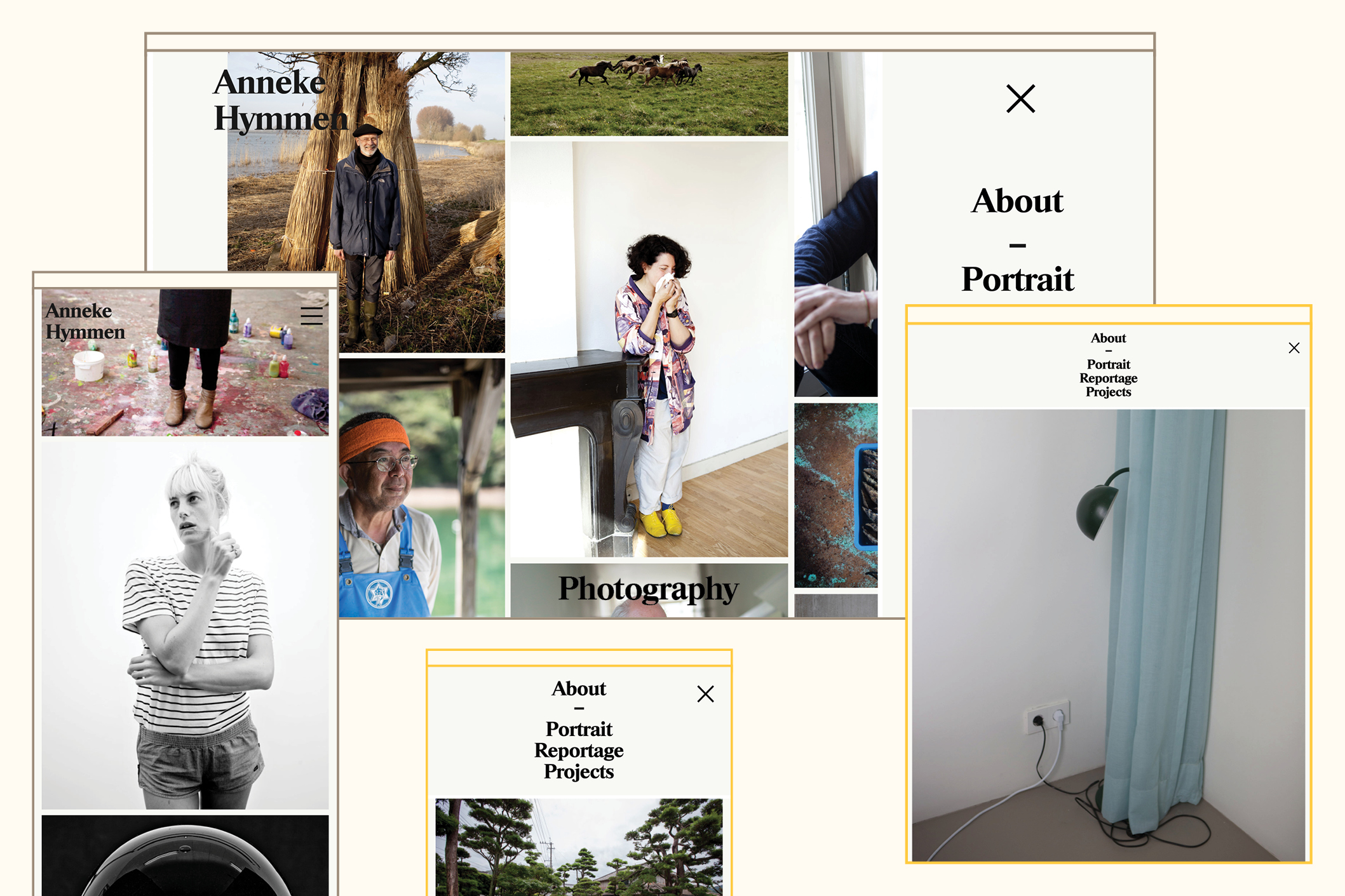
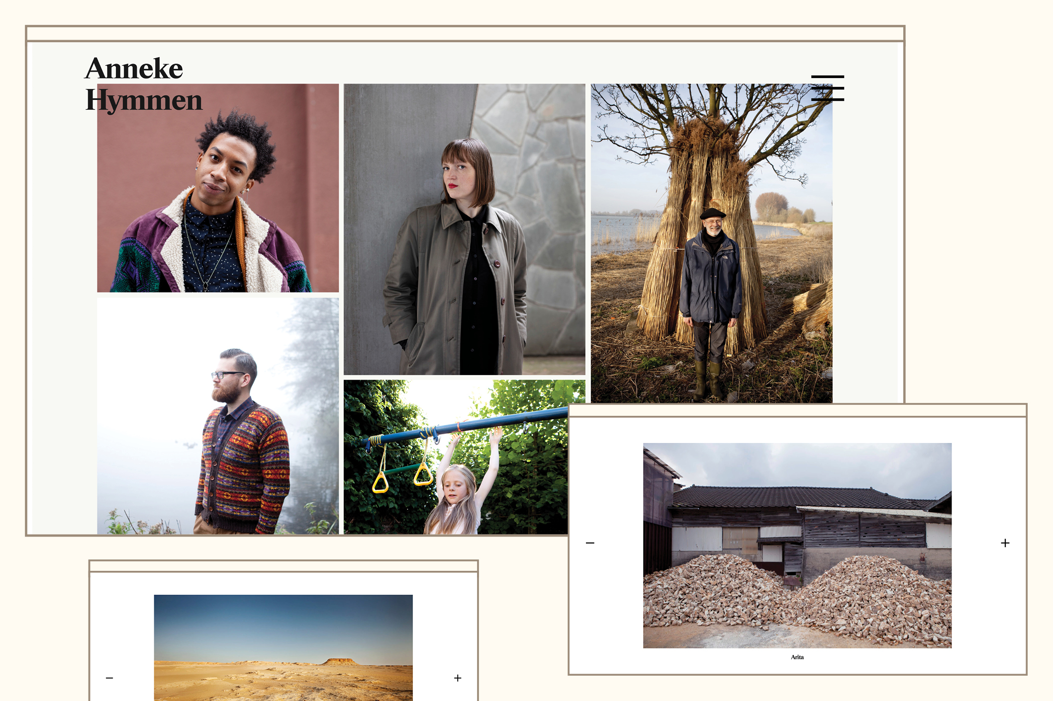
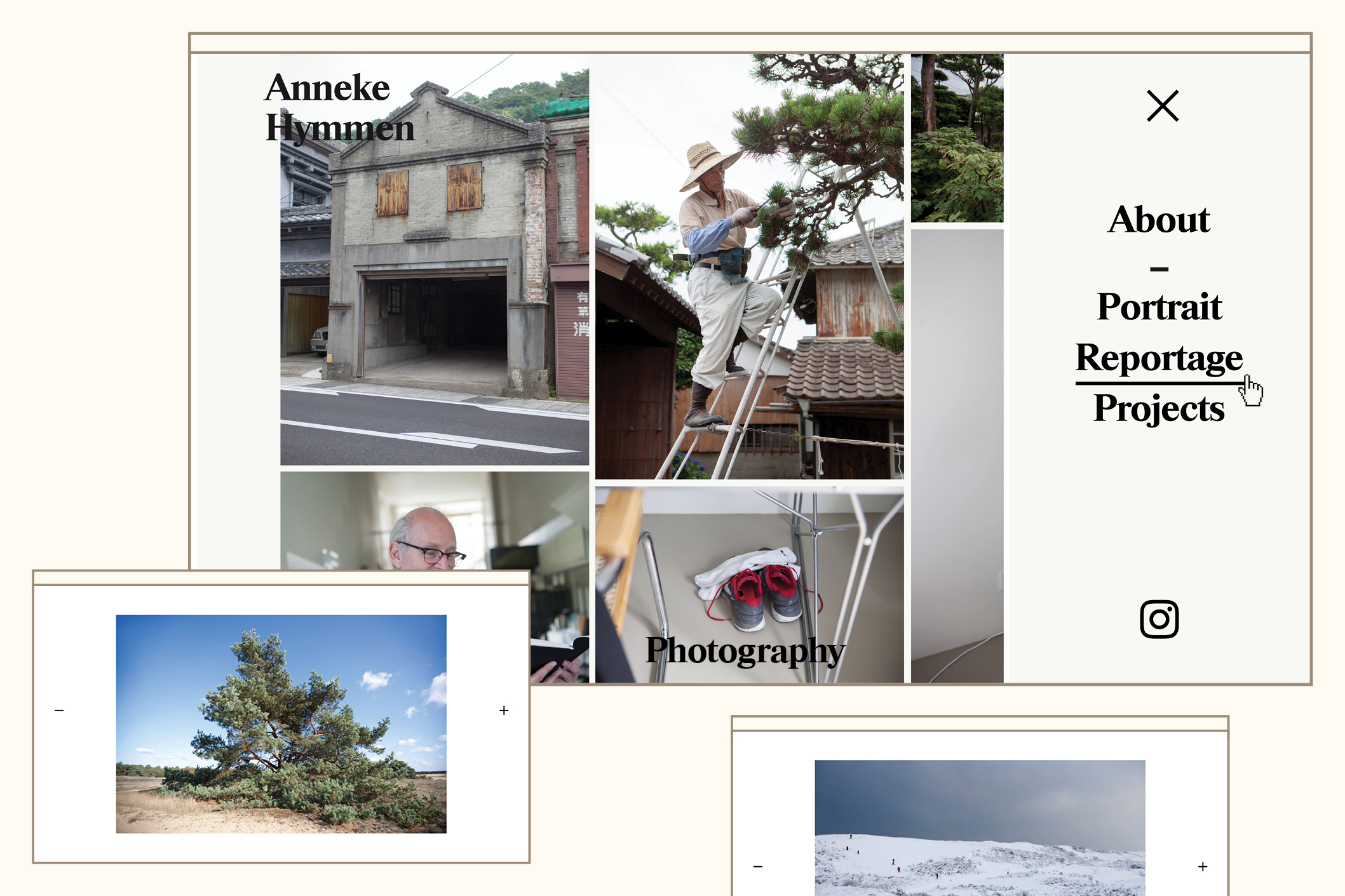
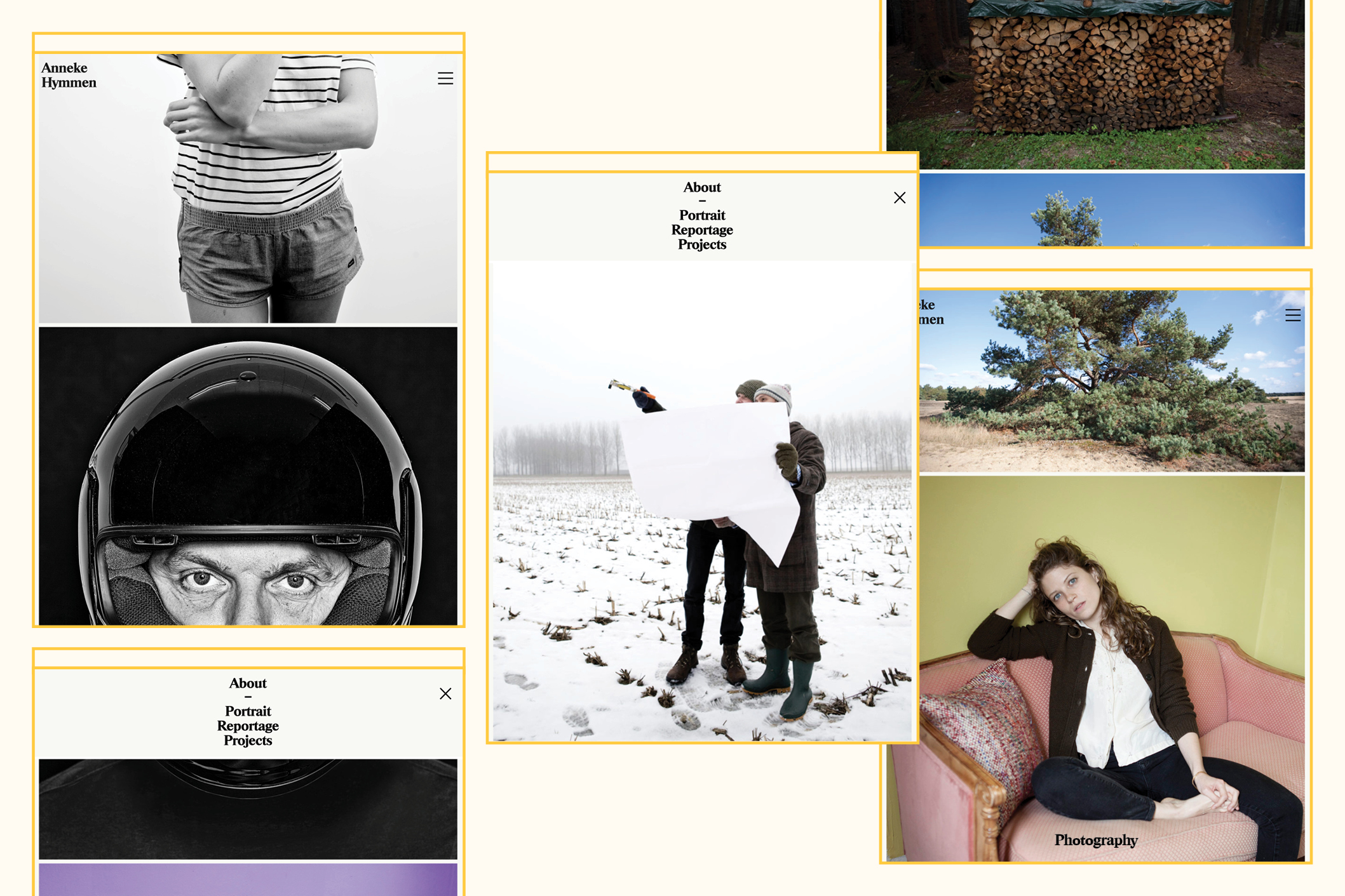
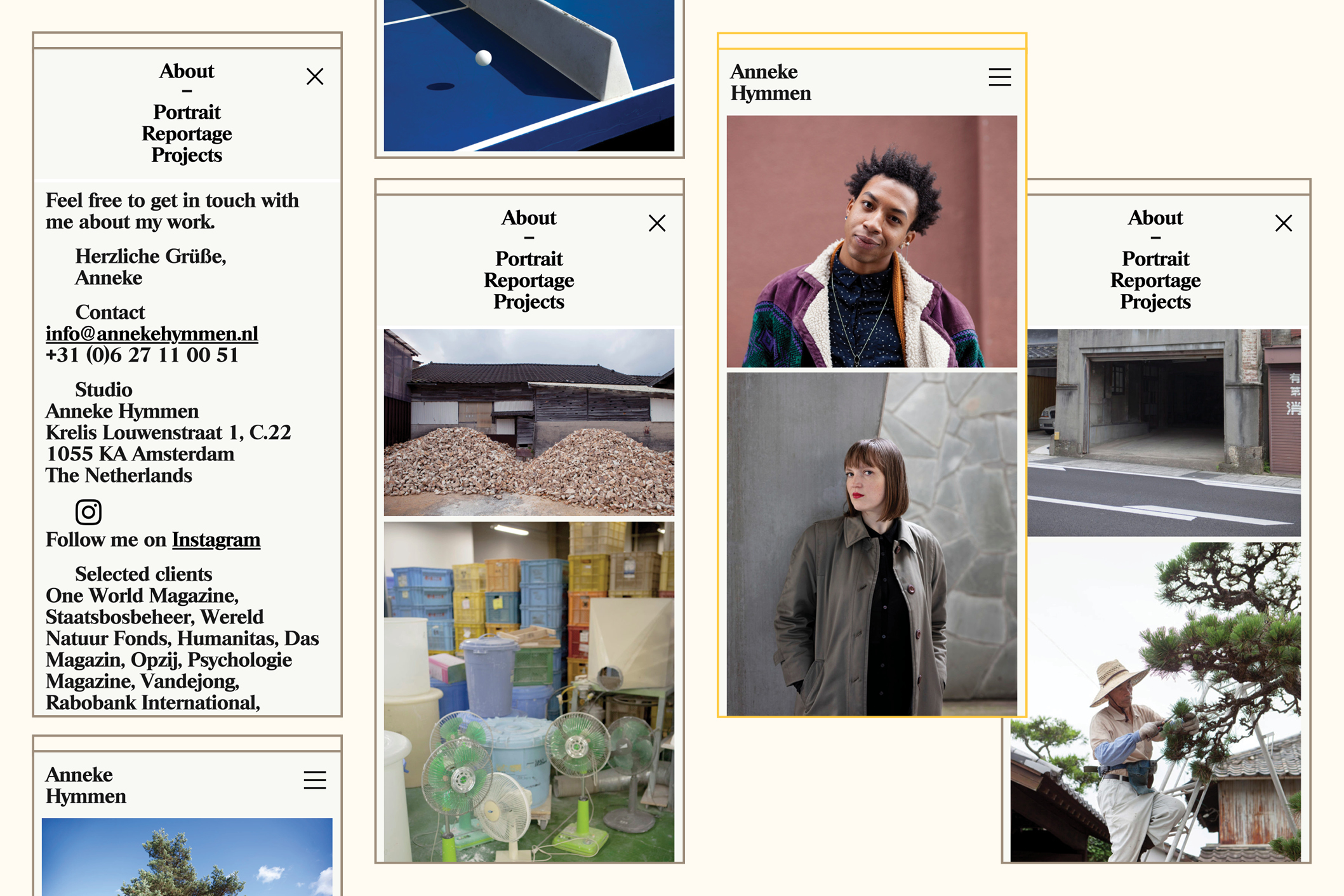
ANNEKE HYMMEN
--------------------------------------
--------------------------------------
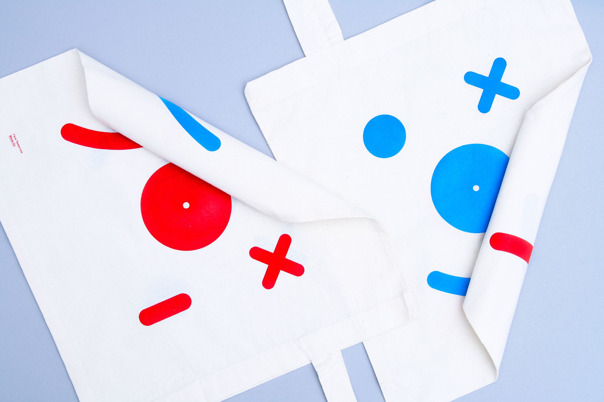
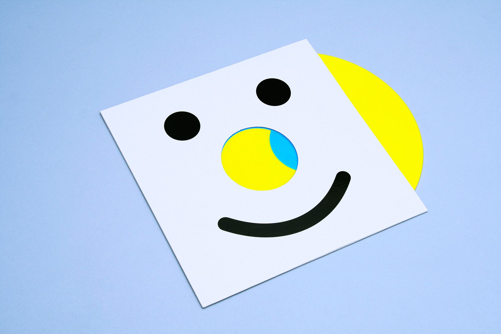
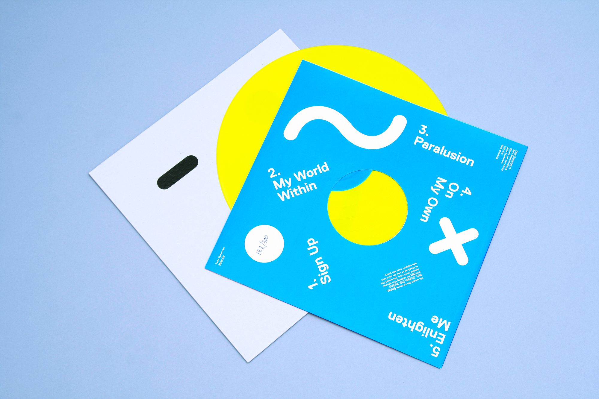
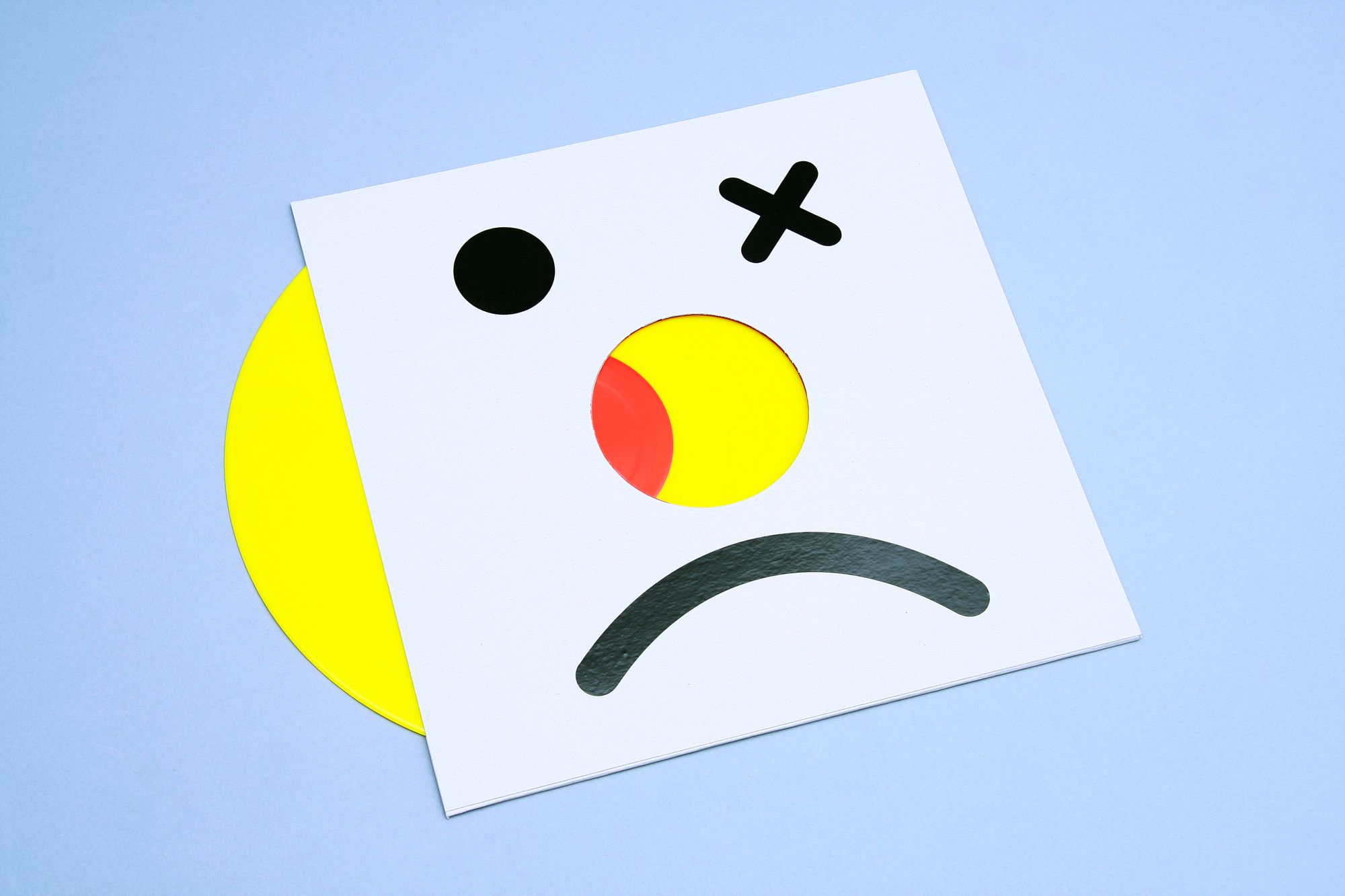
FACE TOMORROW 12” MOVE ON
--------------------------------------
Artwork for Face Tomorrow’s last LP ‘Move On’. The glossy black stickers
on the cover are put on by hand.
Because of the possible combinations with the eyes (circle, cross or dash) and mouths (happy, sad or undecided), the artwork is different on every LP. The vinyl is smiley-bright-yellow. Design in collaboration with Rob van
den Nieuwenhuizen.
--------------------------------------
--------------------------------------
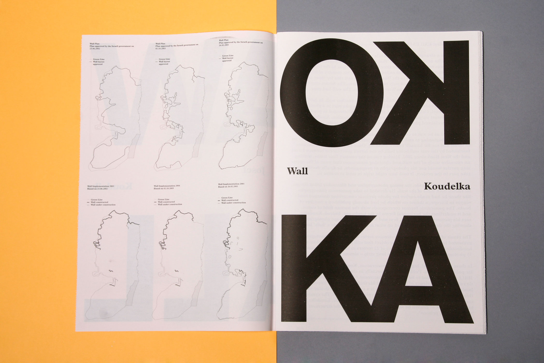
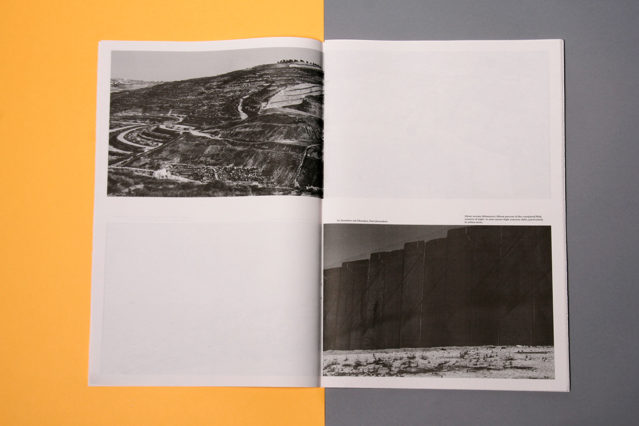
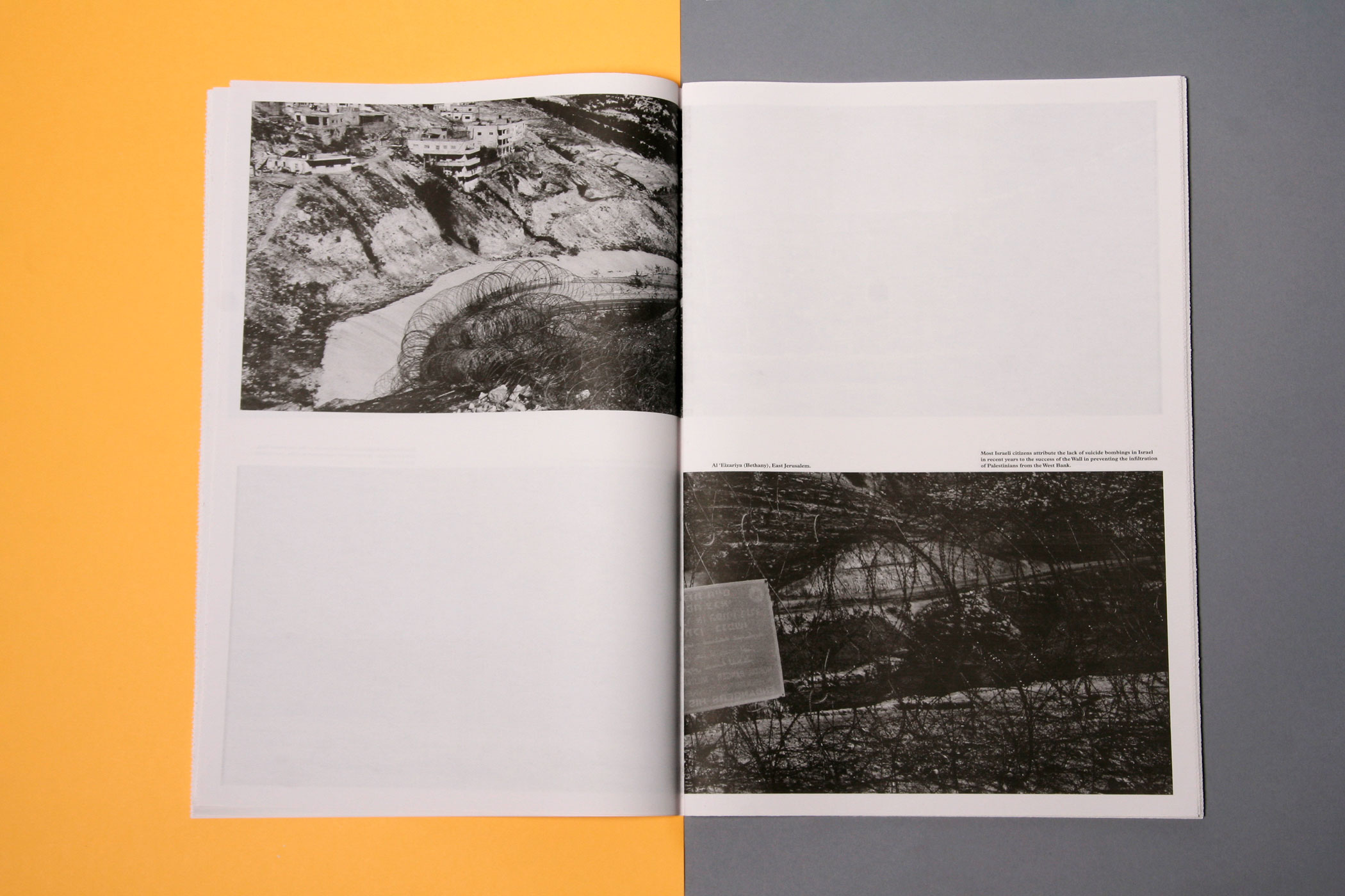
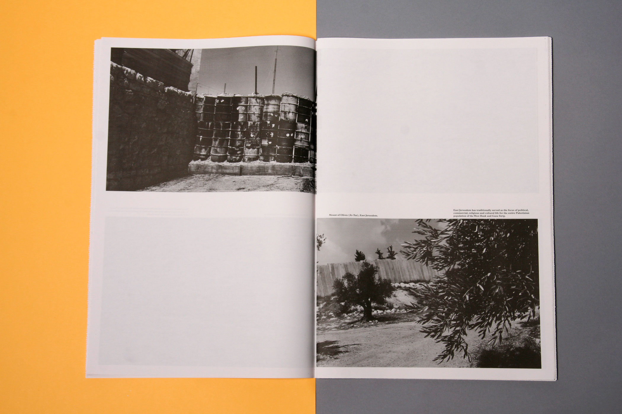
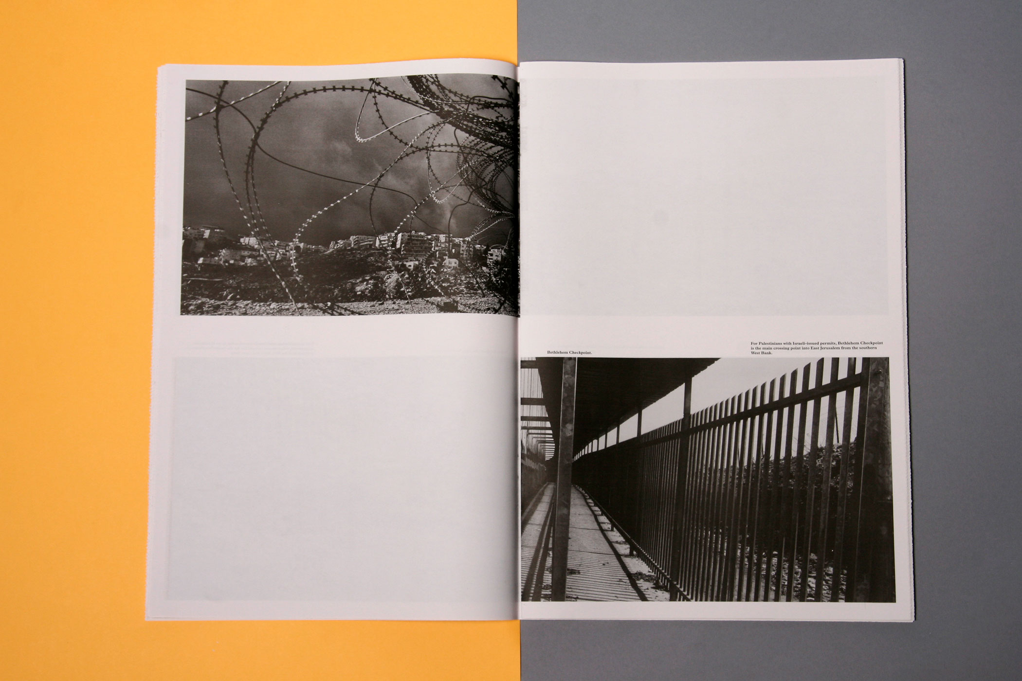
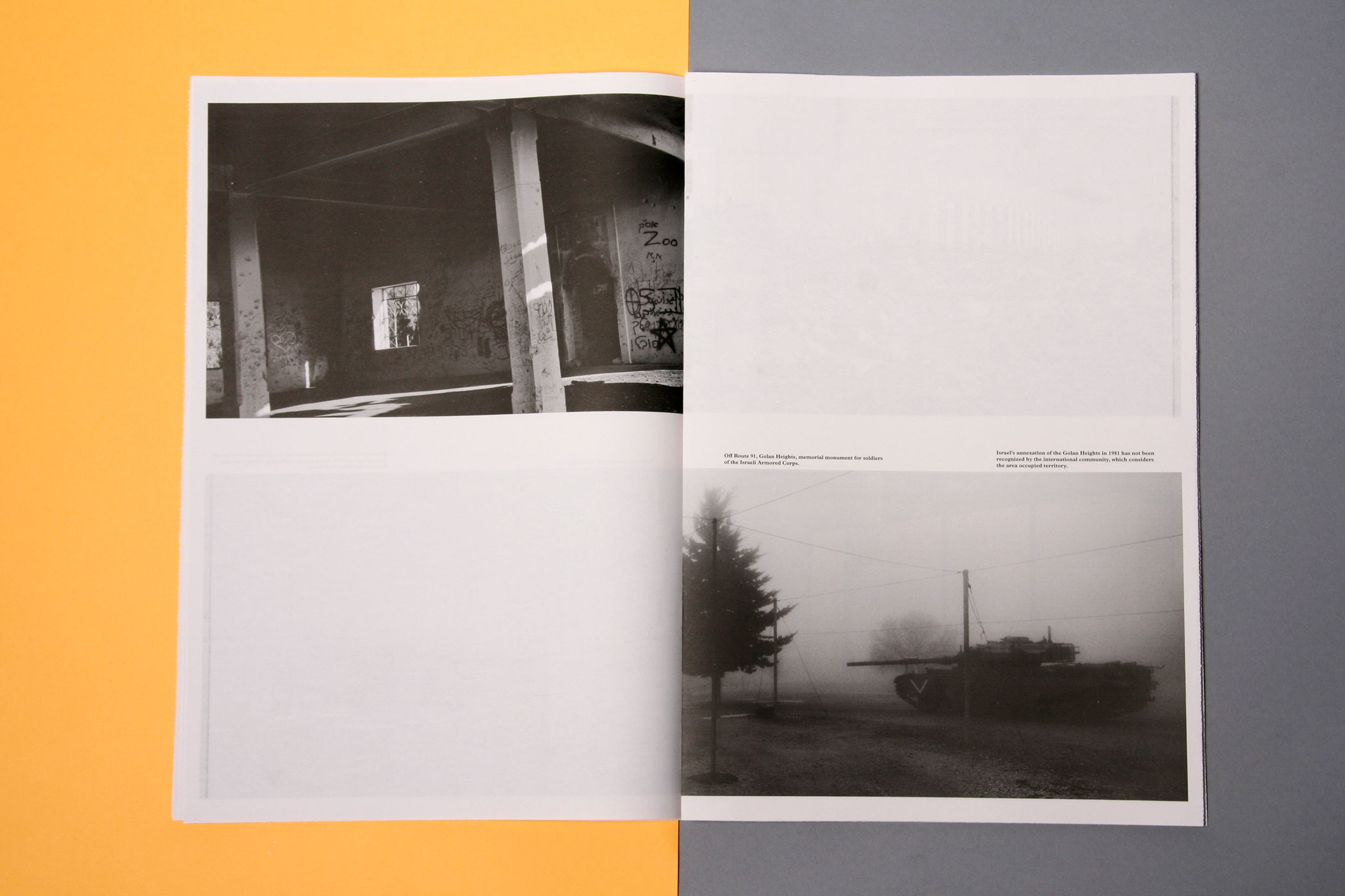
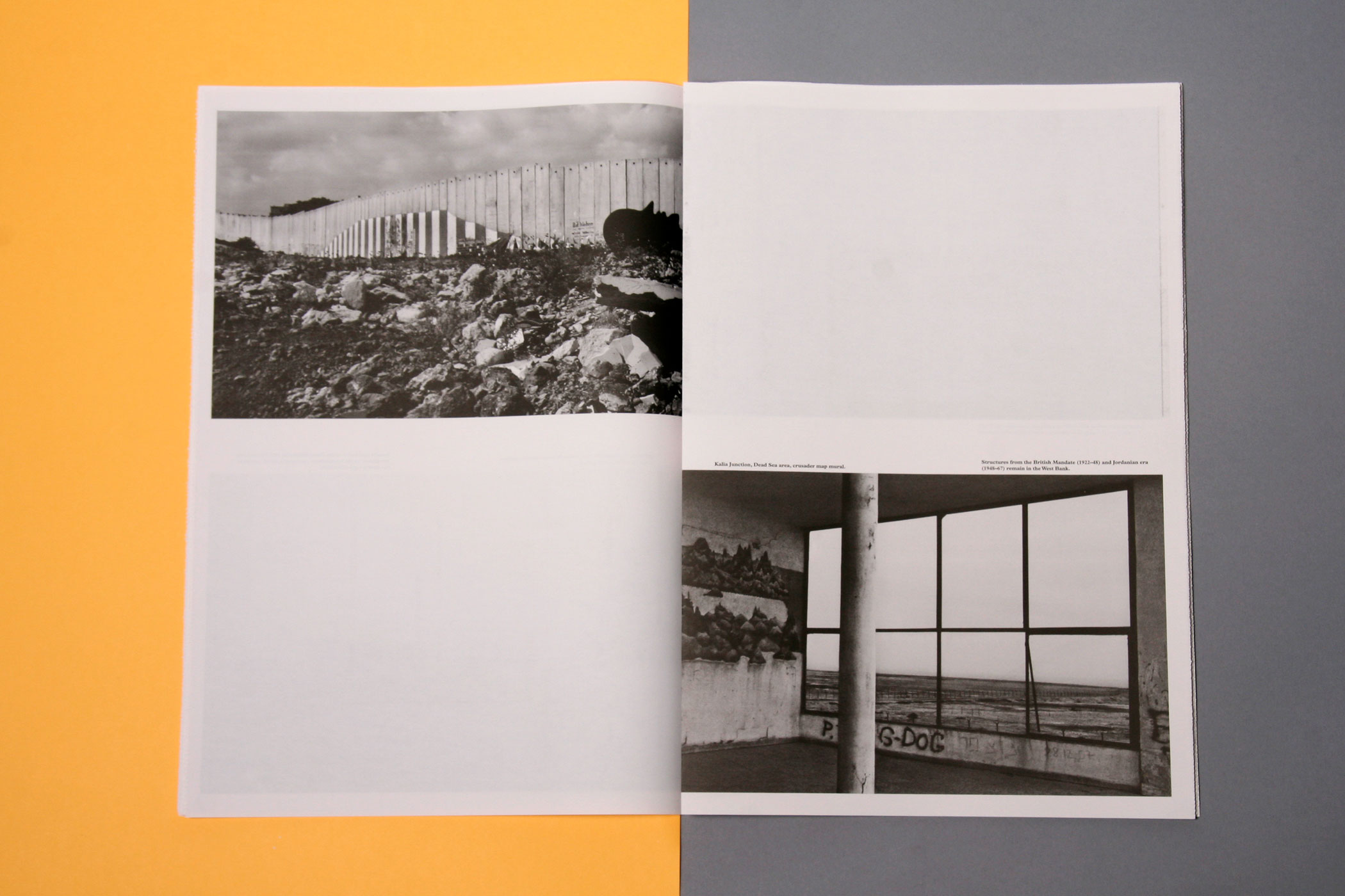
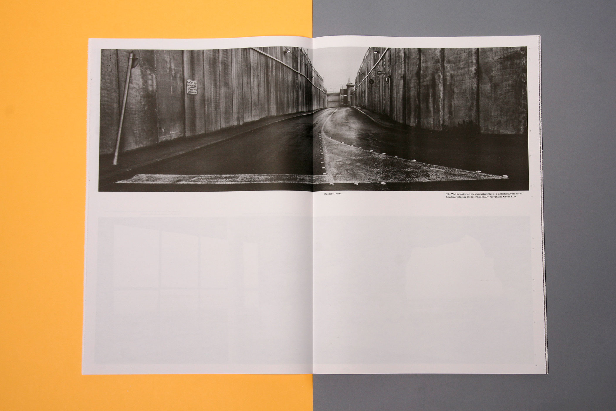
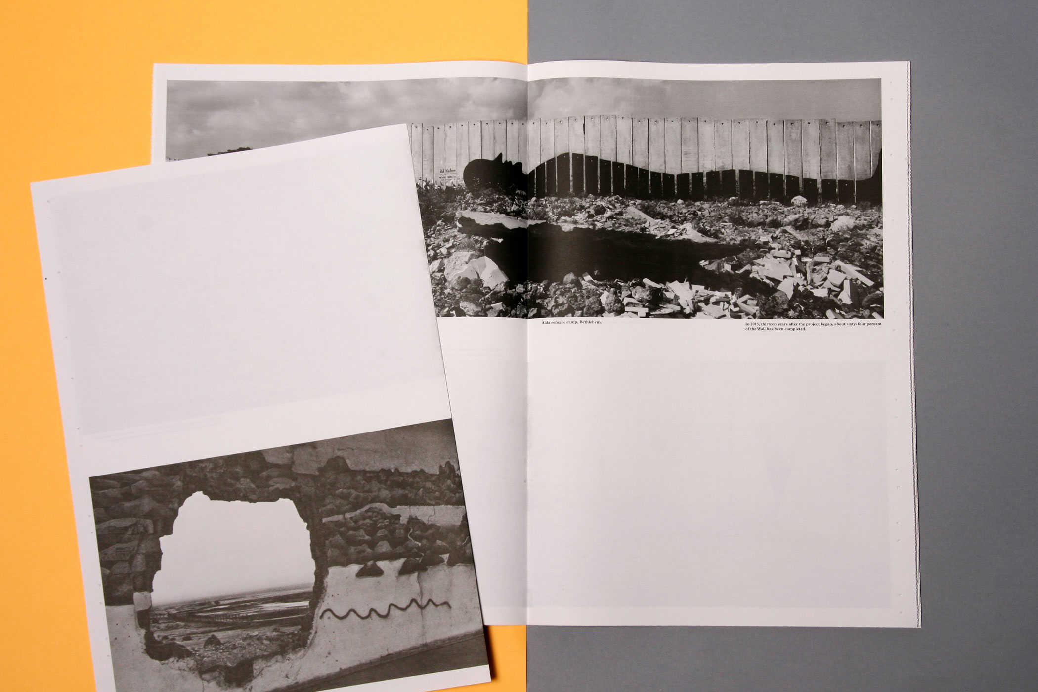
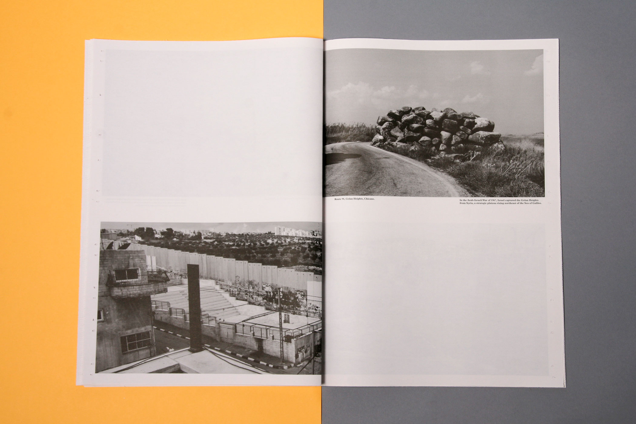
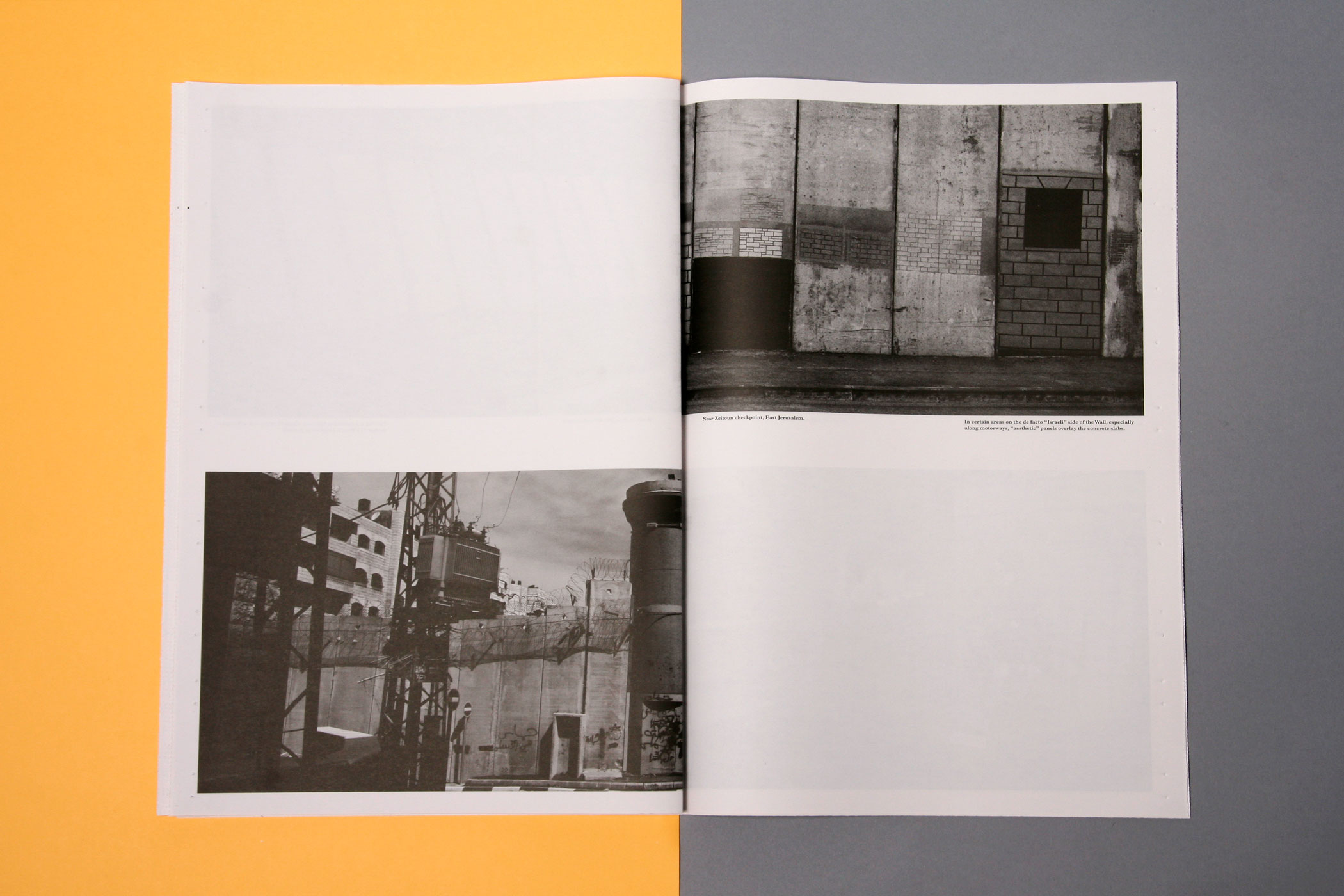
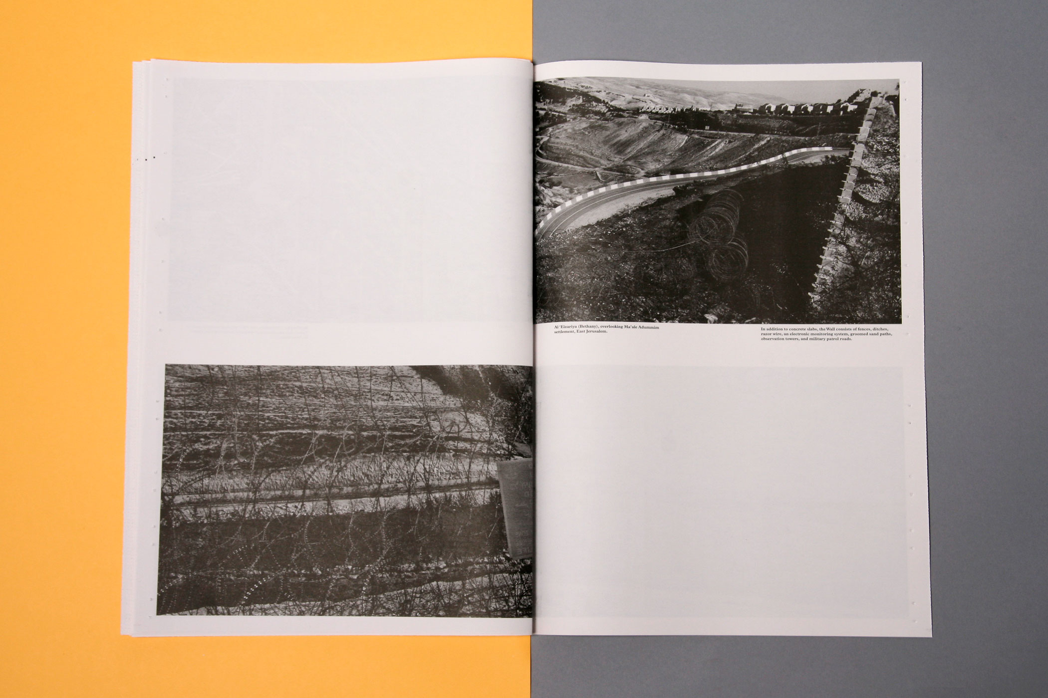
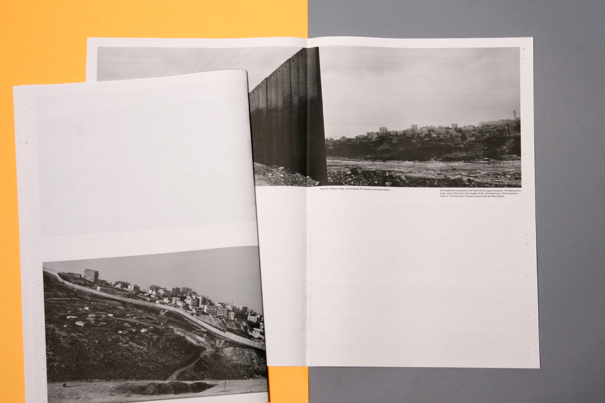
JOSEF KOUDELKA
--------------------------------------
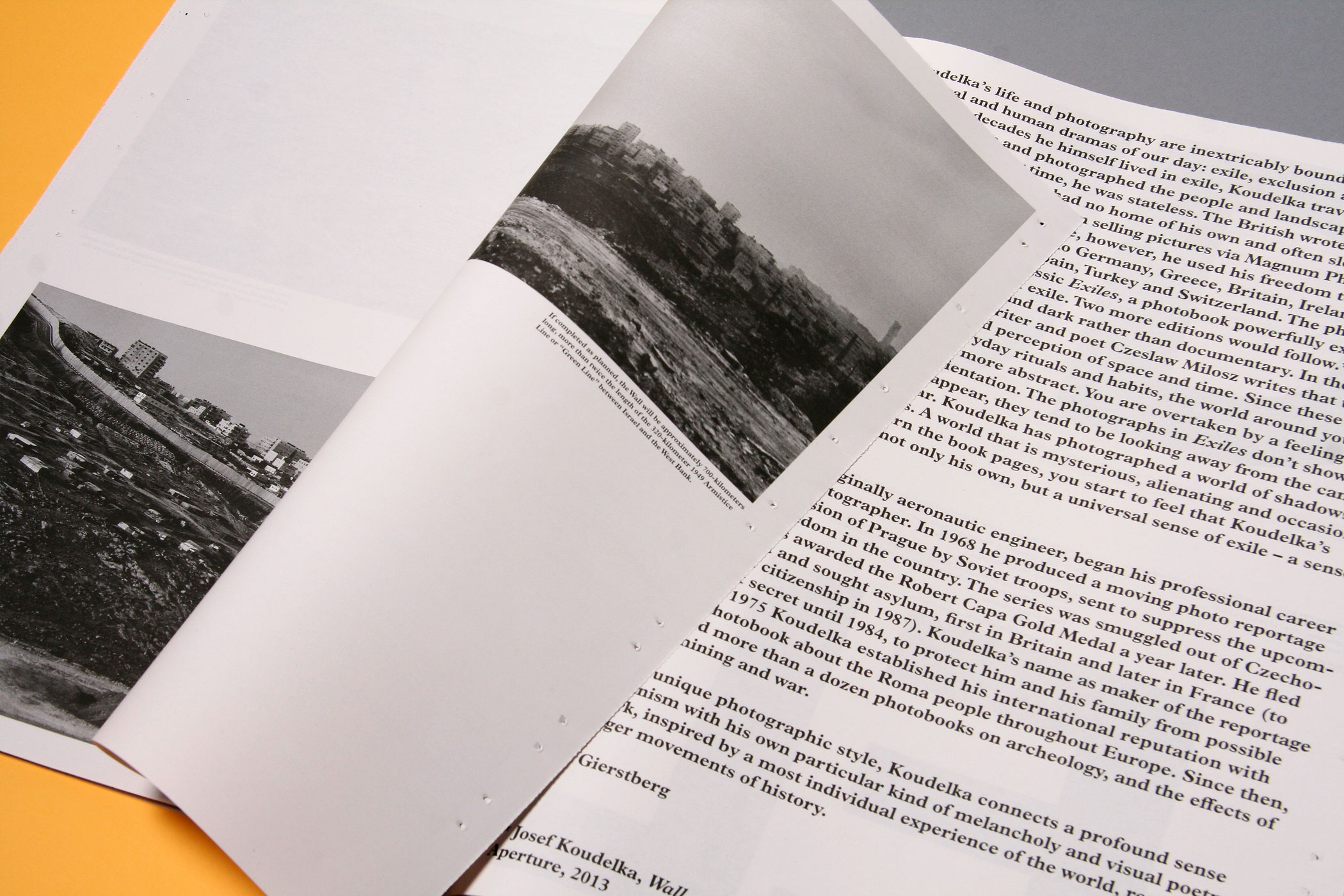
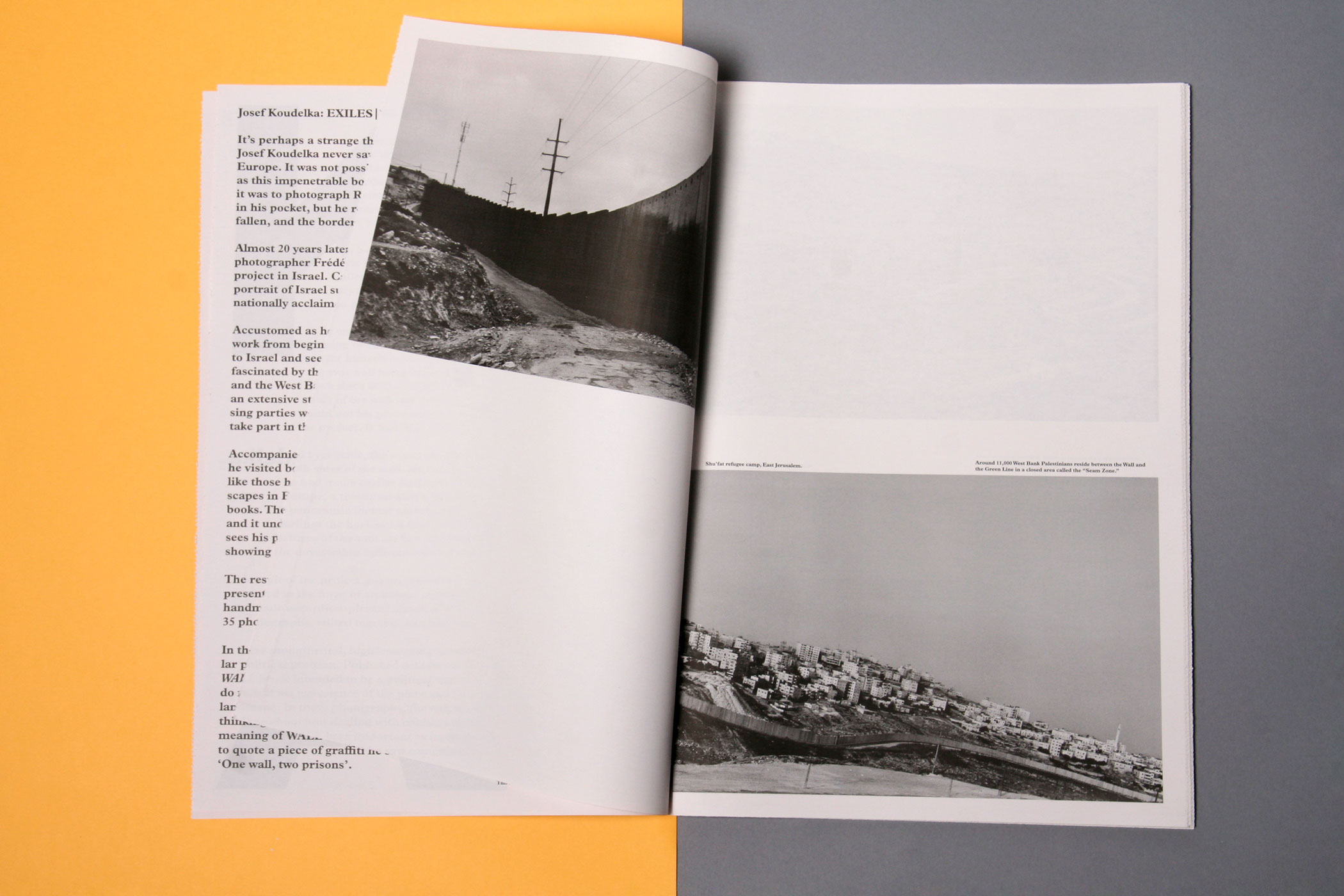
This publication features a new selection of Josef Koudelka's panorama series 'WALL', and is published by Fotomuseum Rotterdam. The series captures the impact of the wall
between Israel and the West Bank on
the surrounding landscape. In the design, this division is underscored
by the placement of images over the entire spread, including the fold
of the newsprint paper. Design in collaboration with Irma Boom.
--------------------------------------
between Israel and the West Bank on
the surrounding landscape. In the design, this division is underscored
by the placement of images over the entire spread, including the fold
of the newsprint paper. Design in collaboration with Irma Boom.
--------------------------------------
--------------------------------------
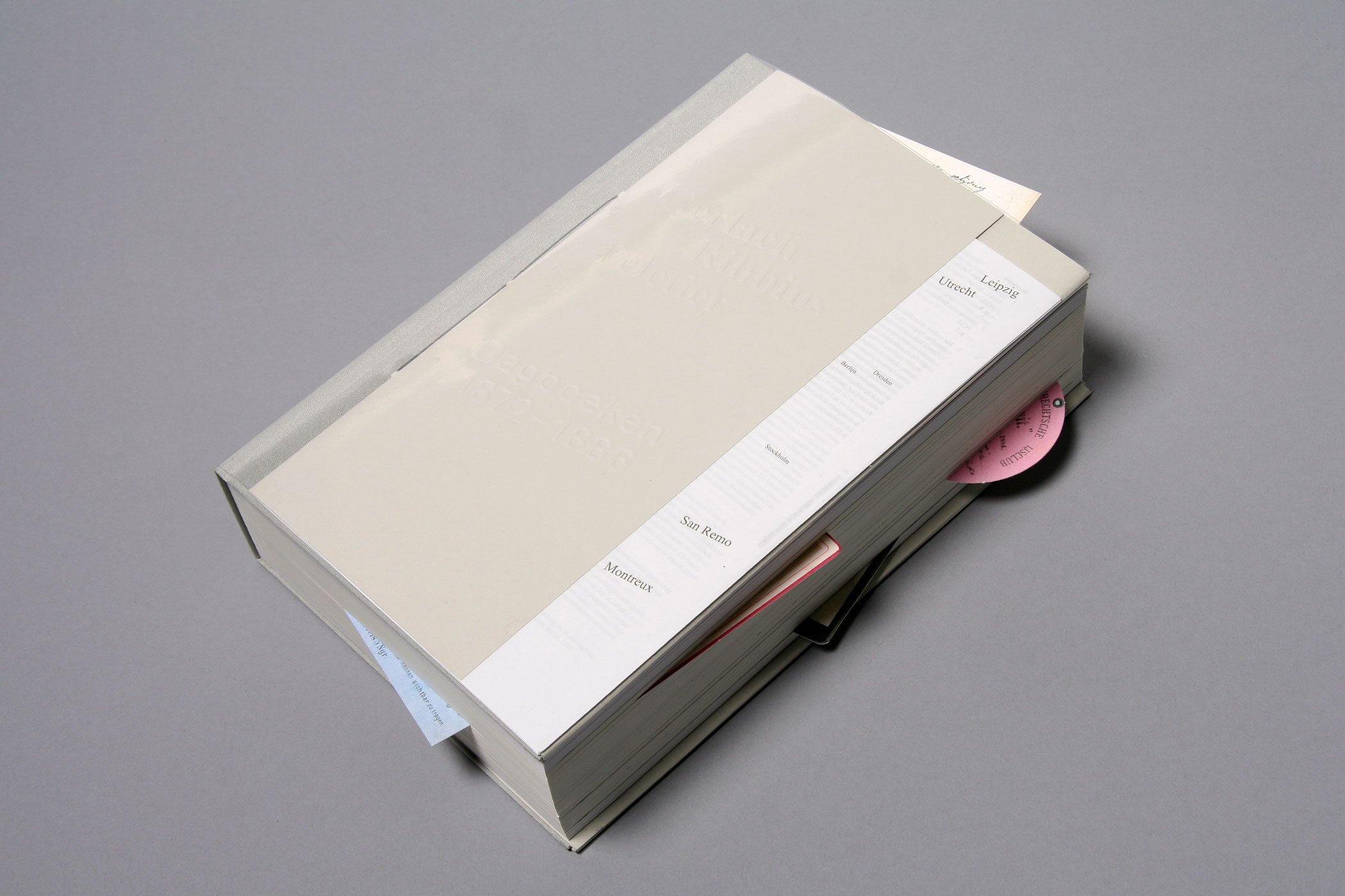
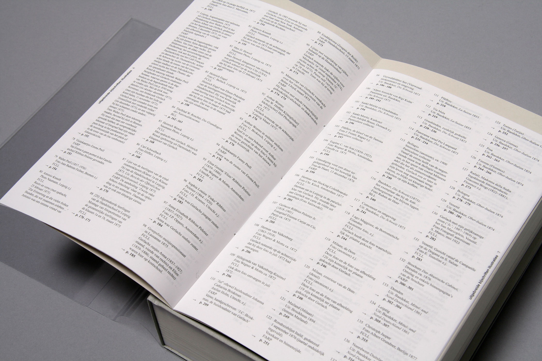
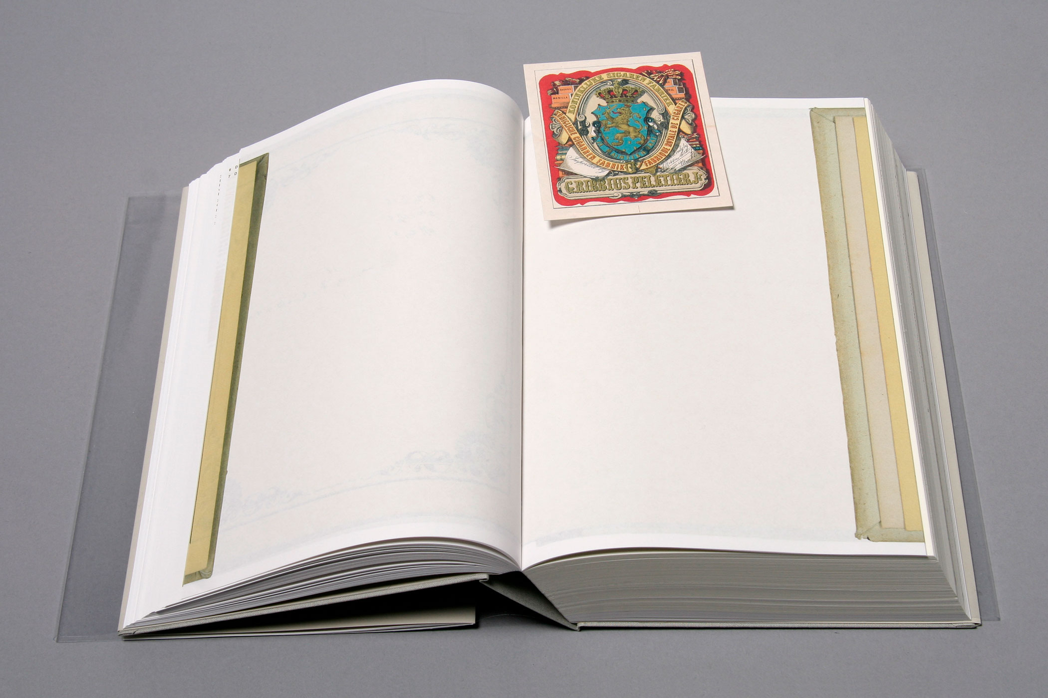
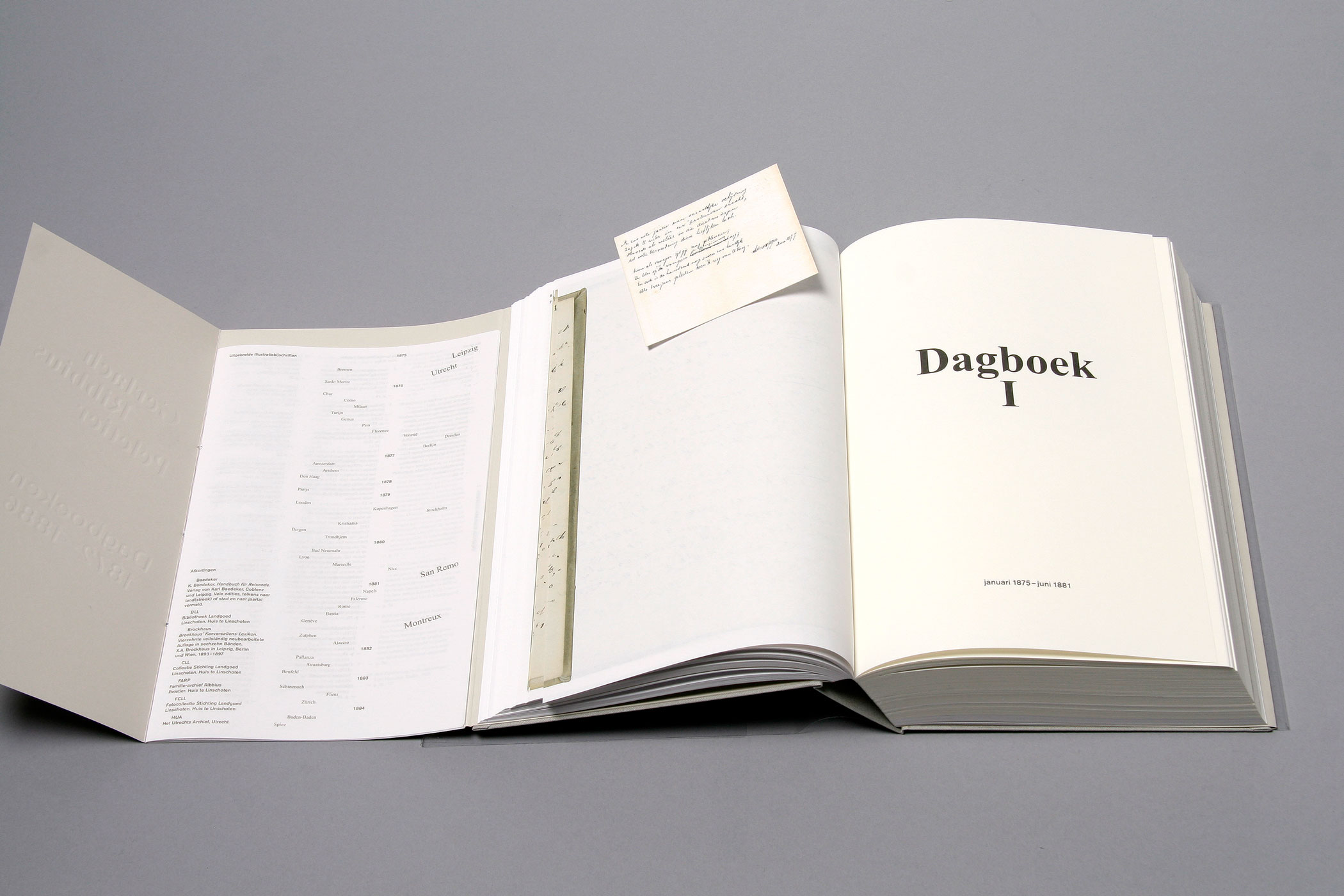
GERLACH RIBBIUS PELETIER
--------------------------------------
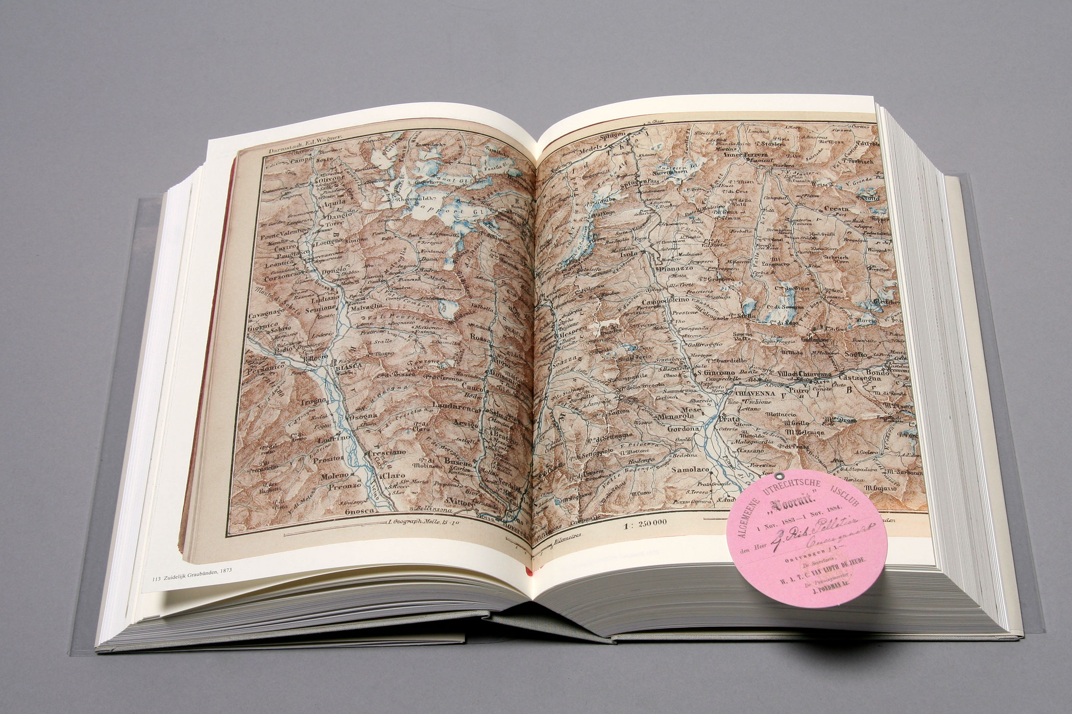
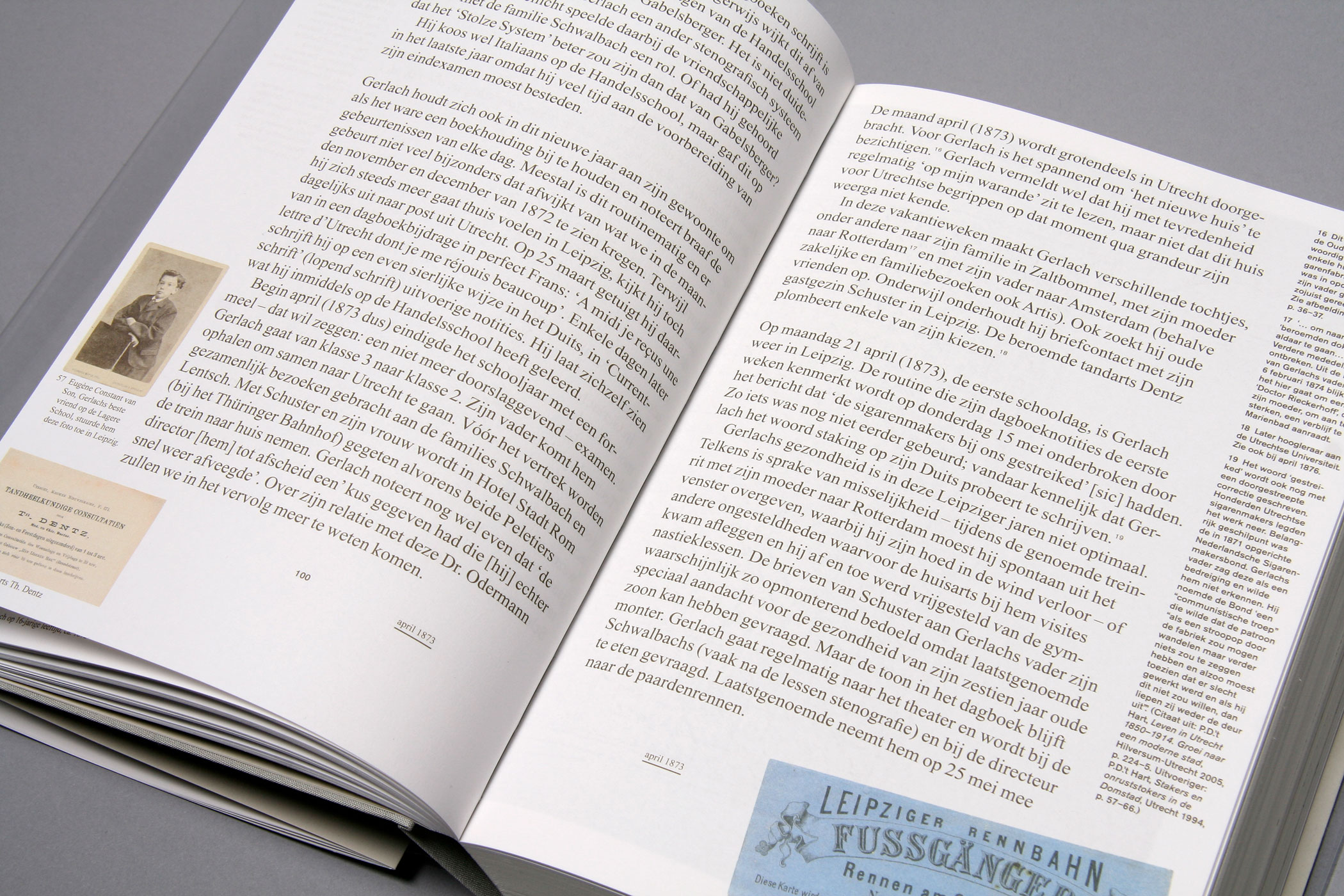
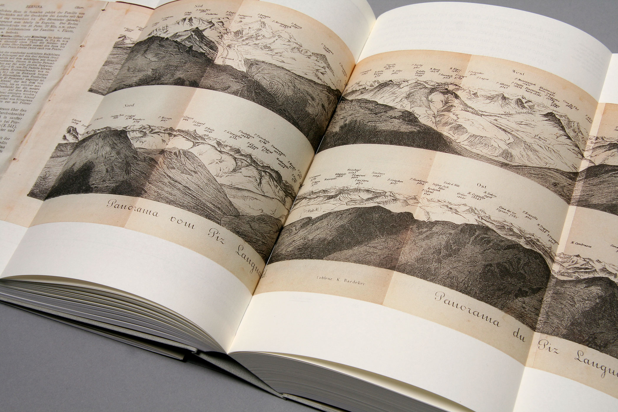
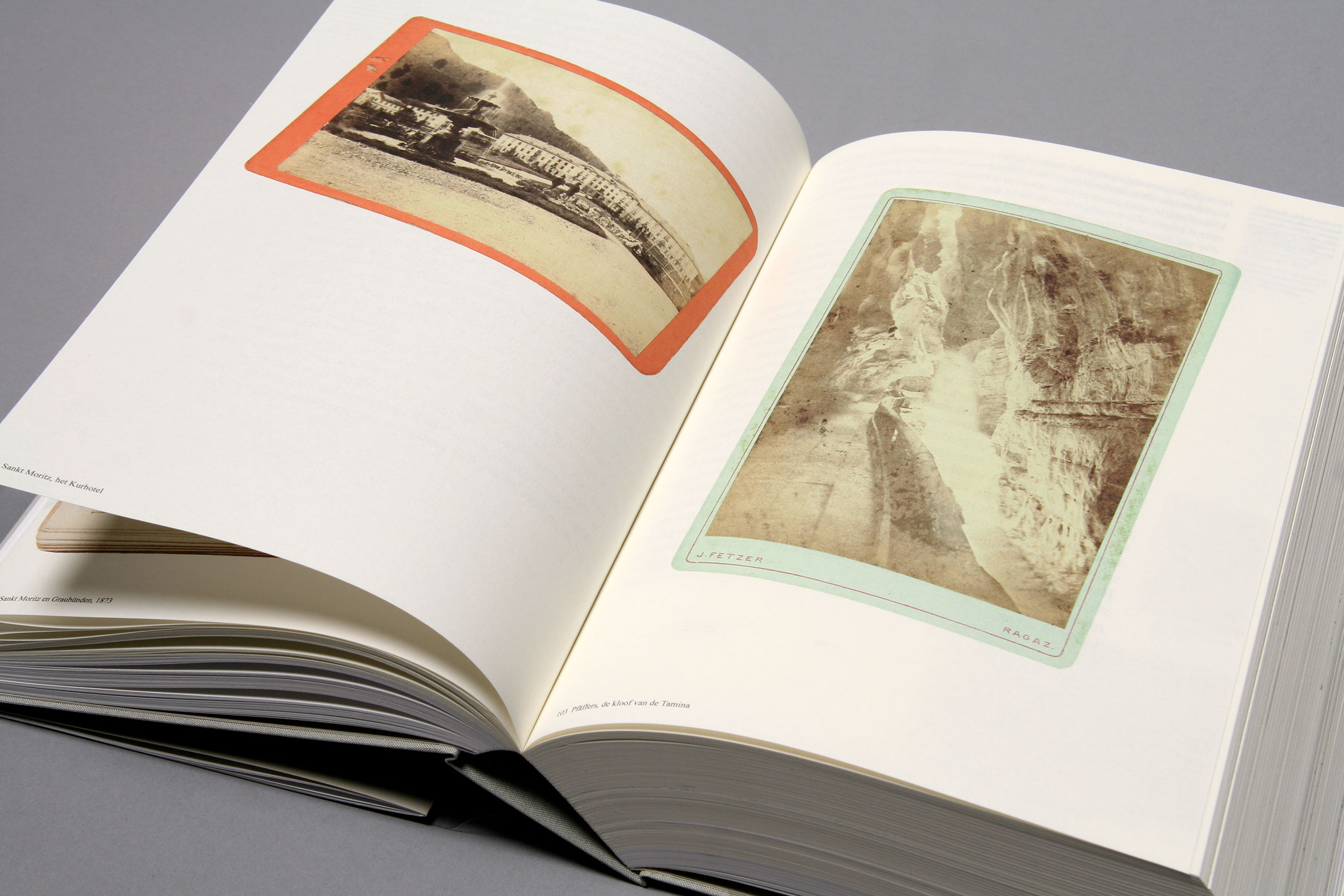
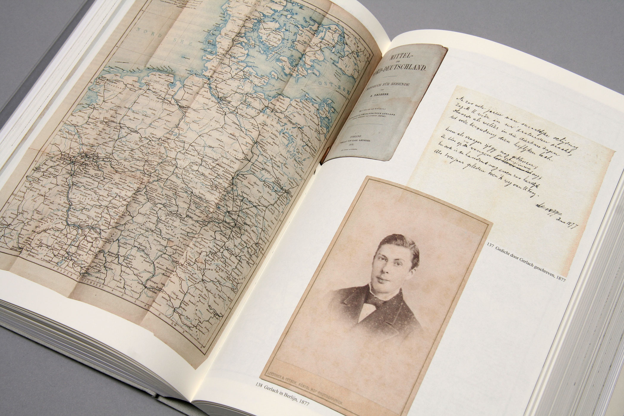
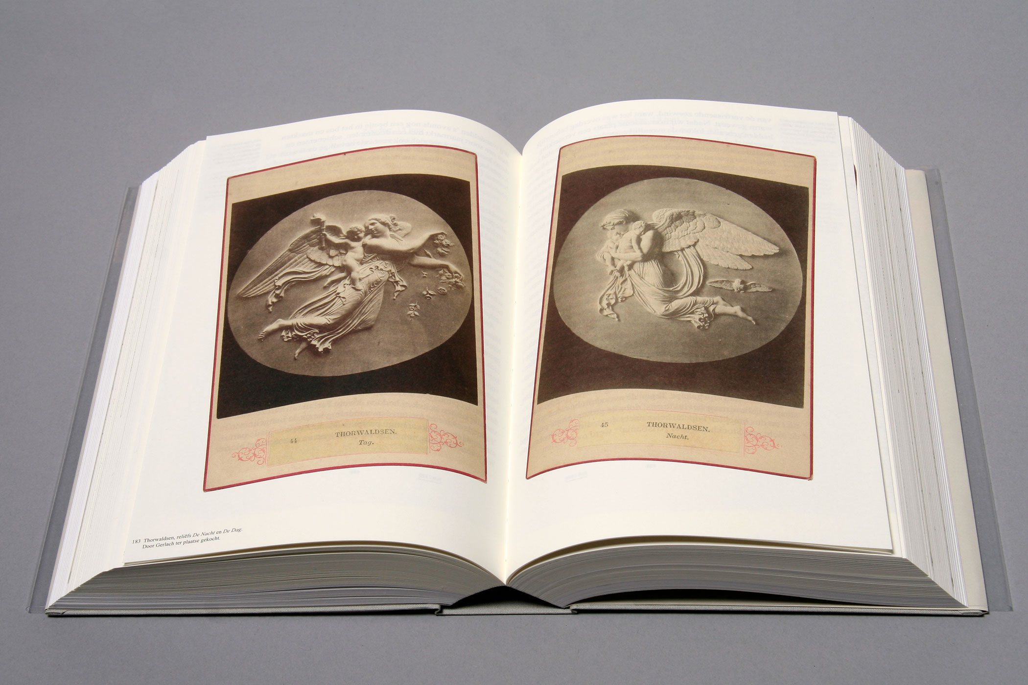
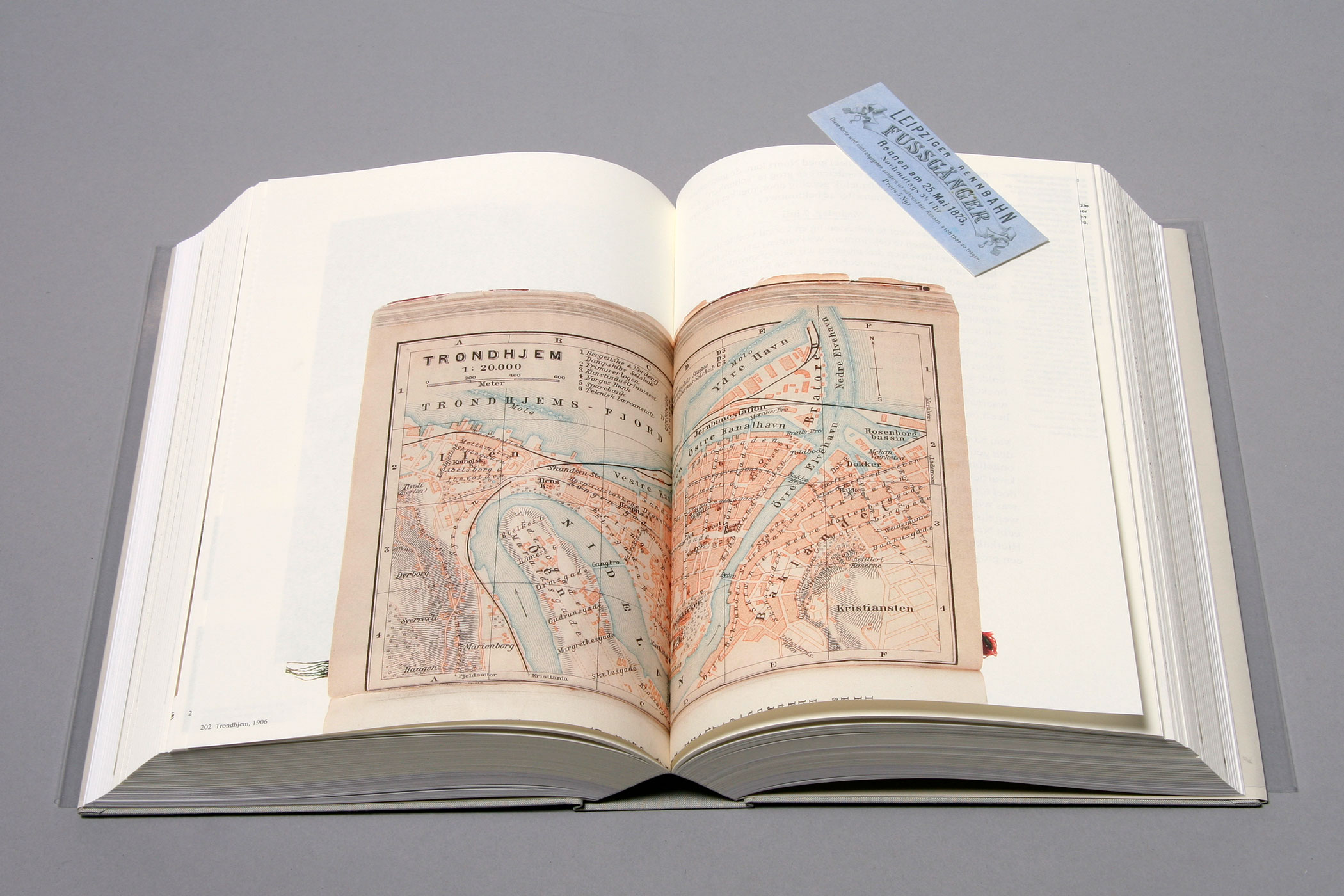
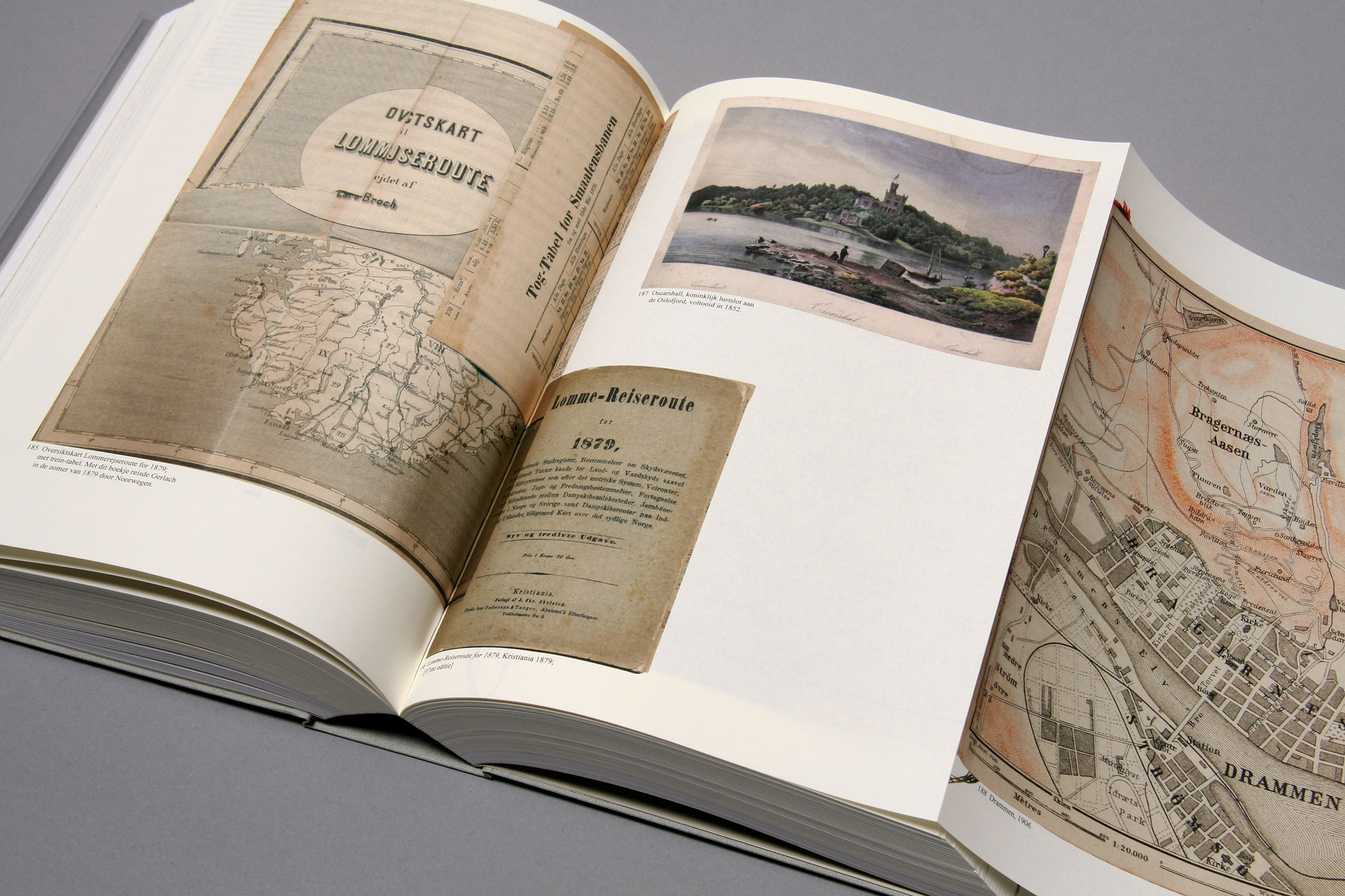
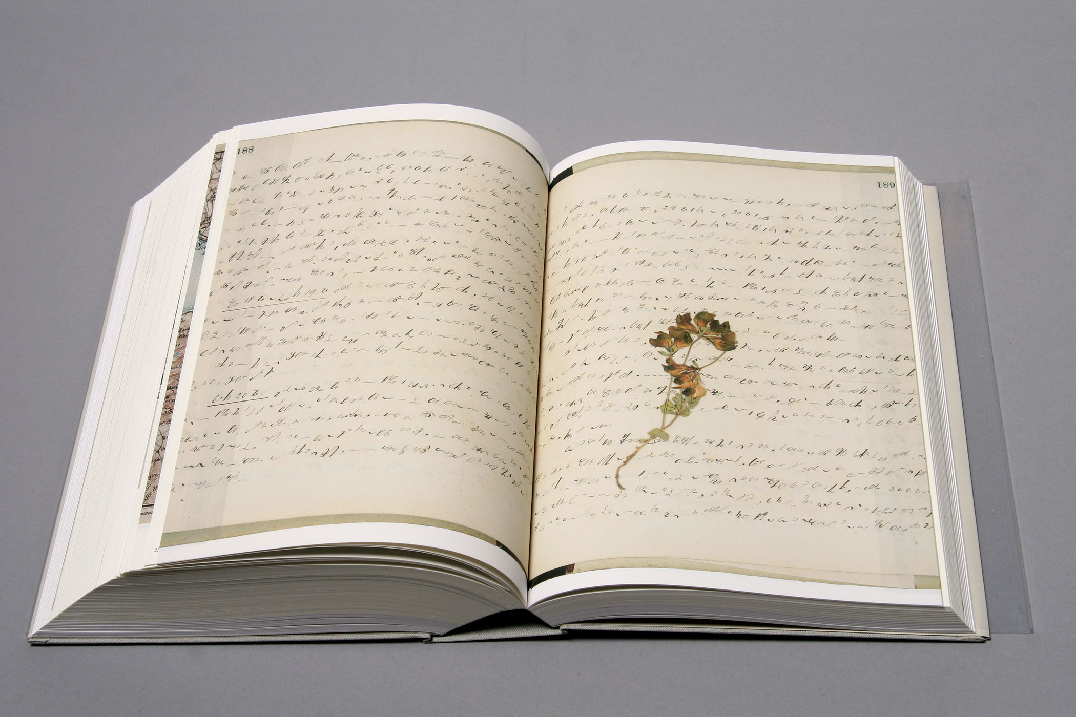
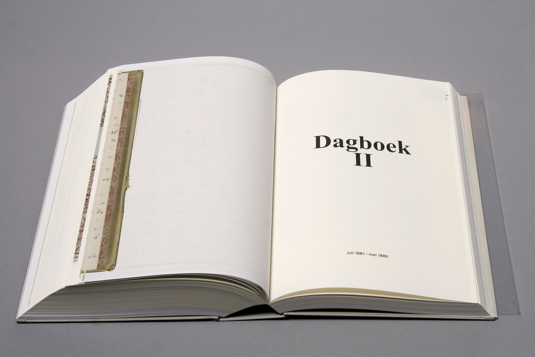
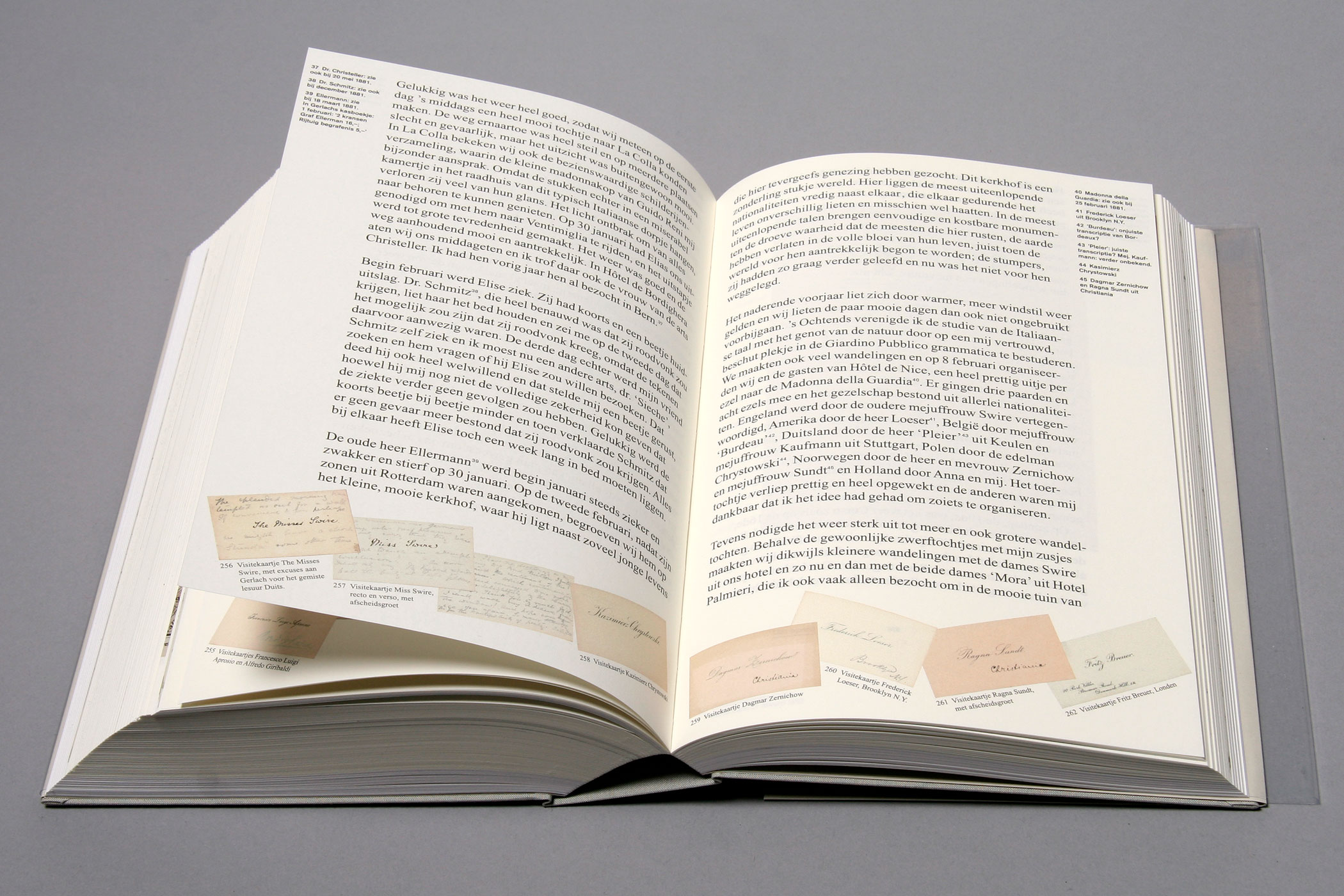
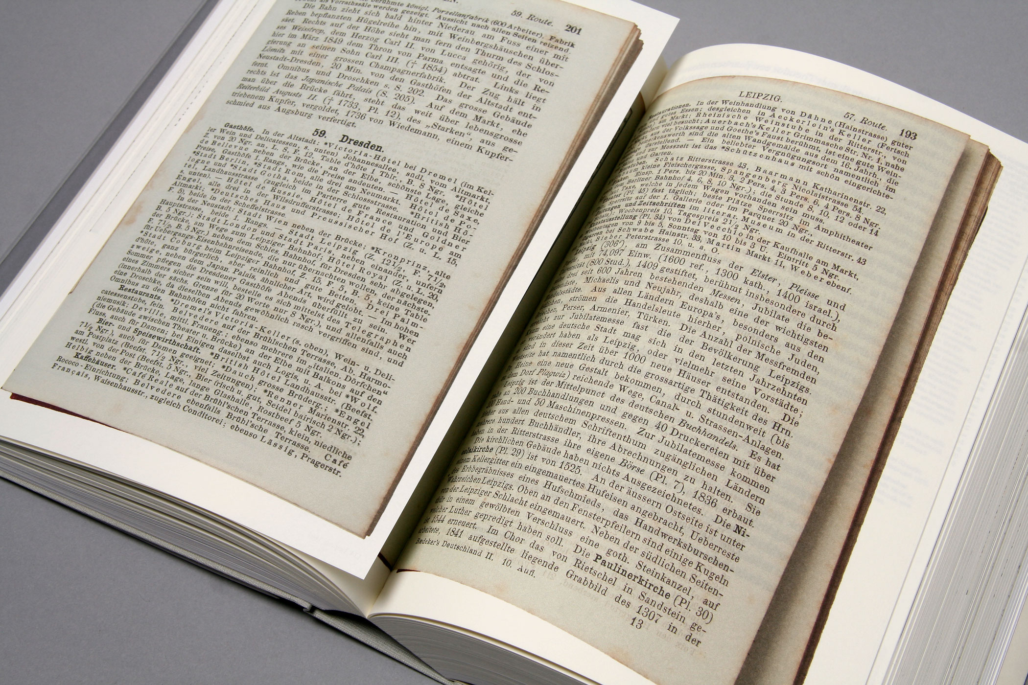
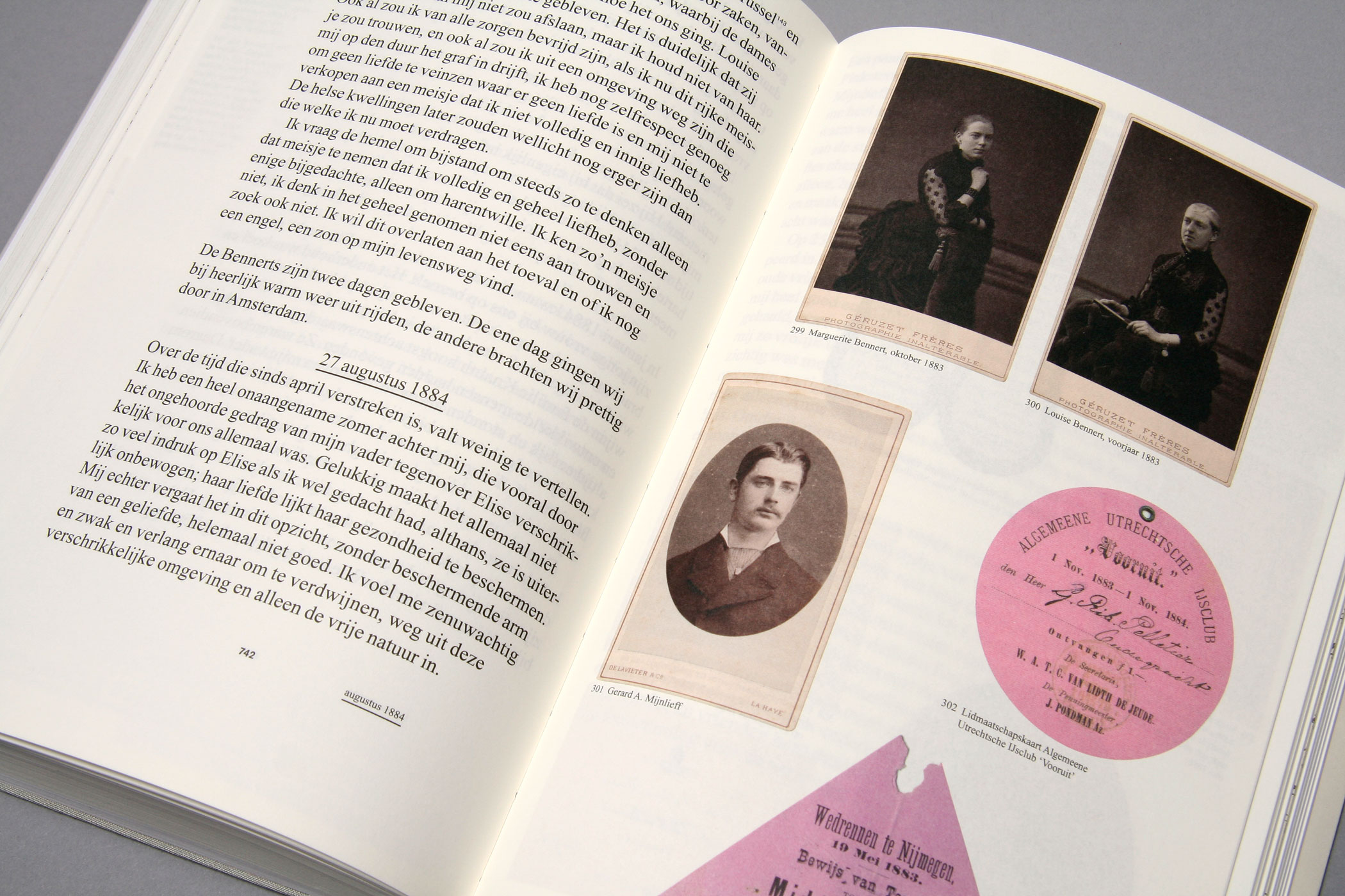
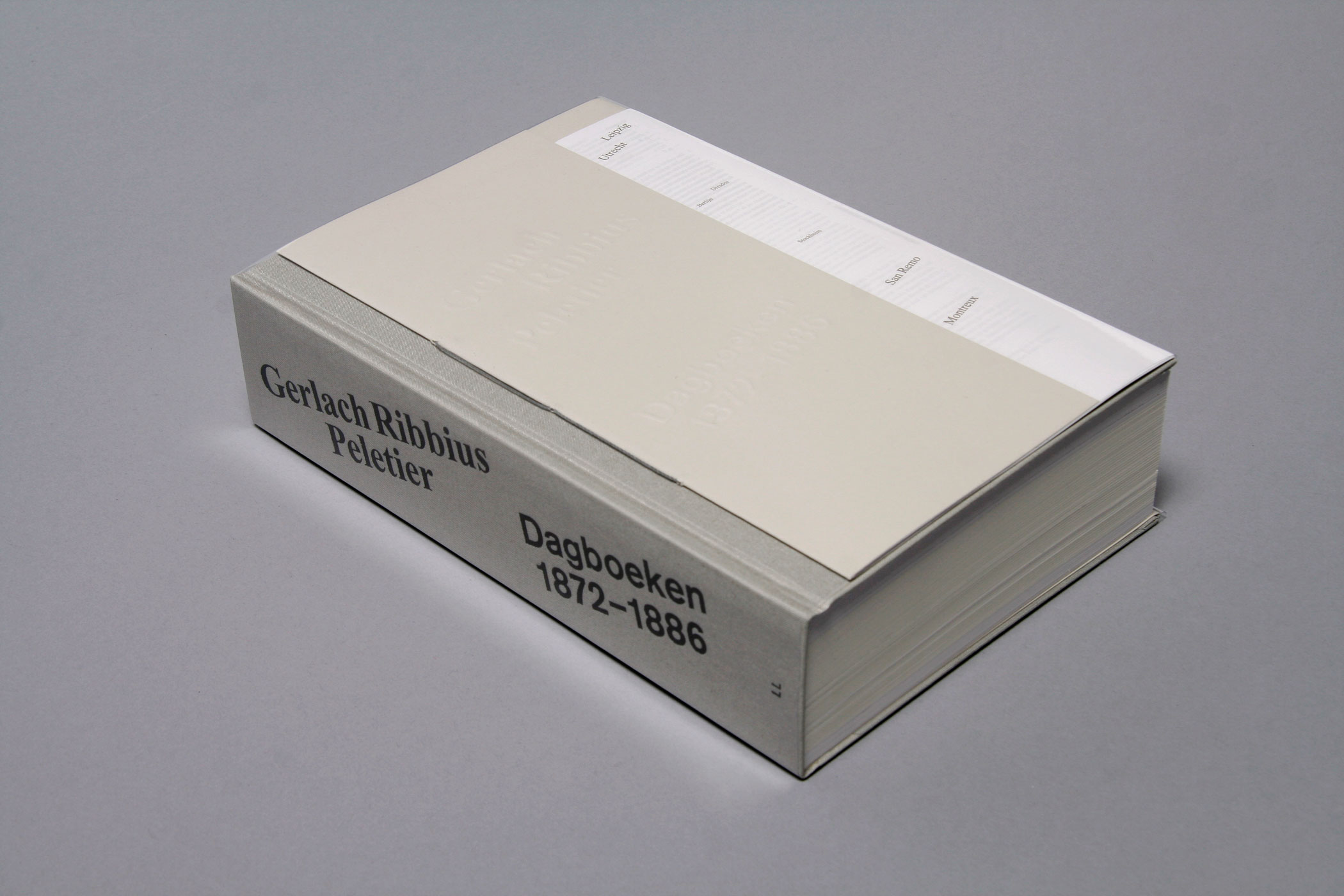
'Gerlach Ribbius Peletier, Dagboeken 1872–1886' is a story of a young Dutchman in search of a fulfilling
life, escaping family expectations by traveling through Europe. With its 892 pages, the book includes images of the original – in German shorthand-coded – diaries and is richly illustrated with archive materials inviting you into
this personal odyssey. Design in
collaboration with Irma Boom.
--------------------------------------
--------------------------------------
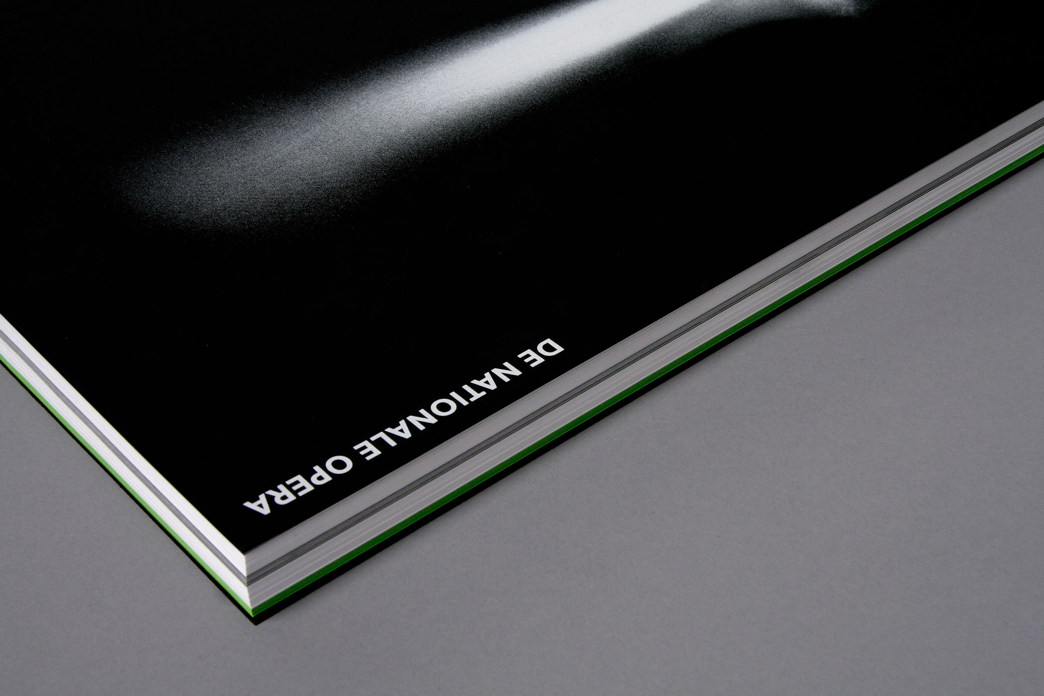
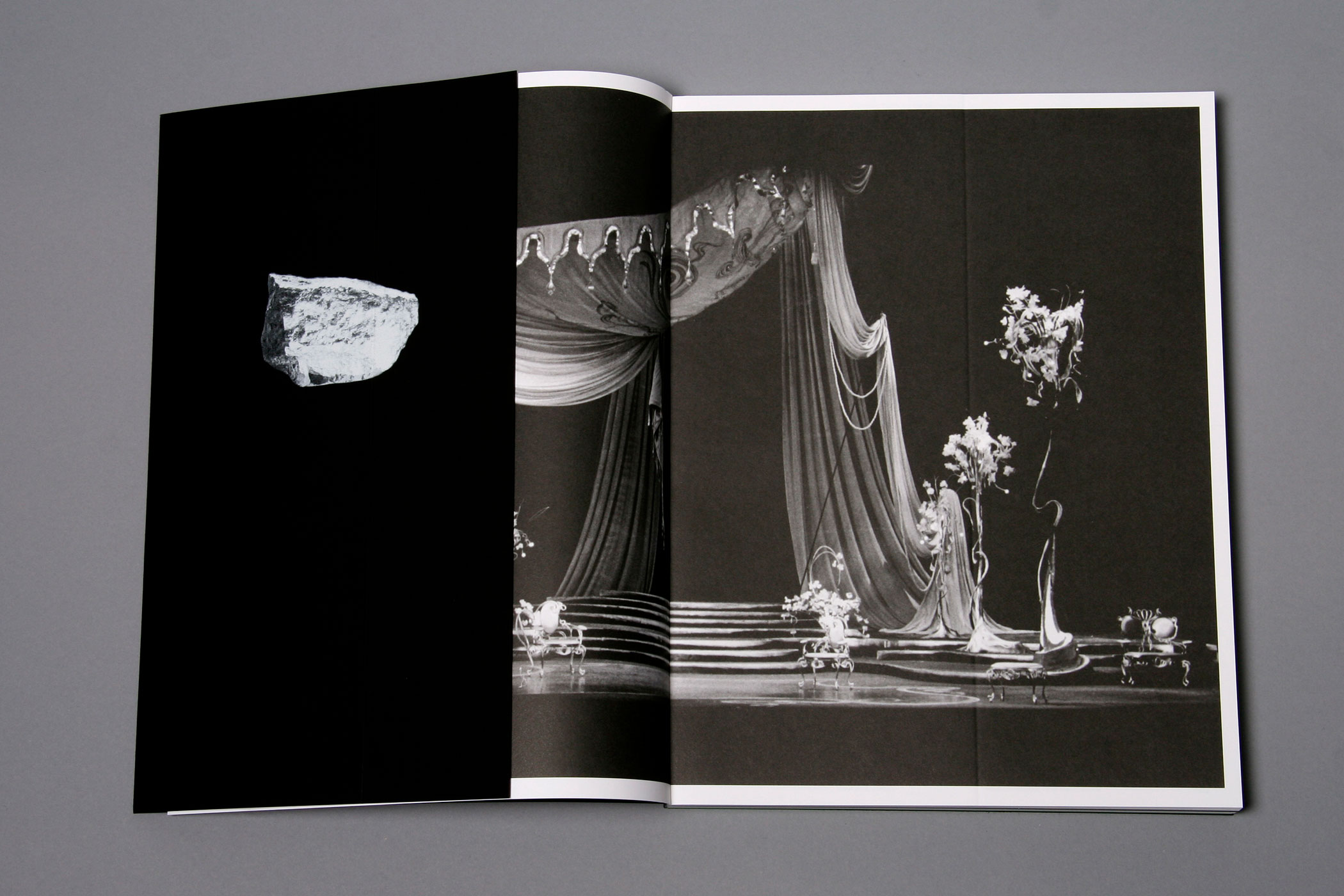
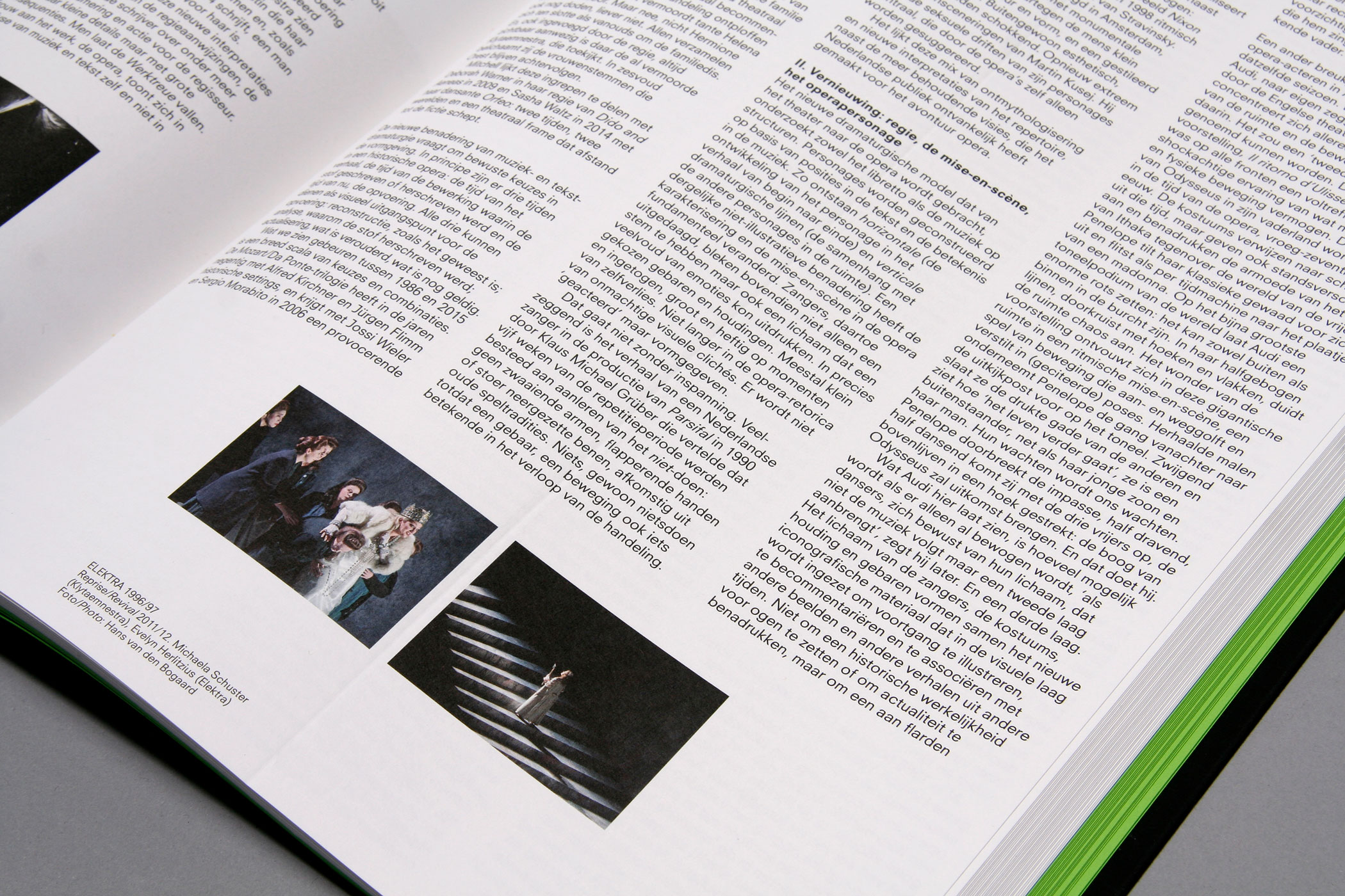
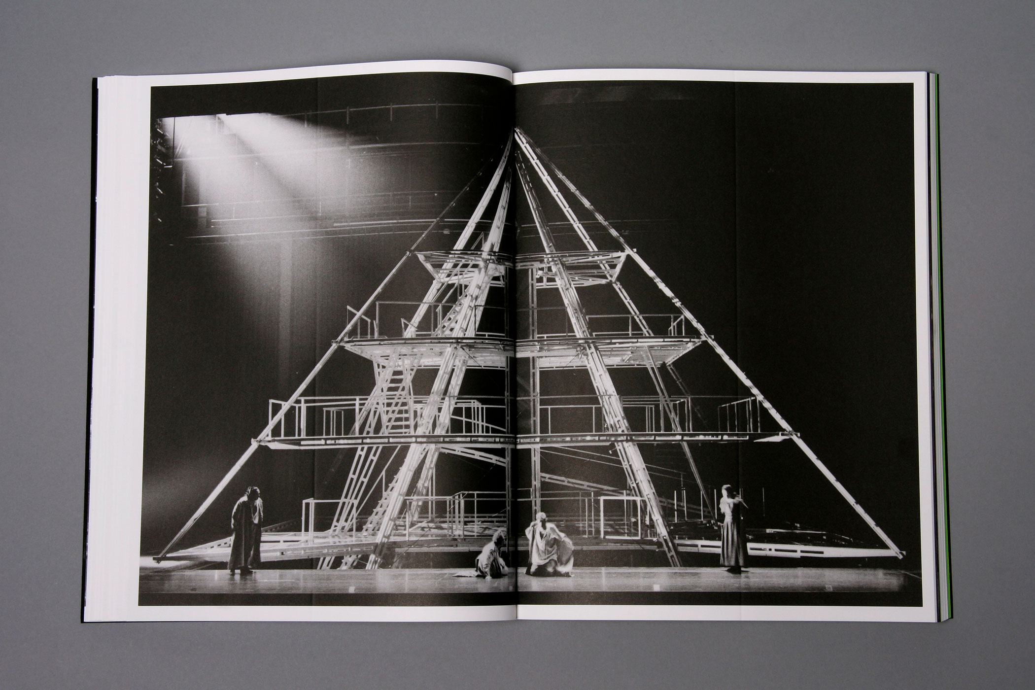
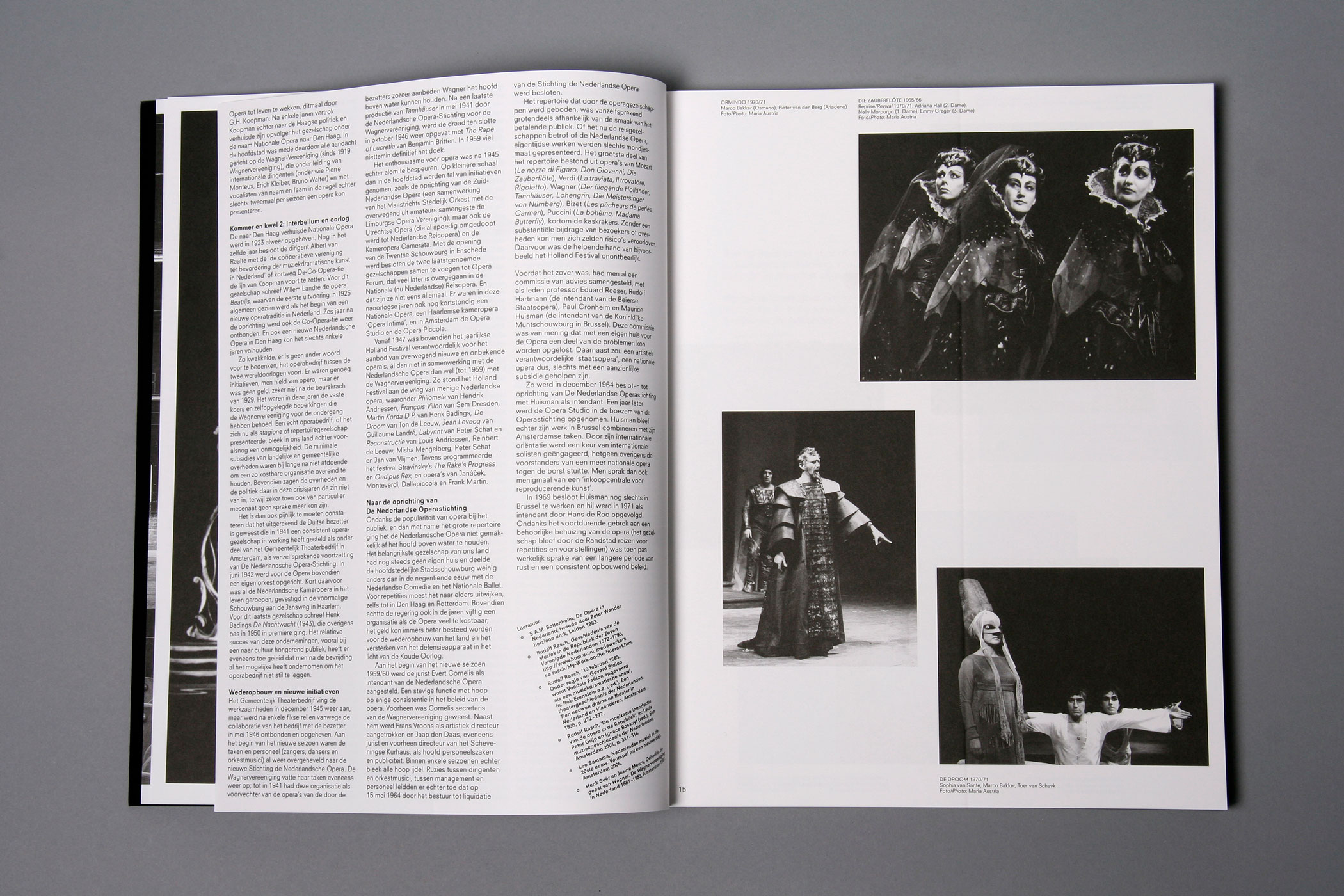
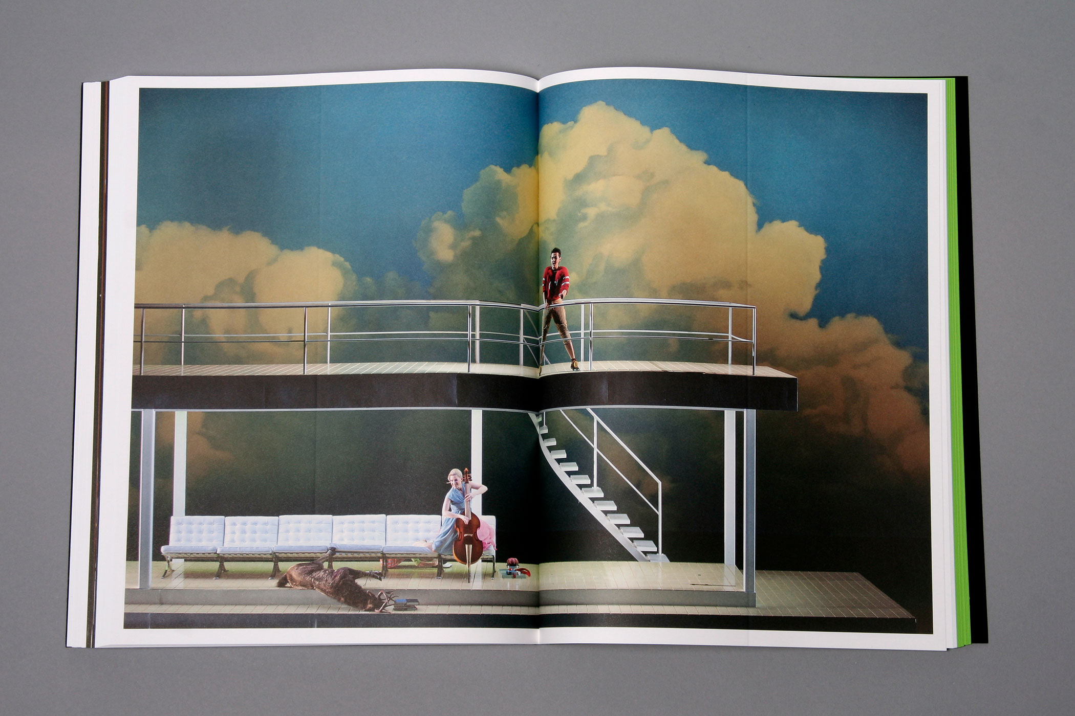
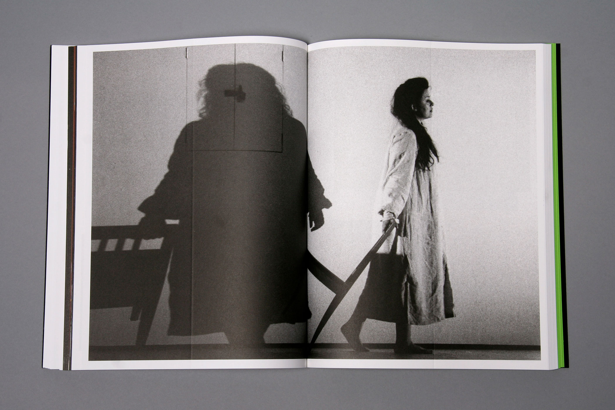
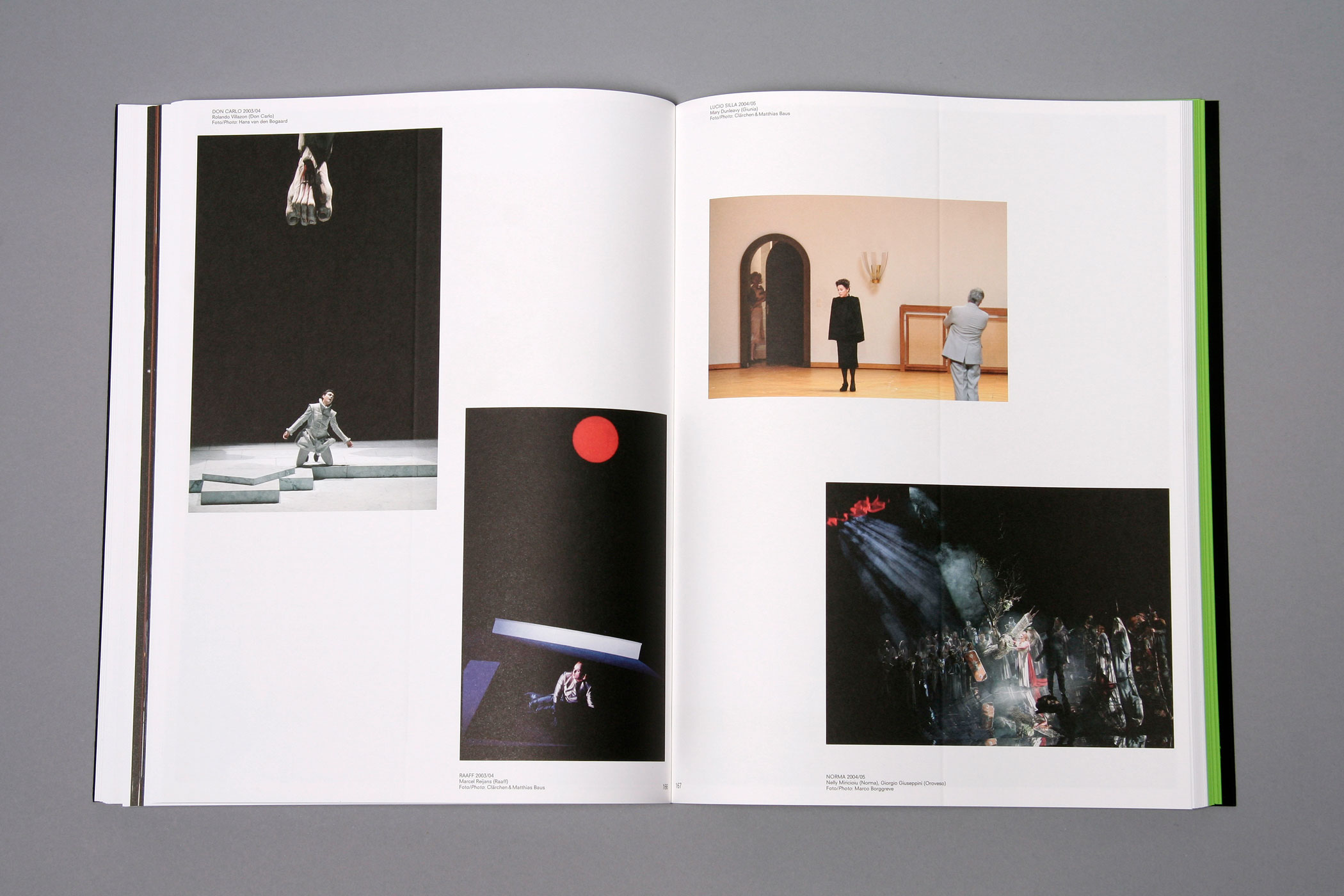
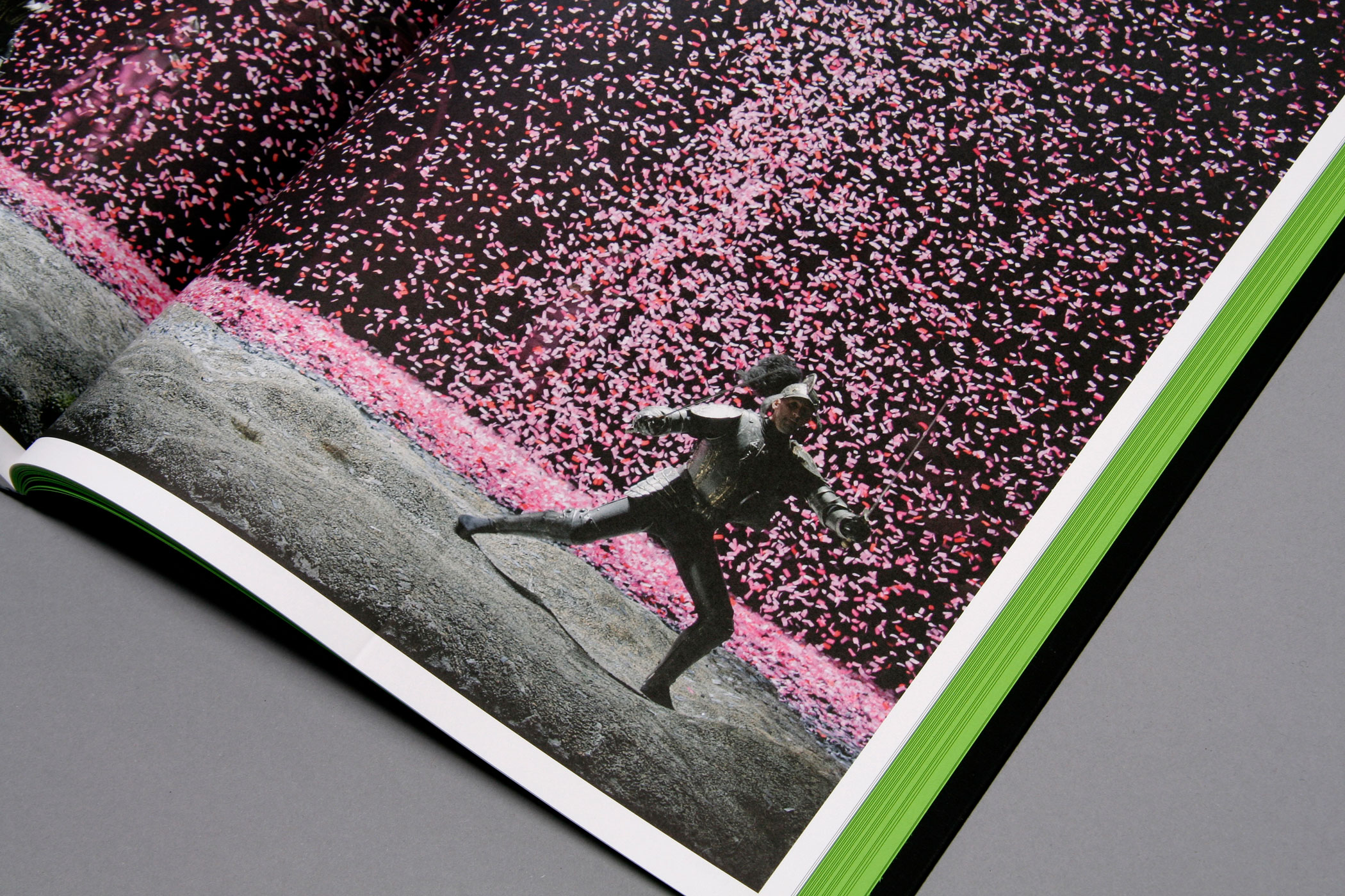
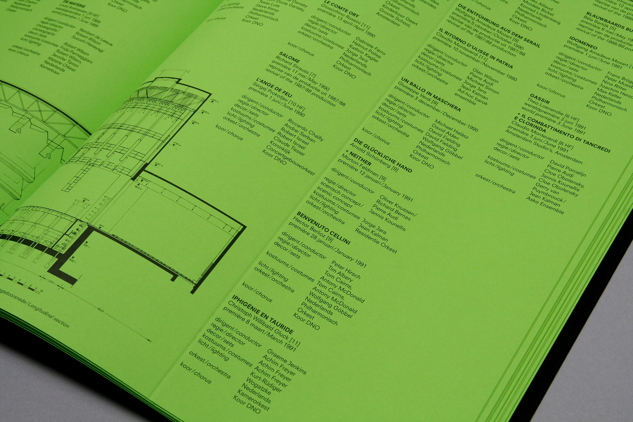
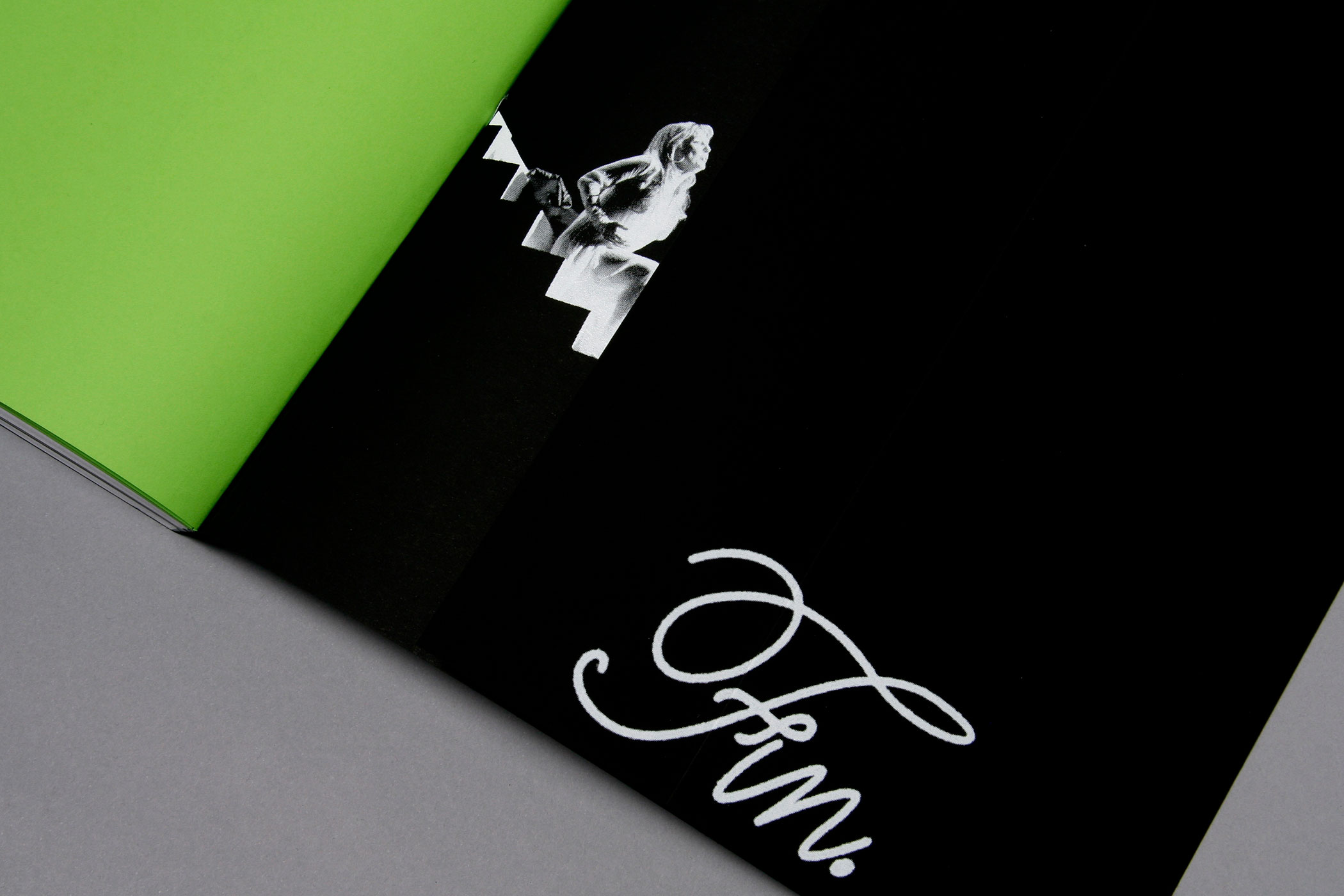
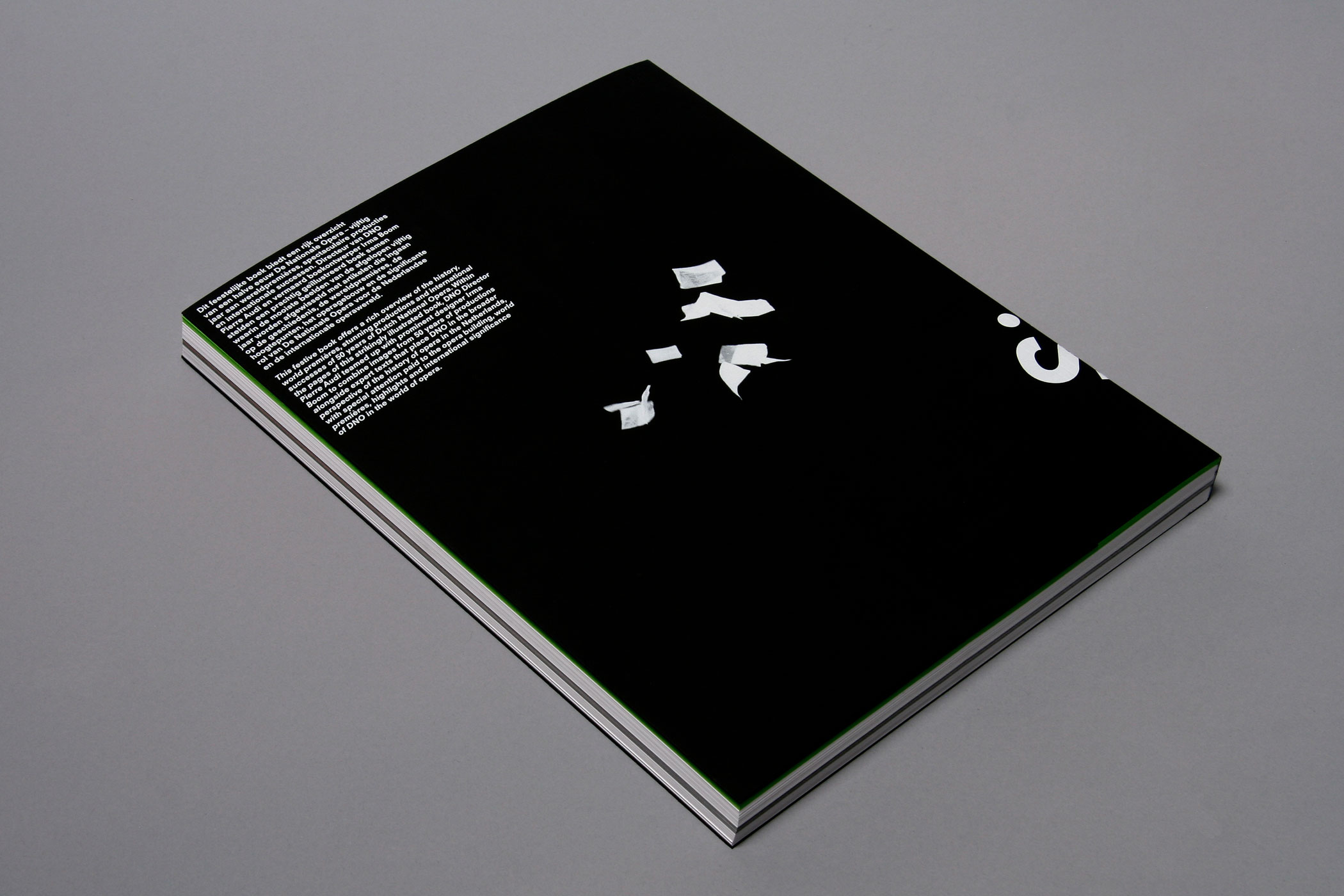
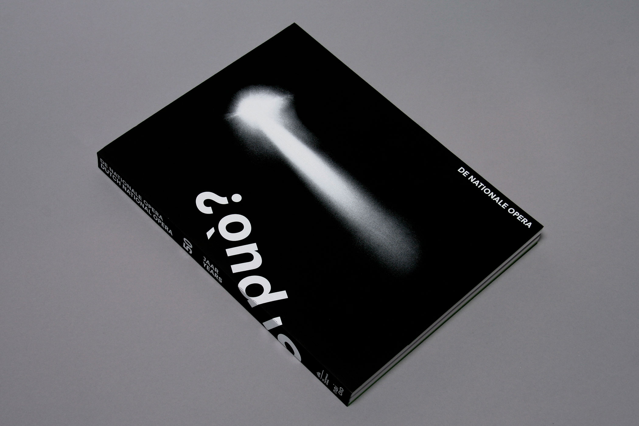
DE NATIONALE OPERA 50 JAAR
--------------------------------------
This book celebrates the 50 year anniversary of the Dutch National Opera. Plentiful images from the archives and essays show a chronological journey of opera productions through the years.
Through the entire book runs an embossed fault line at a set distance, referring to the technical backstage set system distances. Design in collaboration with Irma Boom.
--------------------------------------
Through the entire book runs an embossed fault line at a set distance, referring to the technical backstage set system distances. Design in collaboration with Irma Boom.
--------------------------------------
--------------------------------------
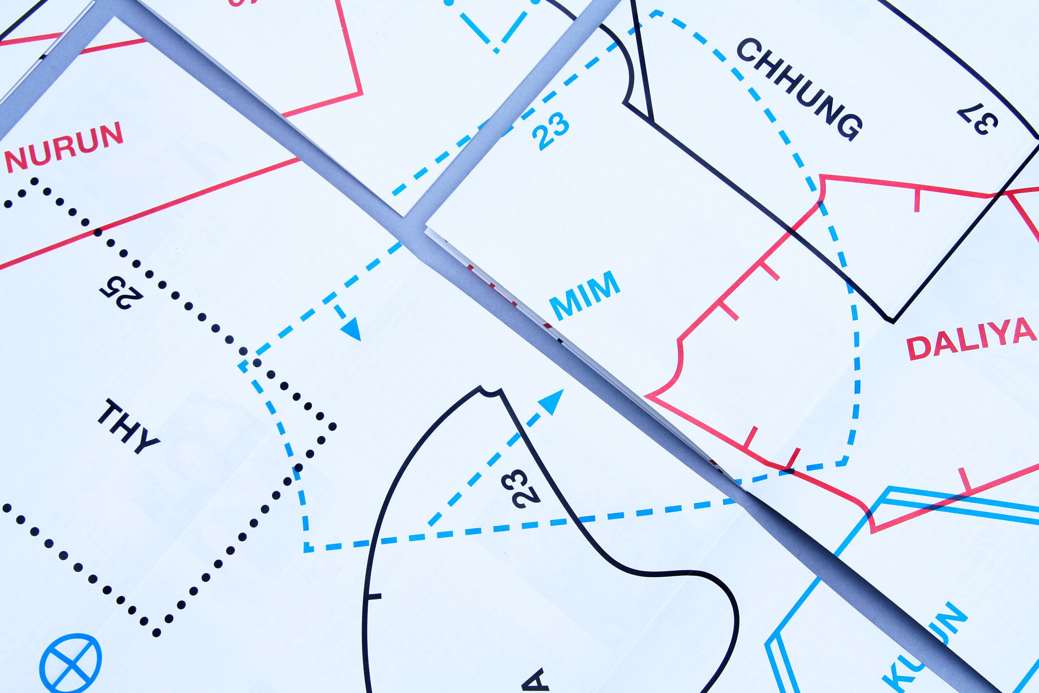
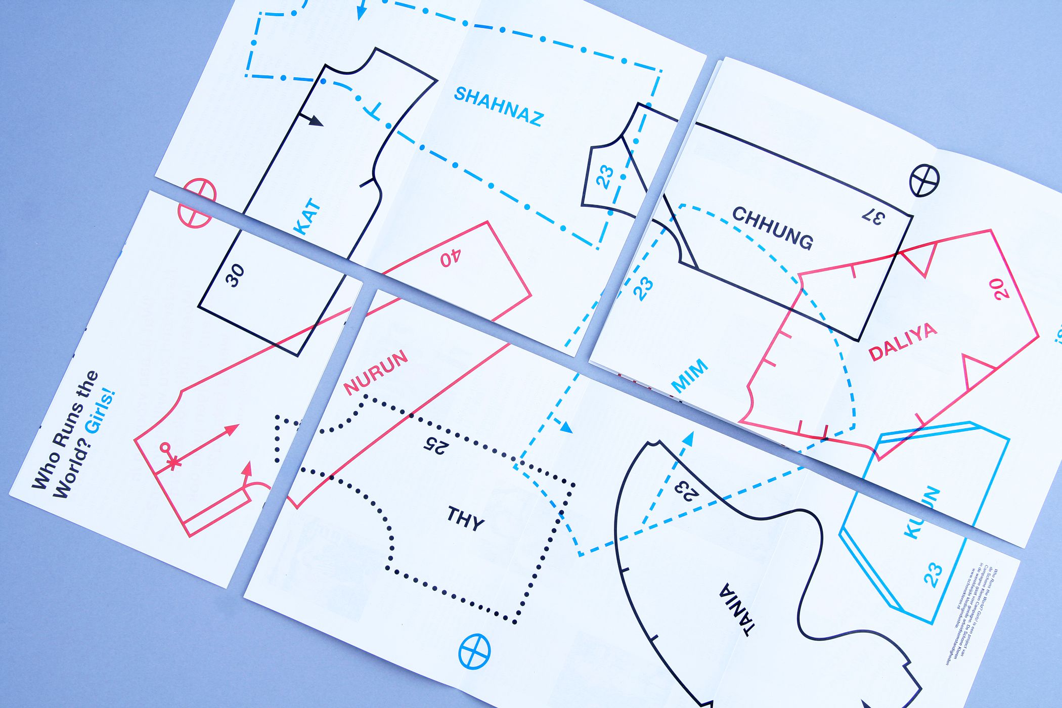
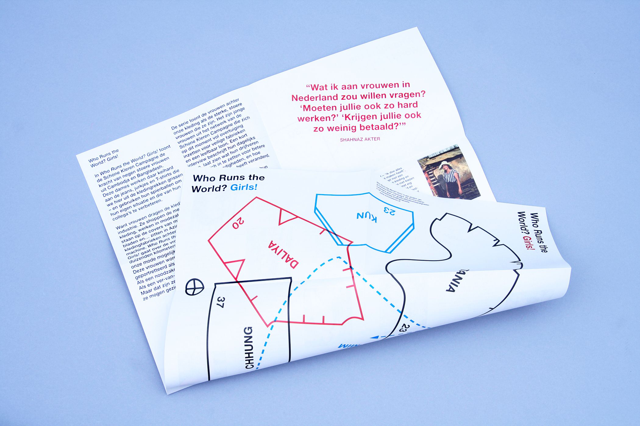
SCHONE KLEREN CAMPAGNE
--------------------------------------
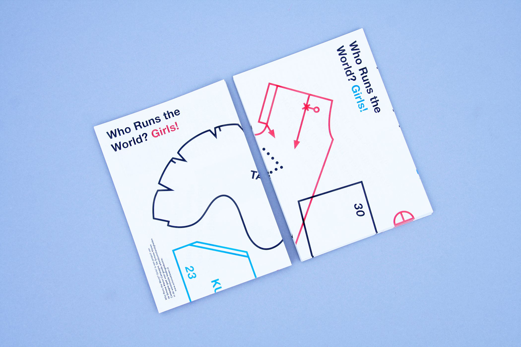
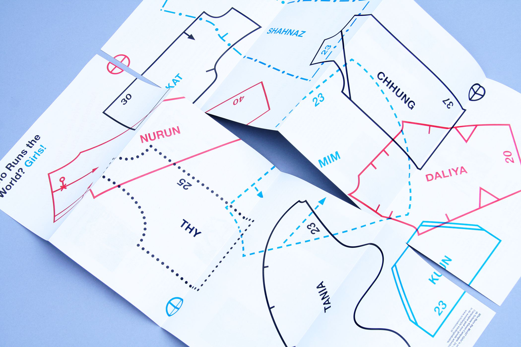
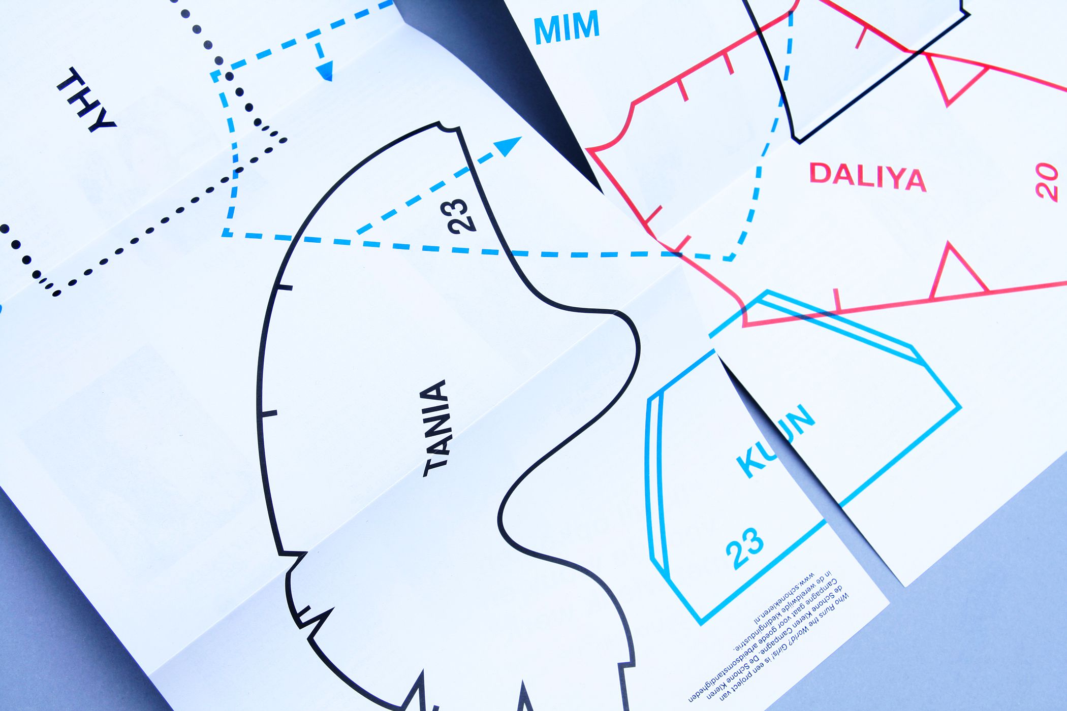
Printed matter and visual identity
for the photo exhibition 'Who Runs
the World? Girls!' for Schone Kleren Campagne (Clean Clothes Campaign).
--------------------------------------
for the photo exhibition 'Who Runs
the World? Girls!' for Schone Kleren Campagne (Clean Clothes Campaign).
--------------------------------------
--------------------------------------
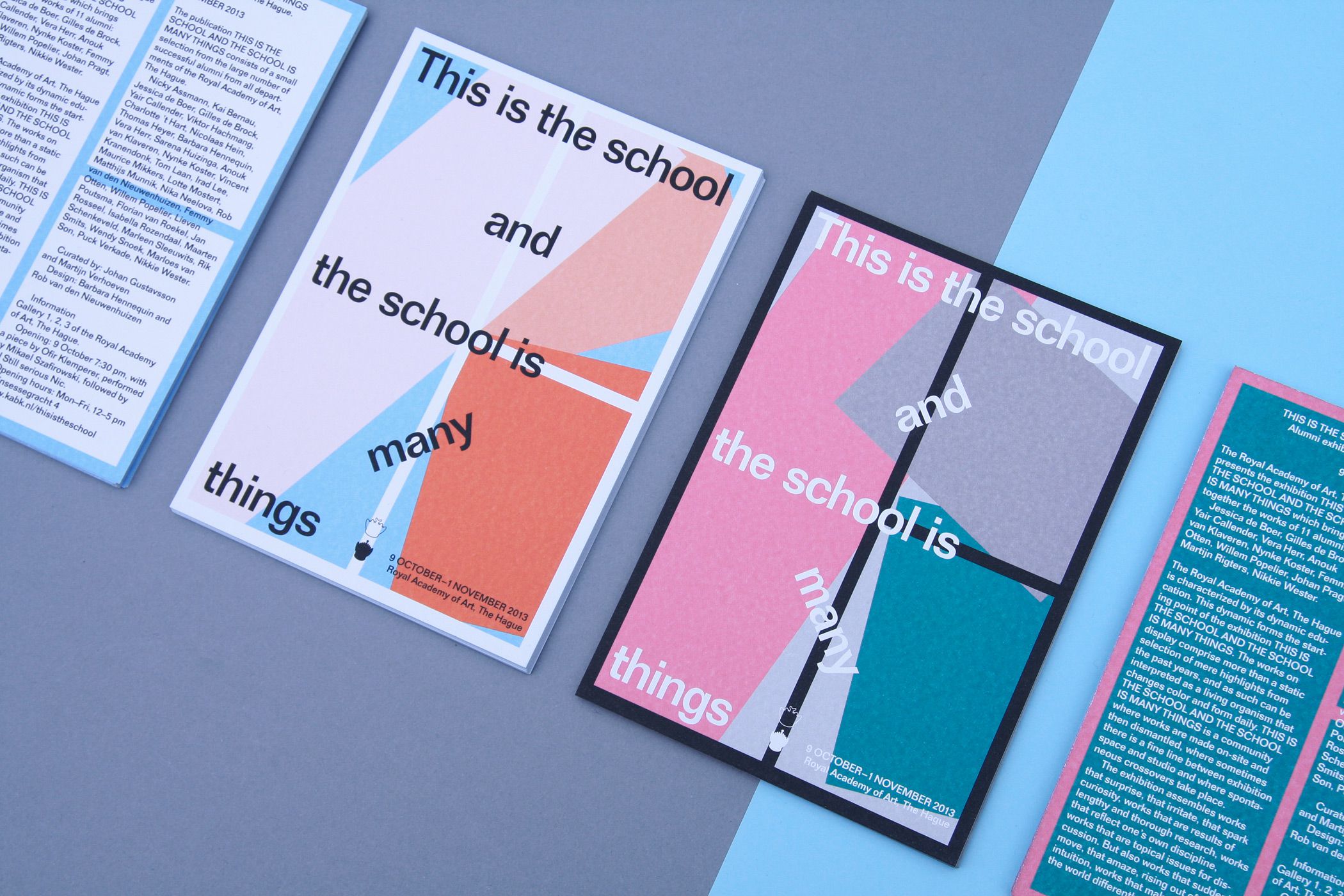
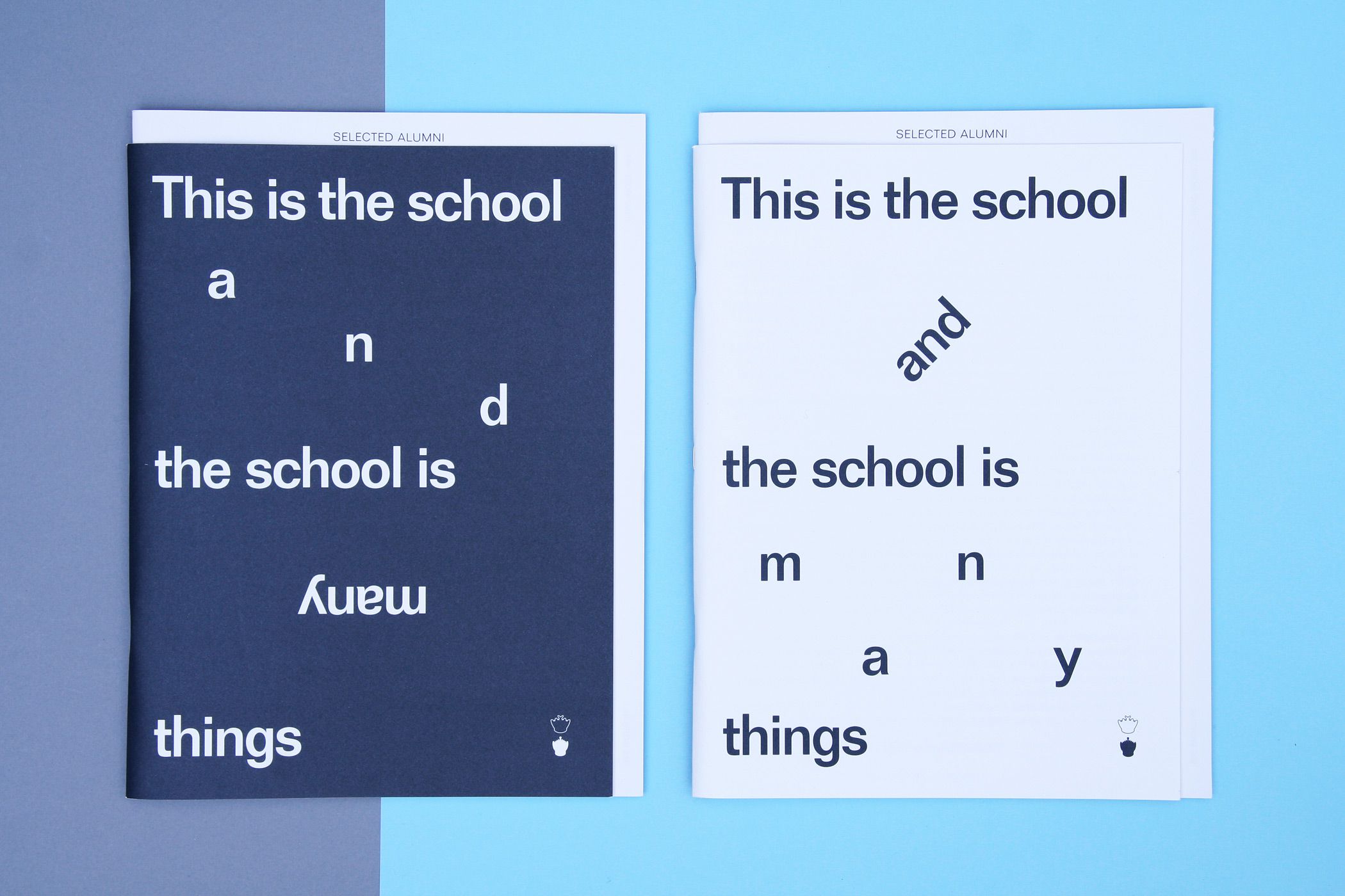
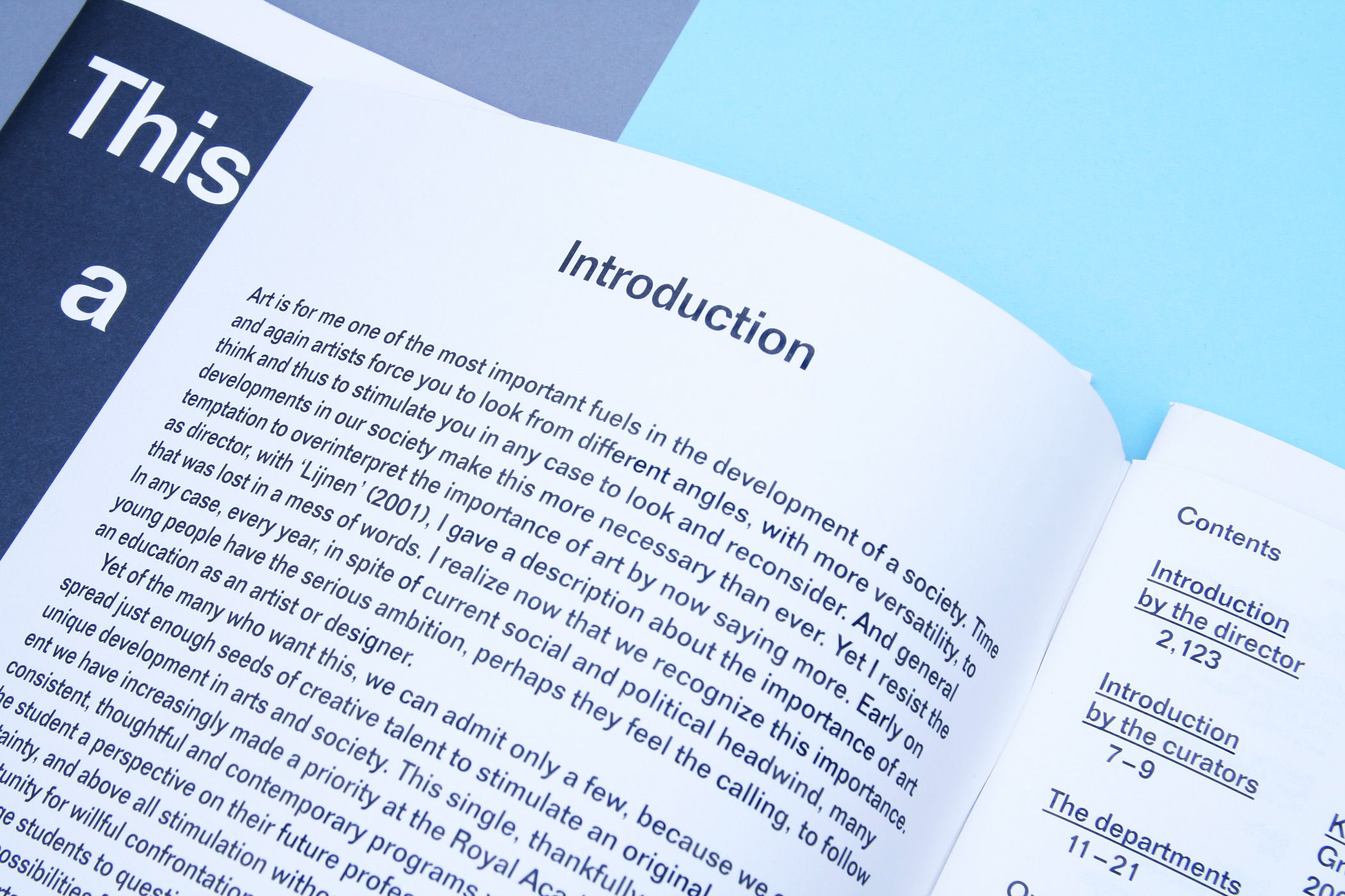
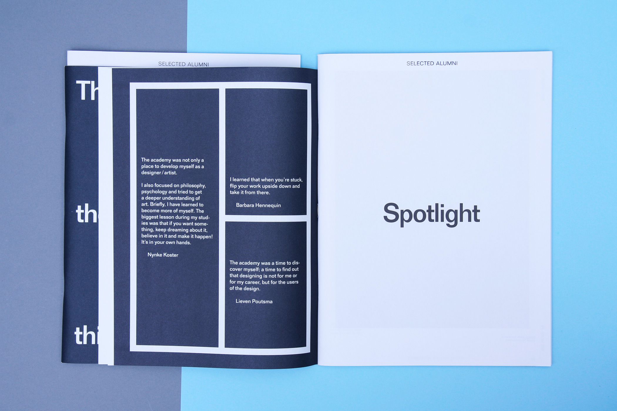
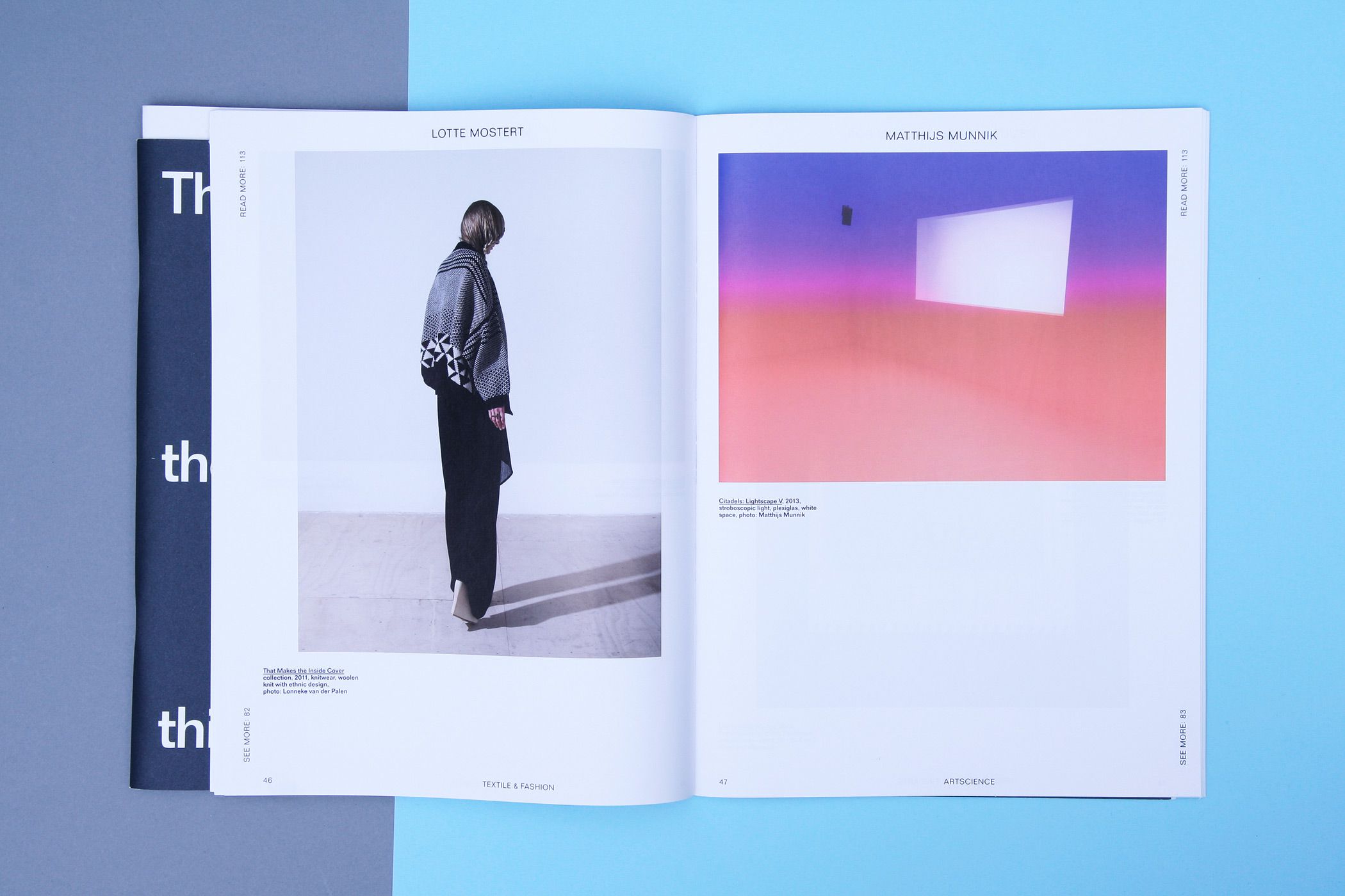
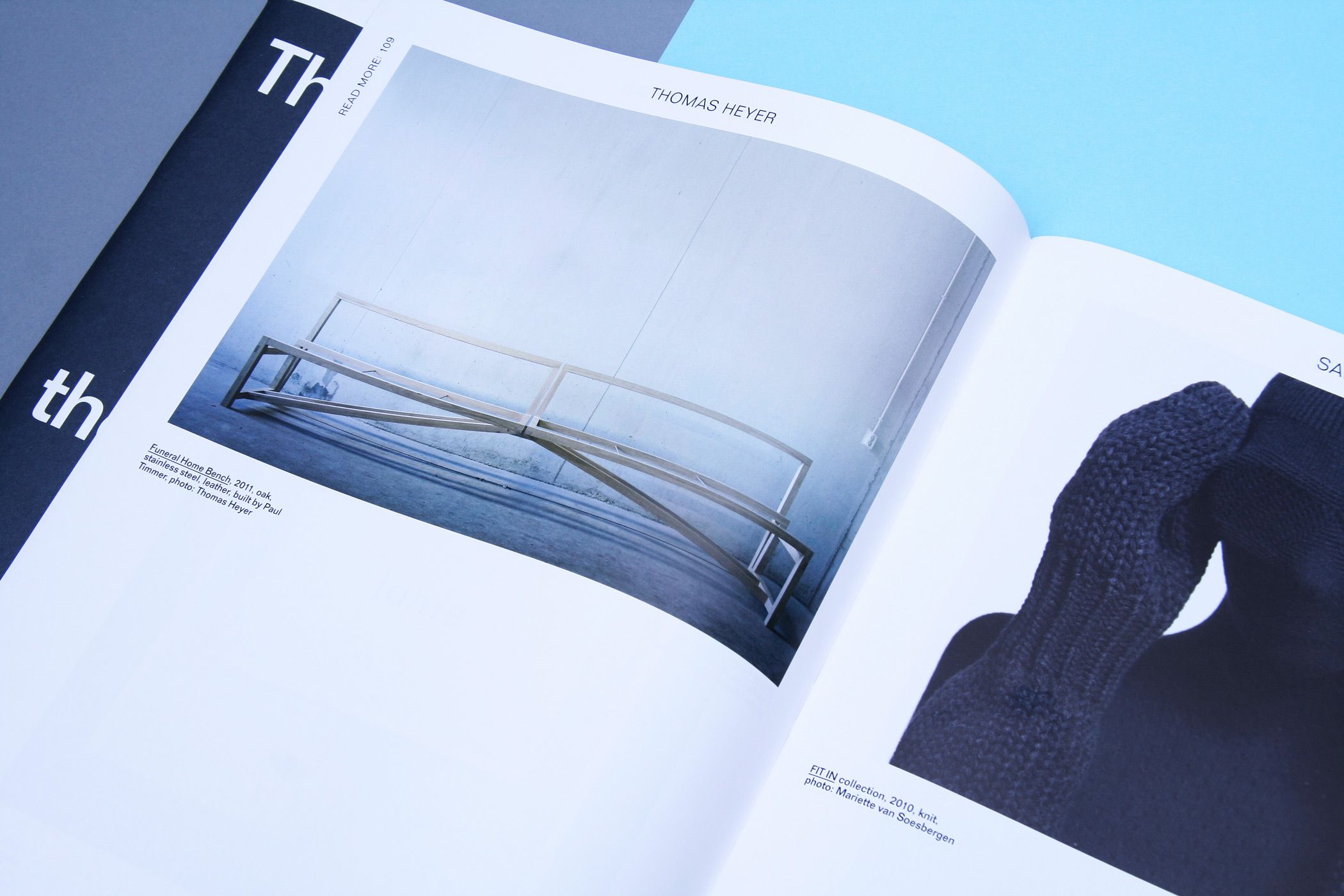
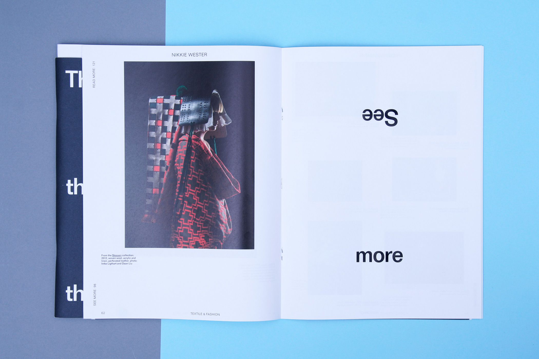
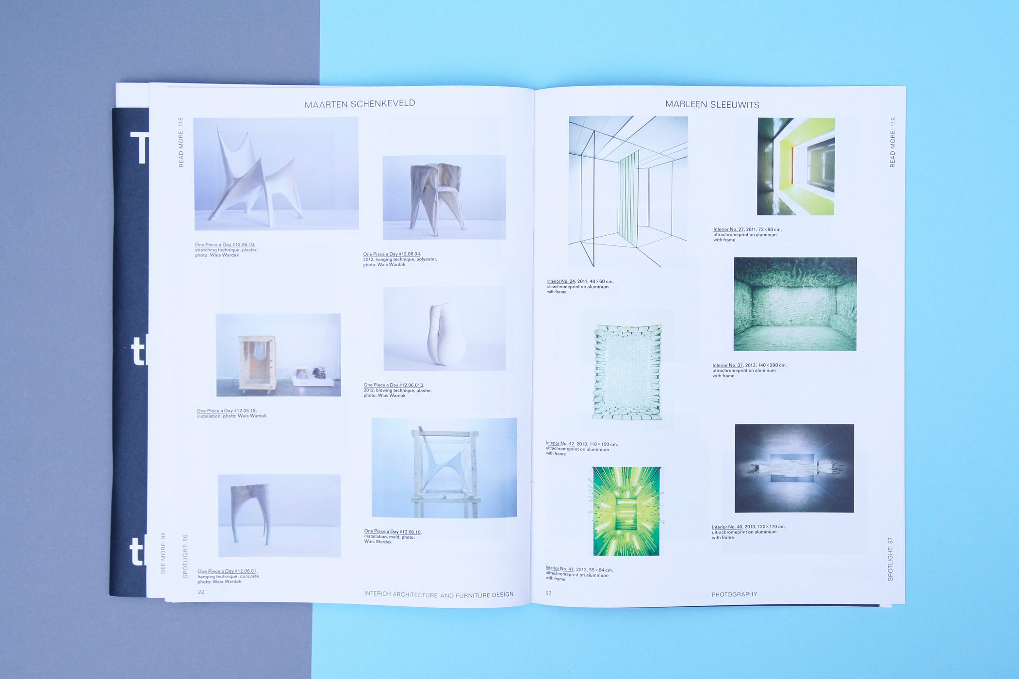
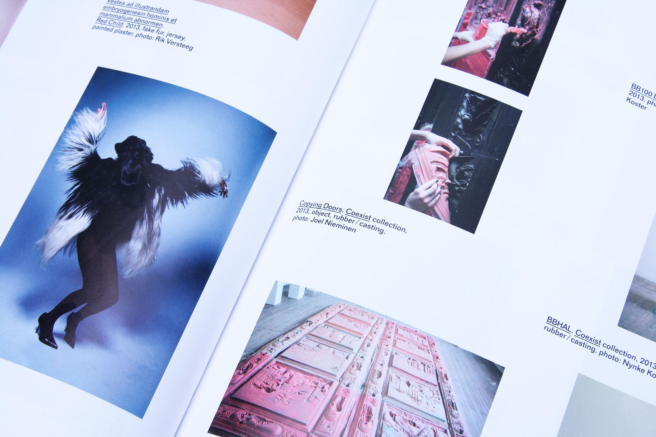
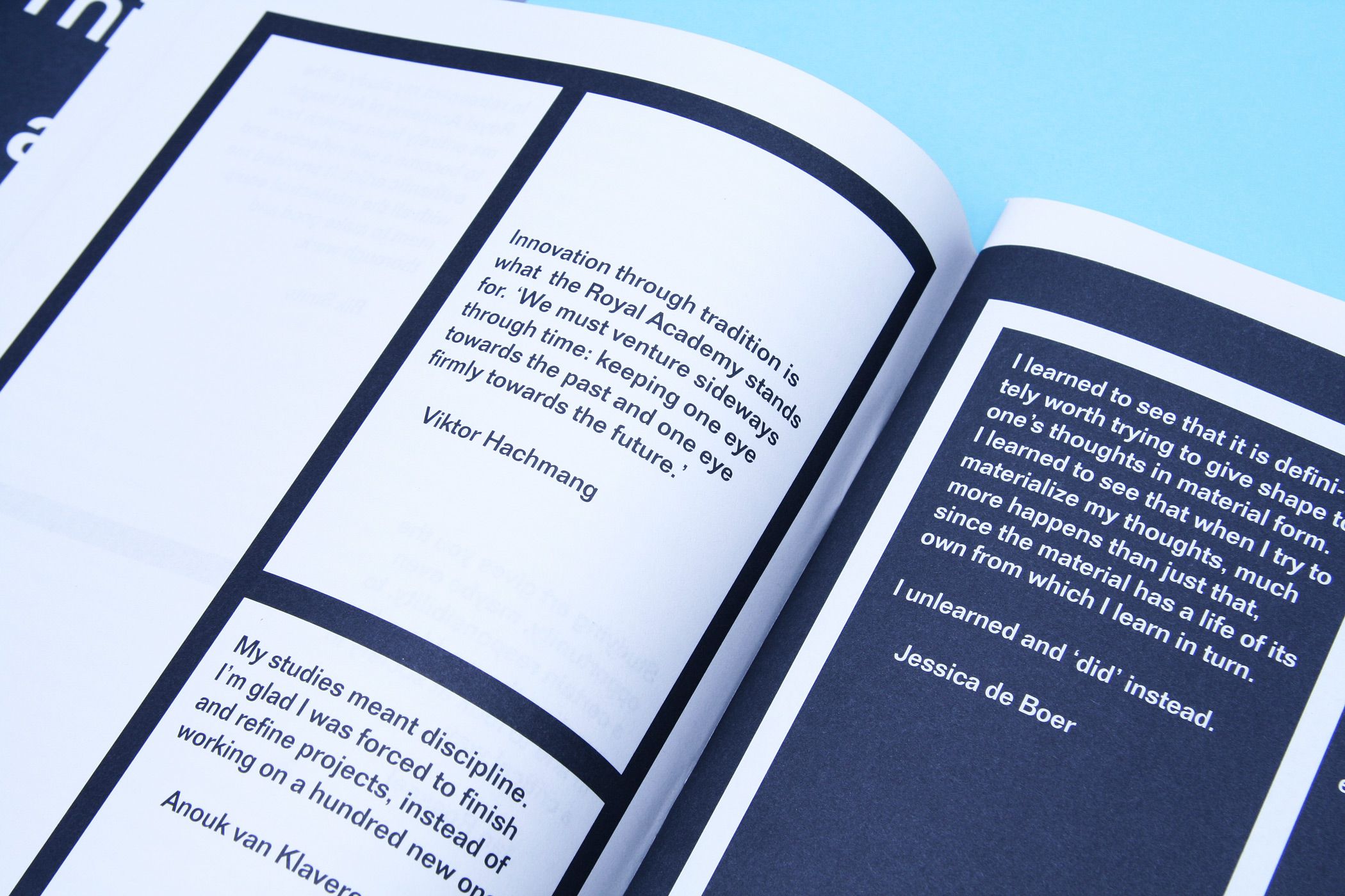
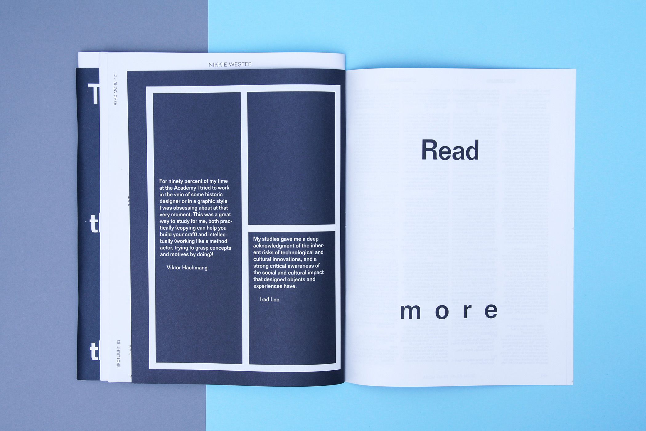
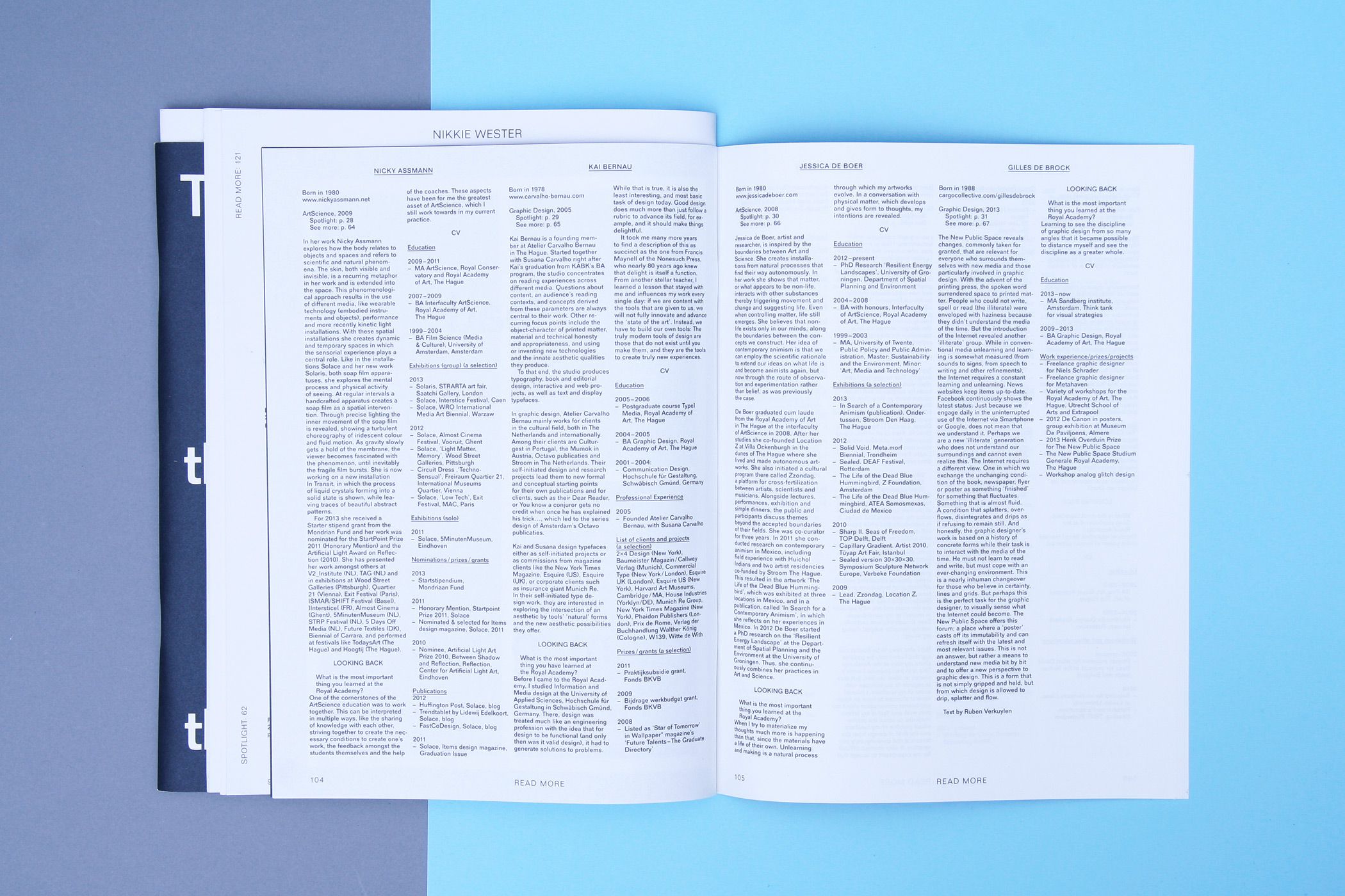
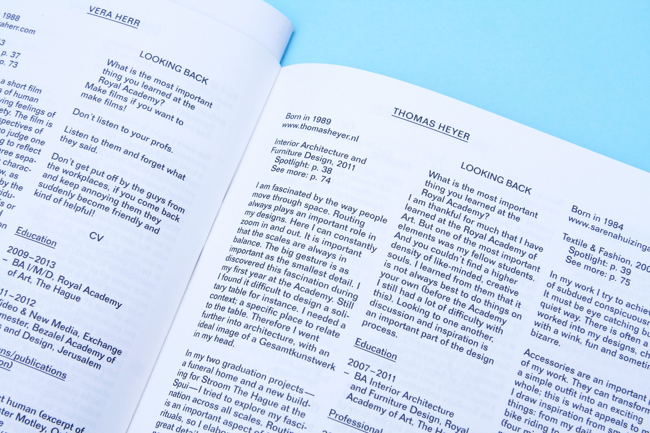
THIS IS THE SCHOOL AND THE SCHOOL IS…
--------------------------------------
Publication and exhibition design for
an alumni exhibition 'This is the
school and the school is many things'
at the Royal Academy of Art (KABK)
in The Hague. The publication is structured in the way you would visit
an exhibition: first you read the introductory text, then you browse through the exhibition for the works that speak to you (Spotlight), then
you look at more work from those
artists (See More), and if hungry for more information you -> (Read More). Design in collaboration with Rob van
den Nieuwenhuizen.
--------------------------------------
--------------------------------------
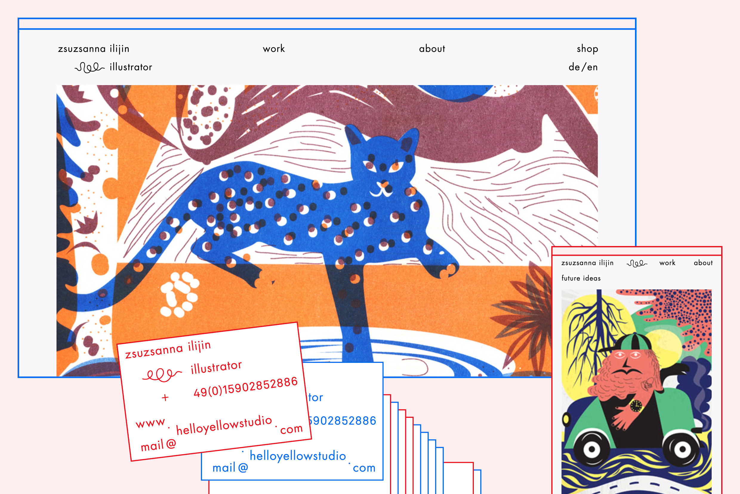
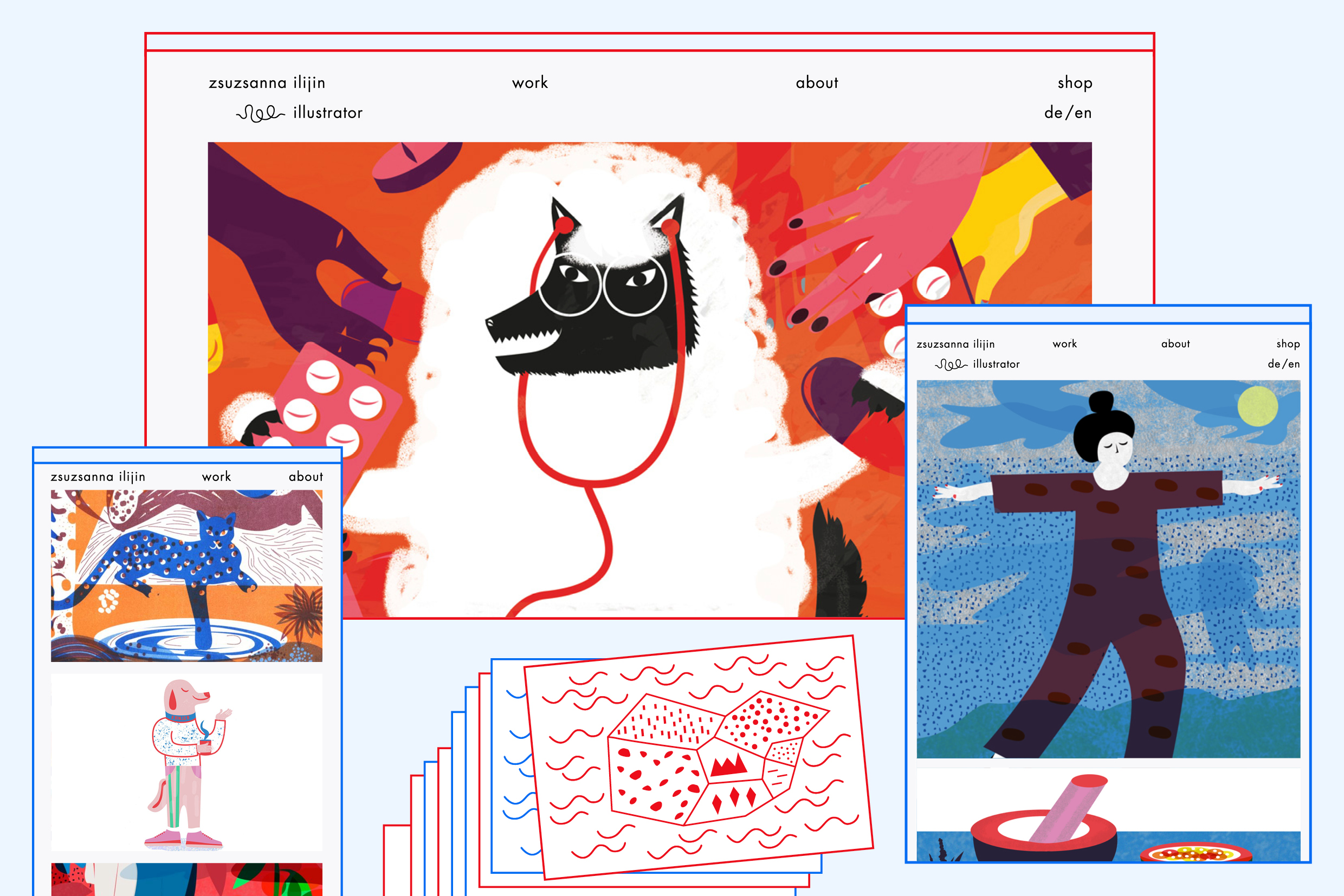
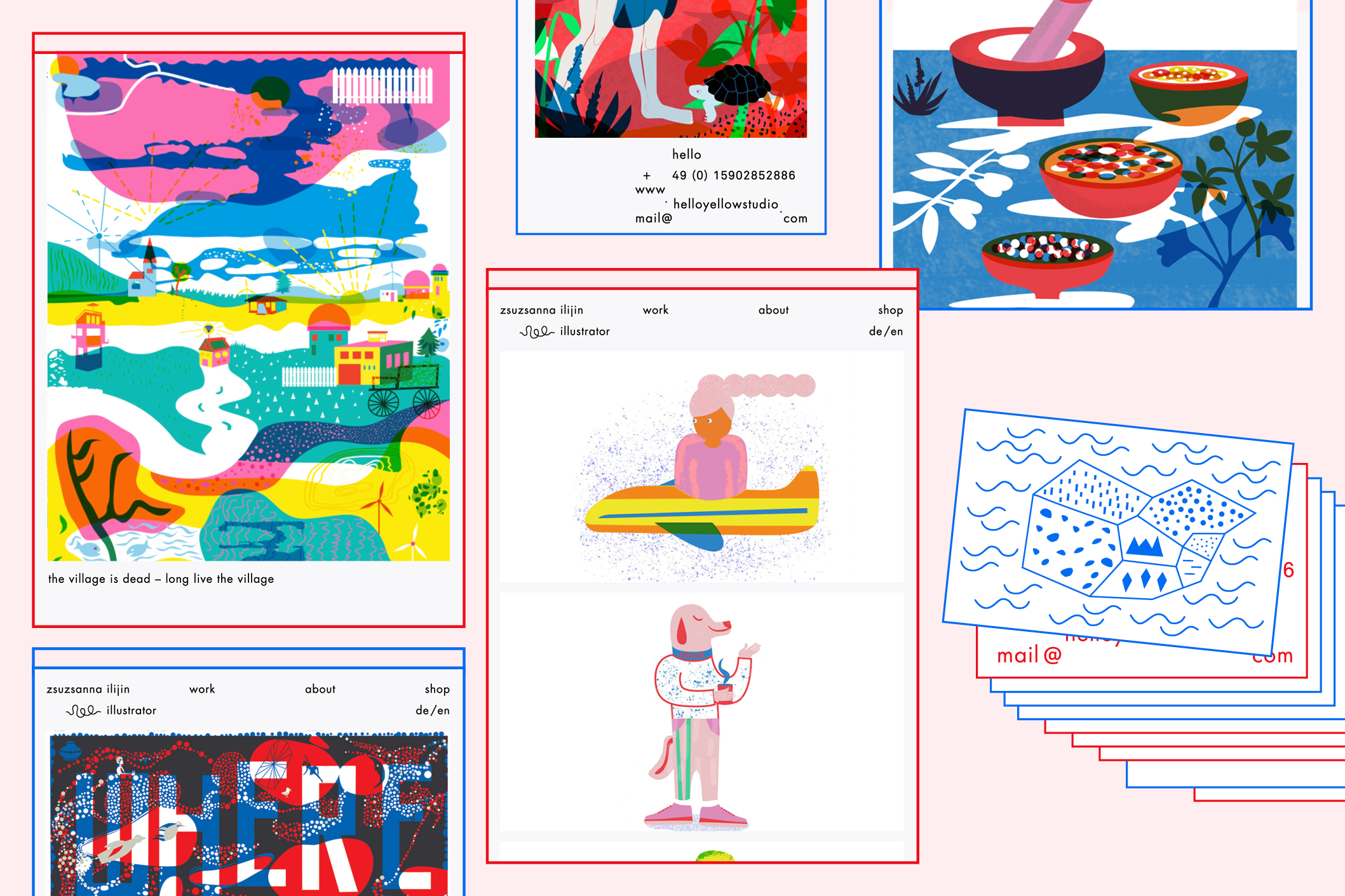
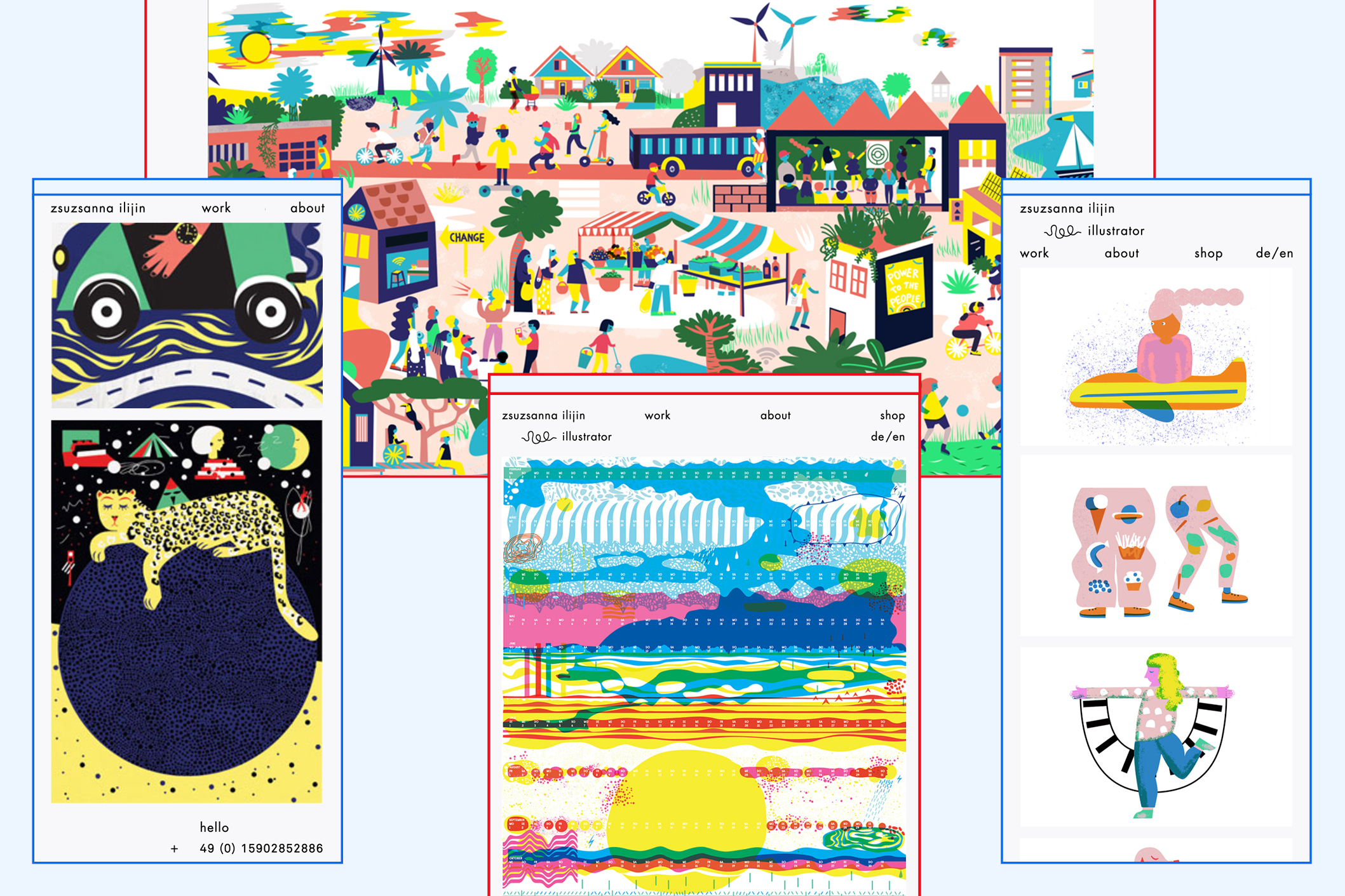
ZSUZSANNA ILIJIN
--------------------------------------
Visual identity for illustrator Zsuzsanna Ilijin.
--------------------------------------
--------------------------------------
--------------------------------------
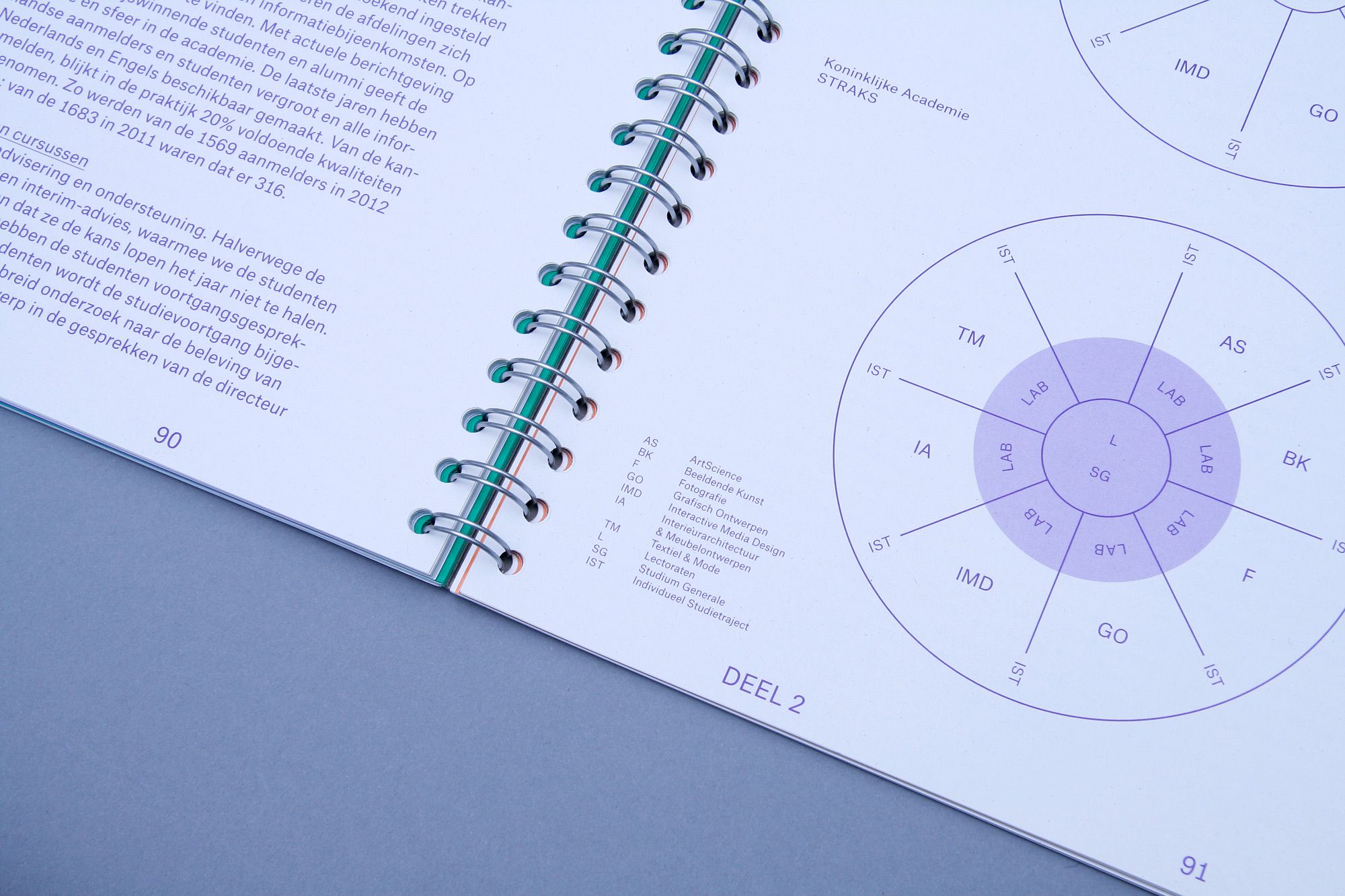
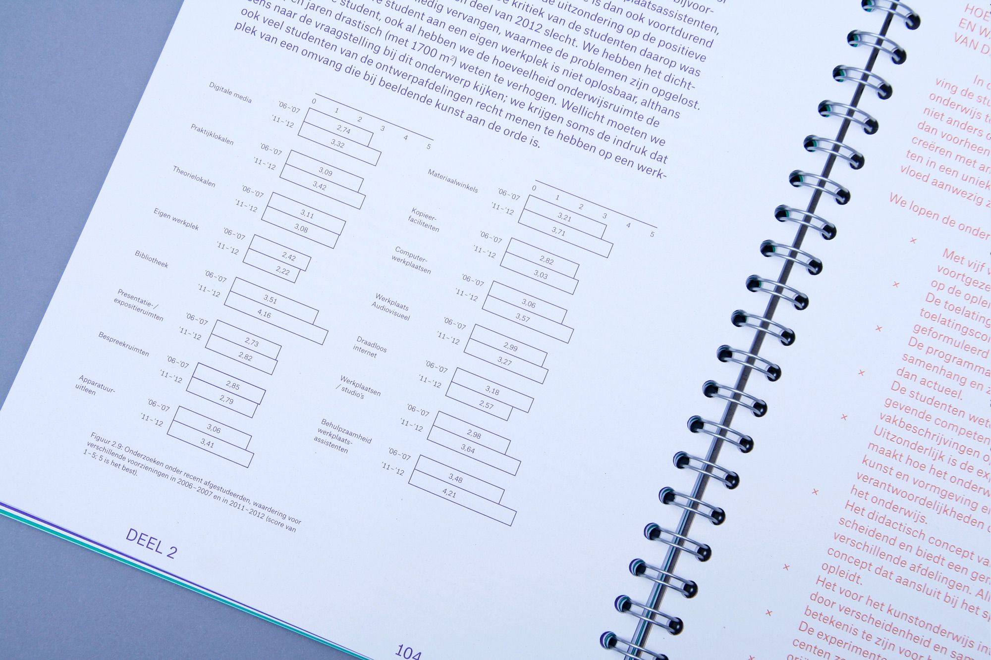
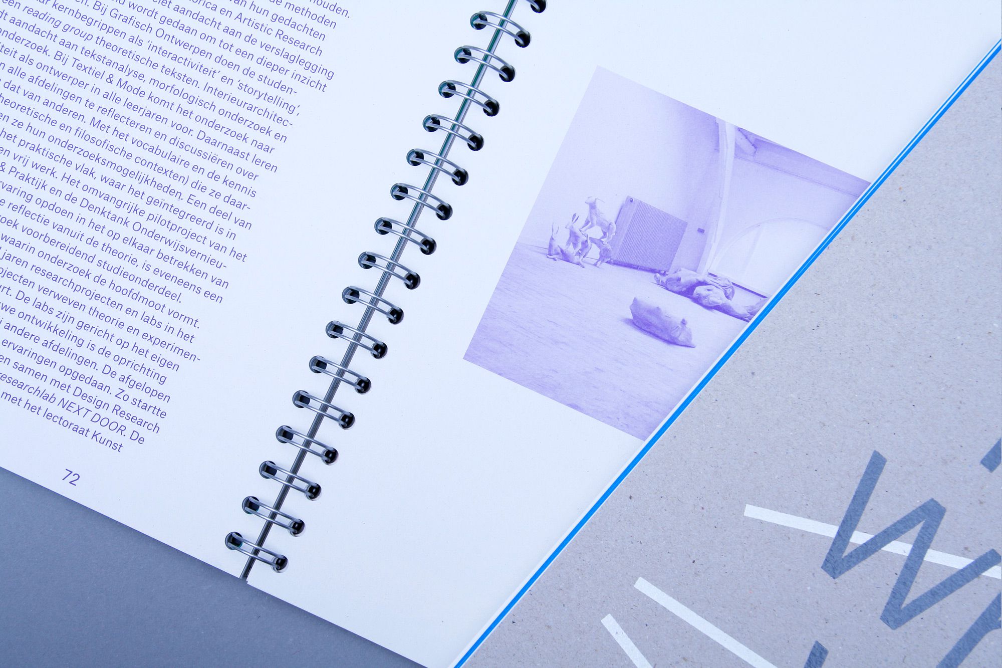
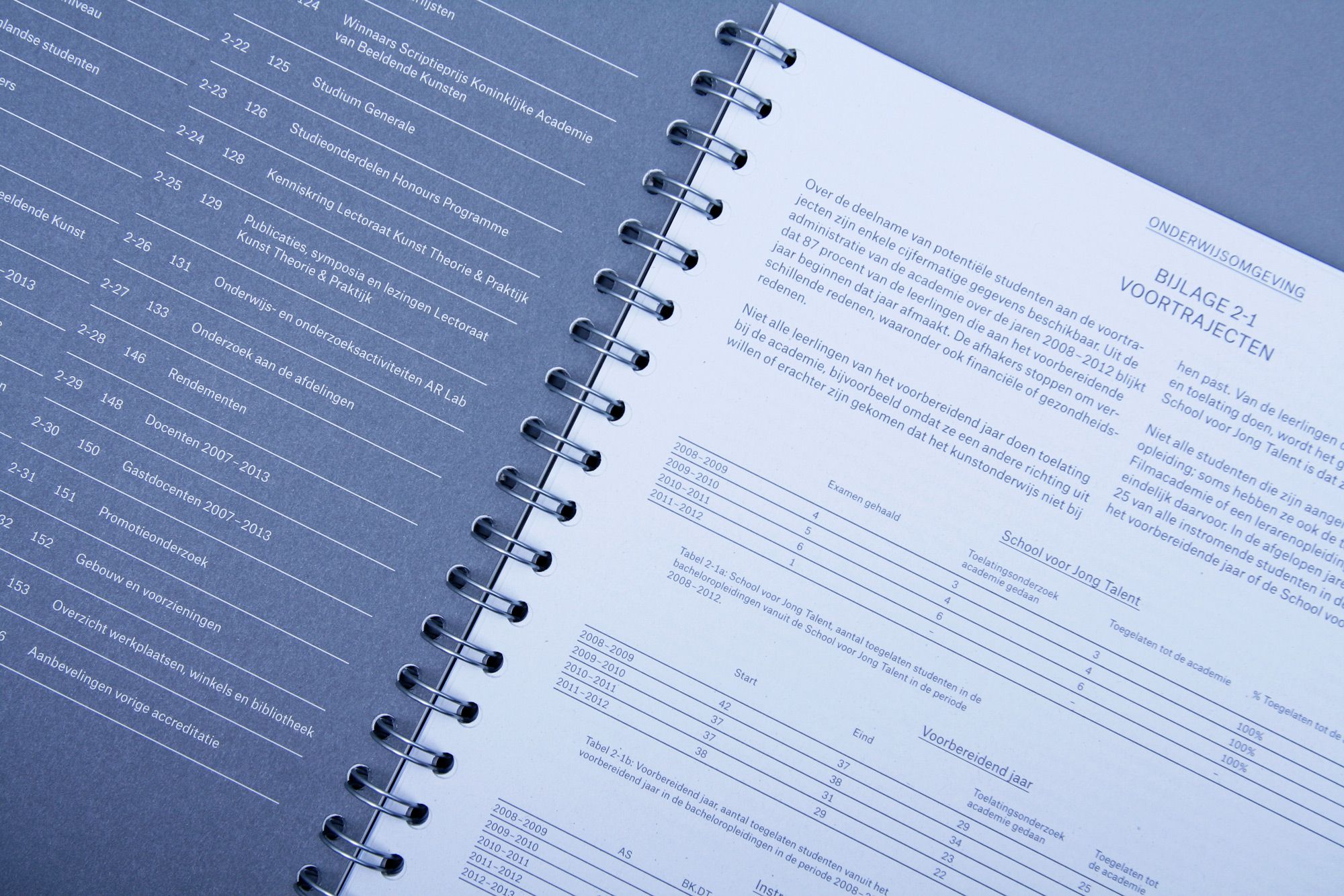
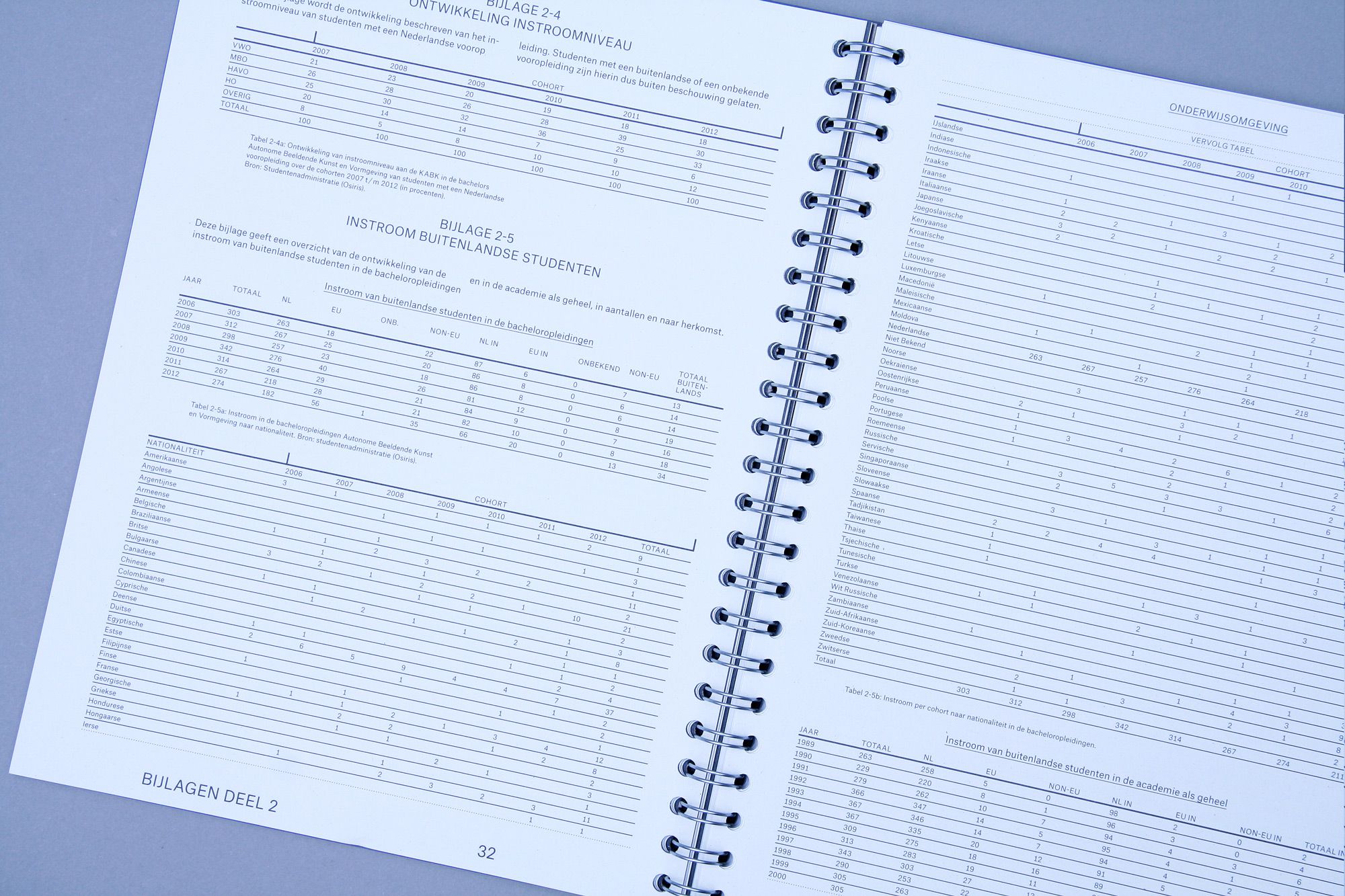
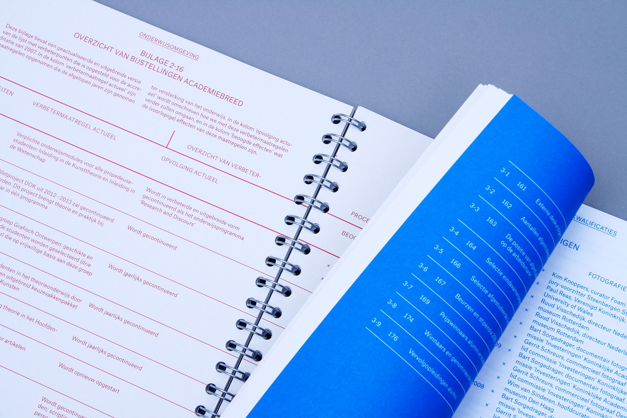
THIS IS WHAT WE ARE…
--------------------------------------
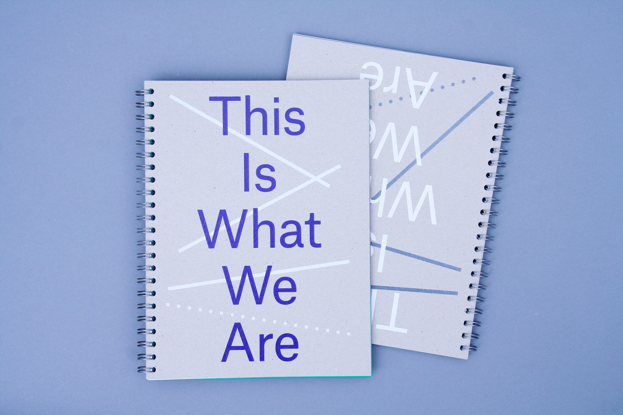
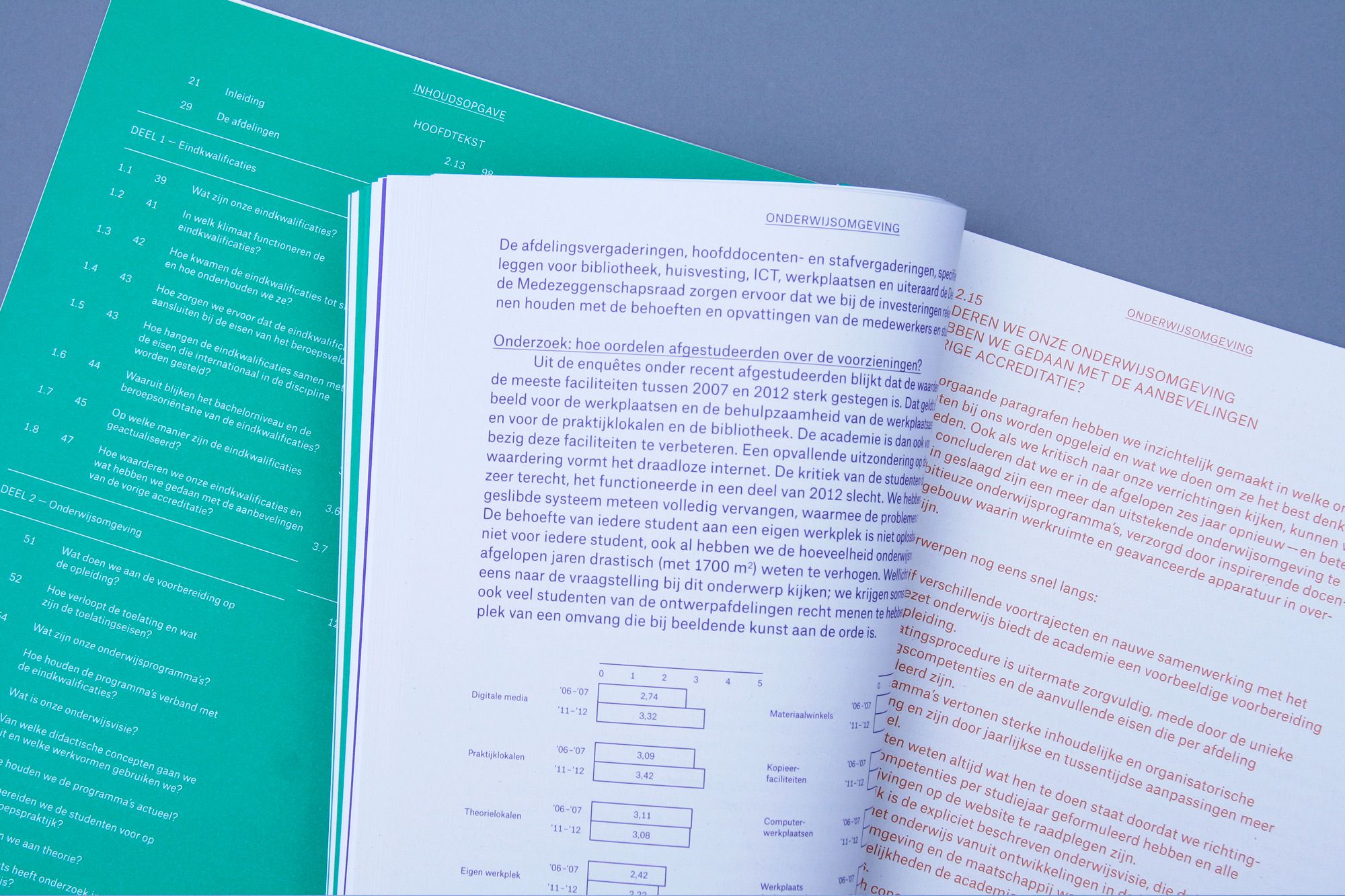
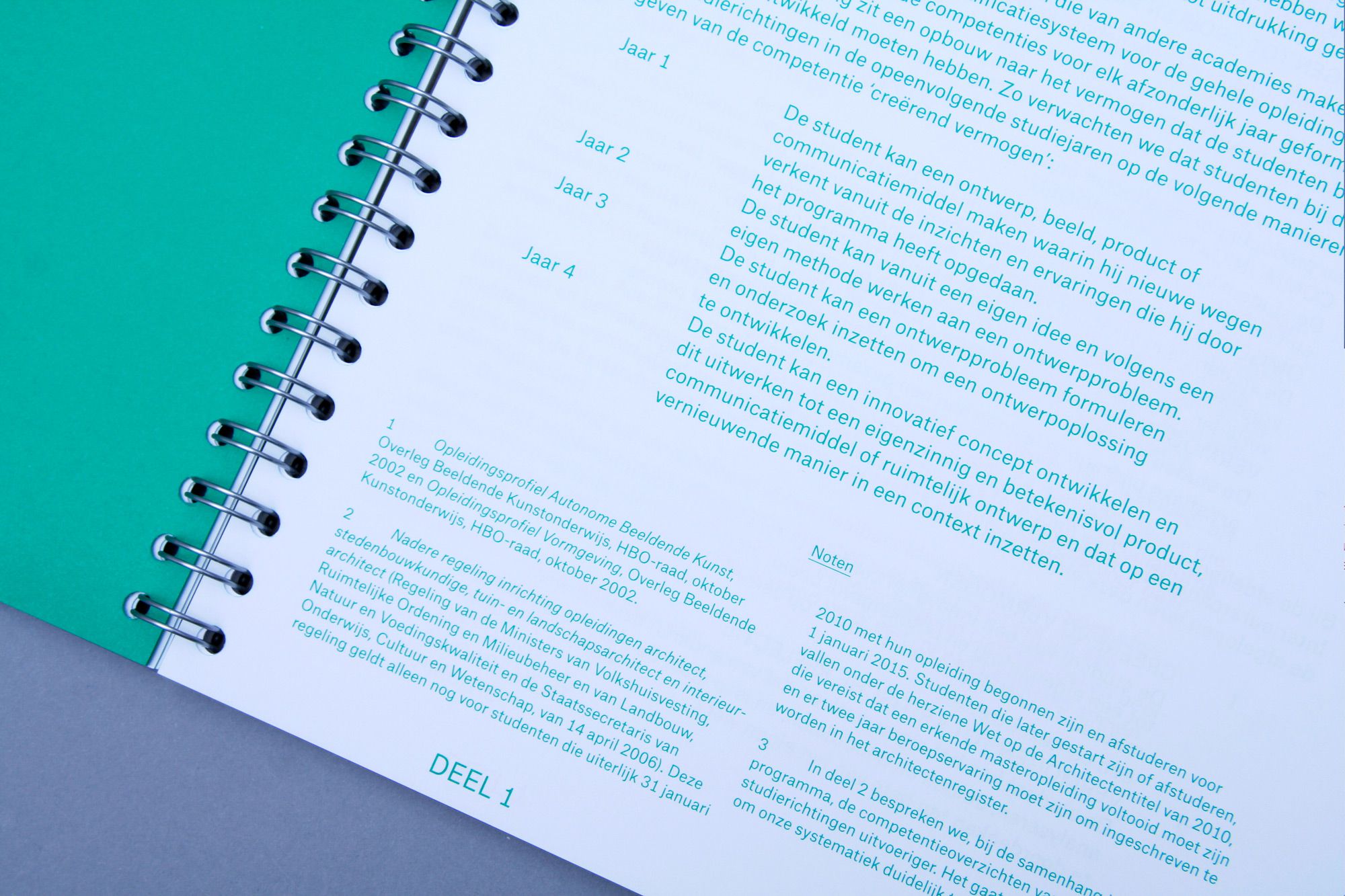
Design of the Accreditation report
'This Is What We Are / Is This What
We Are' for the Royal Academy of Art (KABK) in The Hague. Consisting of
two books, the design of the report reflects the creative process of a designer or artist: a non-lineair
and experimental way of working that organically shifts back and forth.
This contrasts the report, which has
a solid structure from the index at
the start of the book to the colophon
at the end. Design in collaboration
with Rob van den Nieuwenhuizen.
--------------------------------------
--------------------------------------
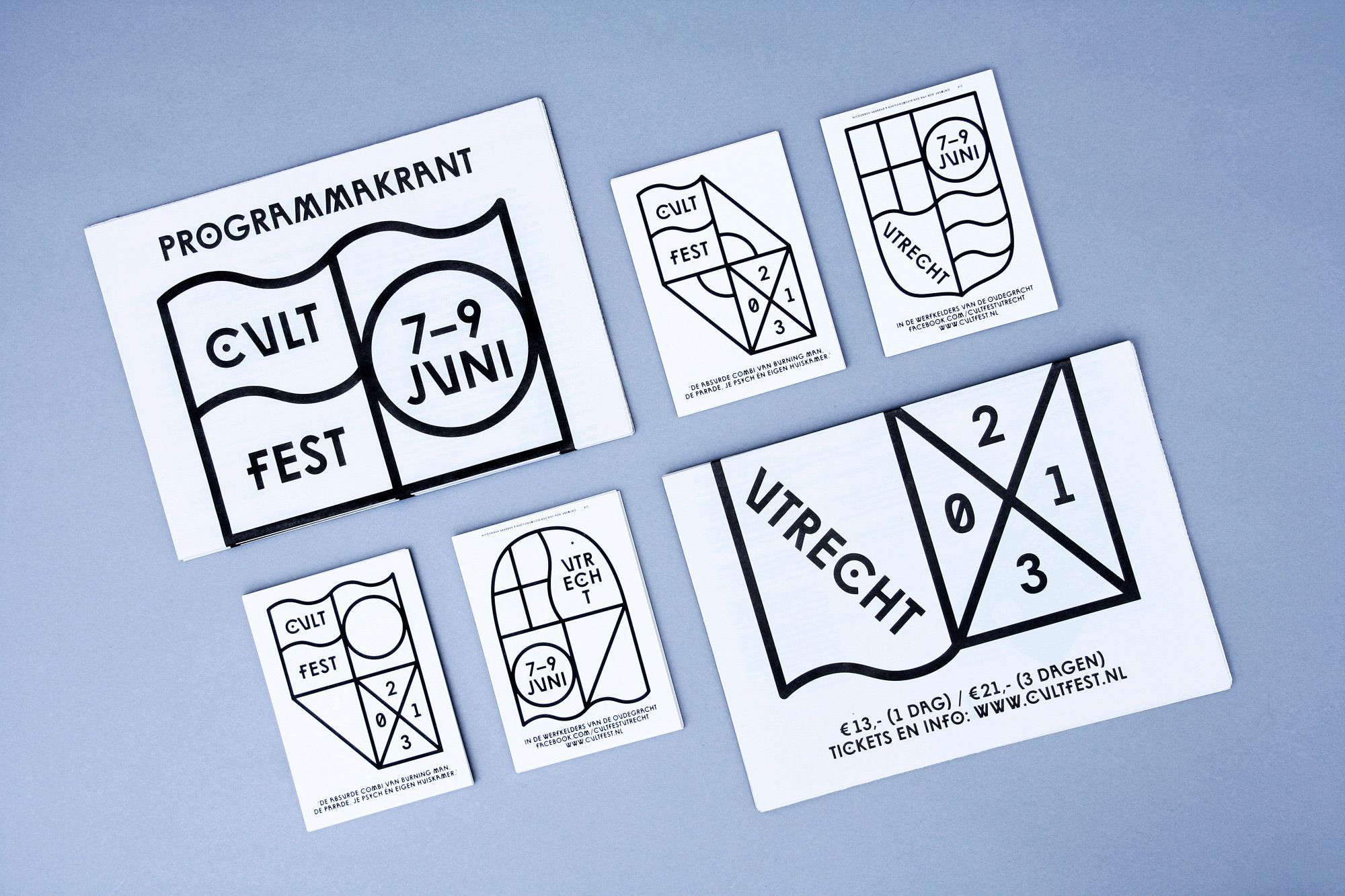
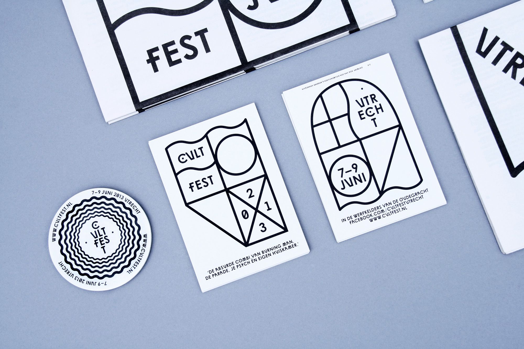
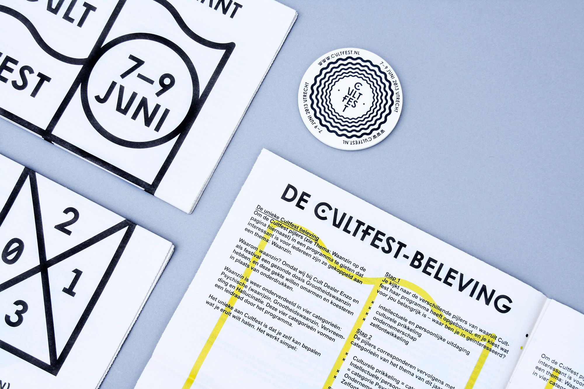
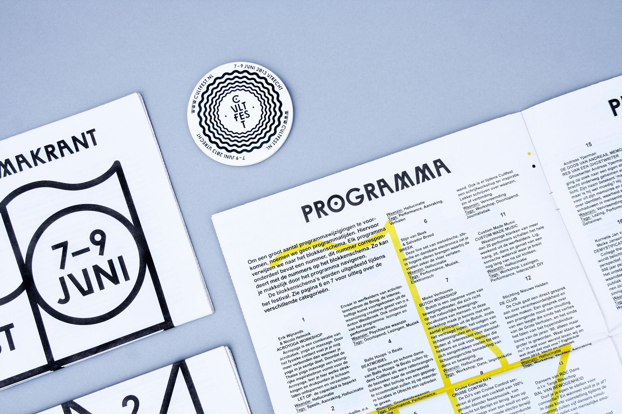
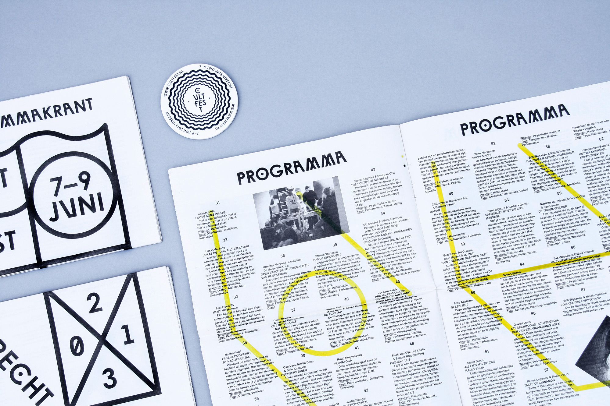
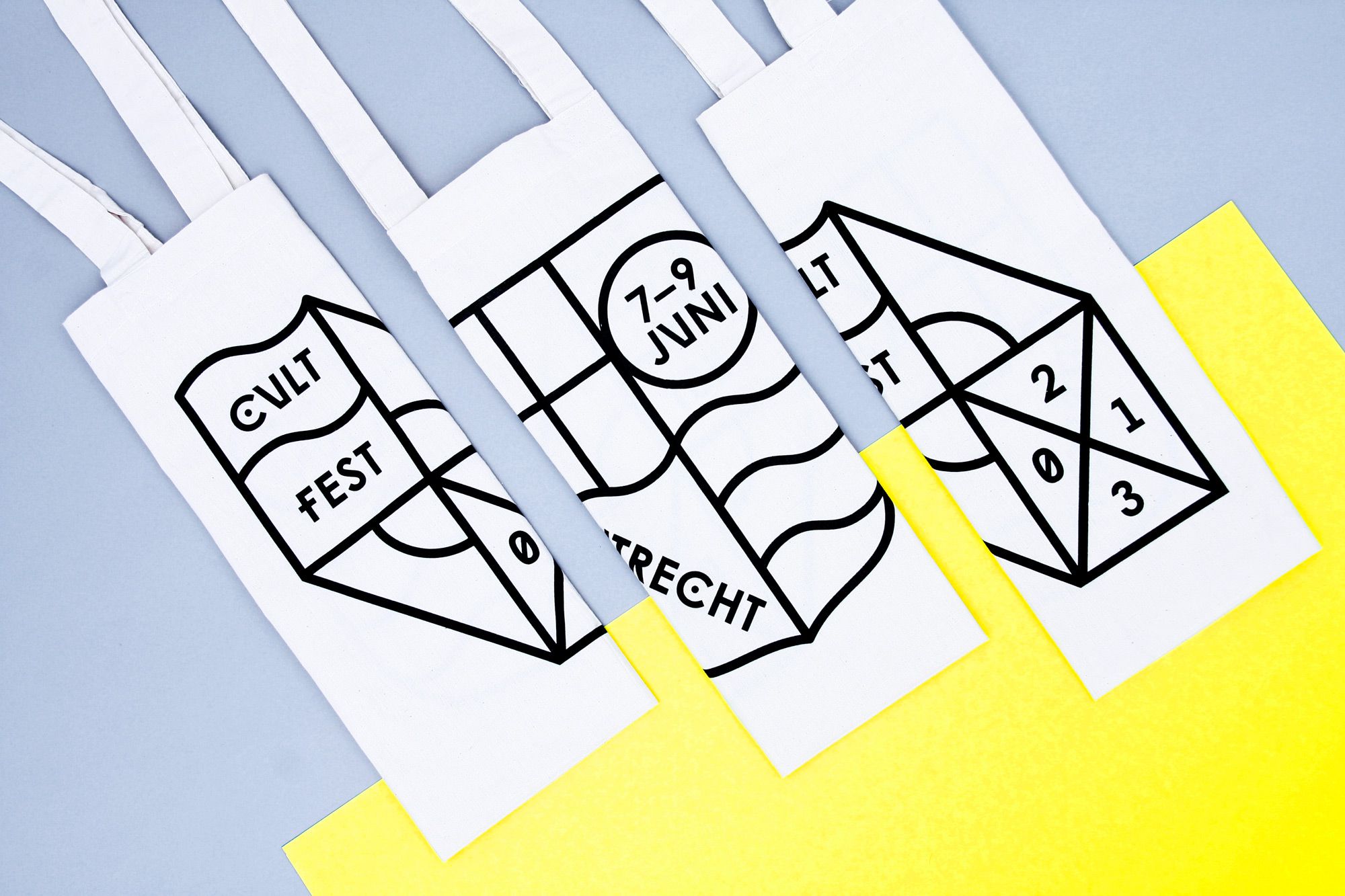
CULTFEST
--------------------------------------
Identity design for Cultfest, an underground cultural festival held
in the cellars and wharfs along the Oudegracht canal that runs through the center of Utrecht. The locations and surroundings shape the festival and
were therefor the inspiration for the identity: shapes of cellar entrances, municipal shields and the water that is ever present. Design in collaboration with Rob van den Nieuwenhuizen.
--------------------------------------
--------------------------------------
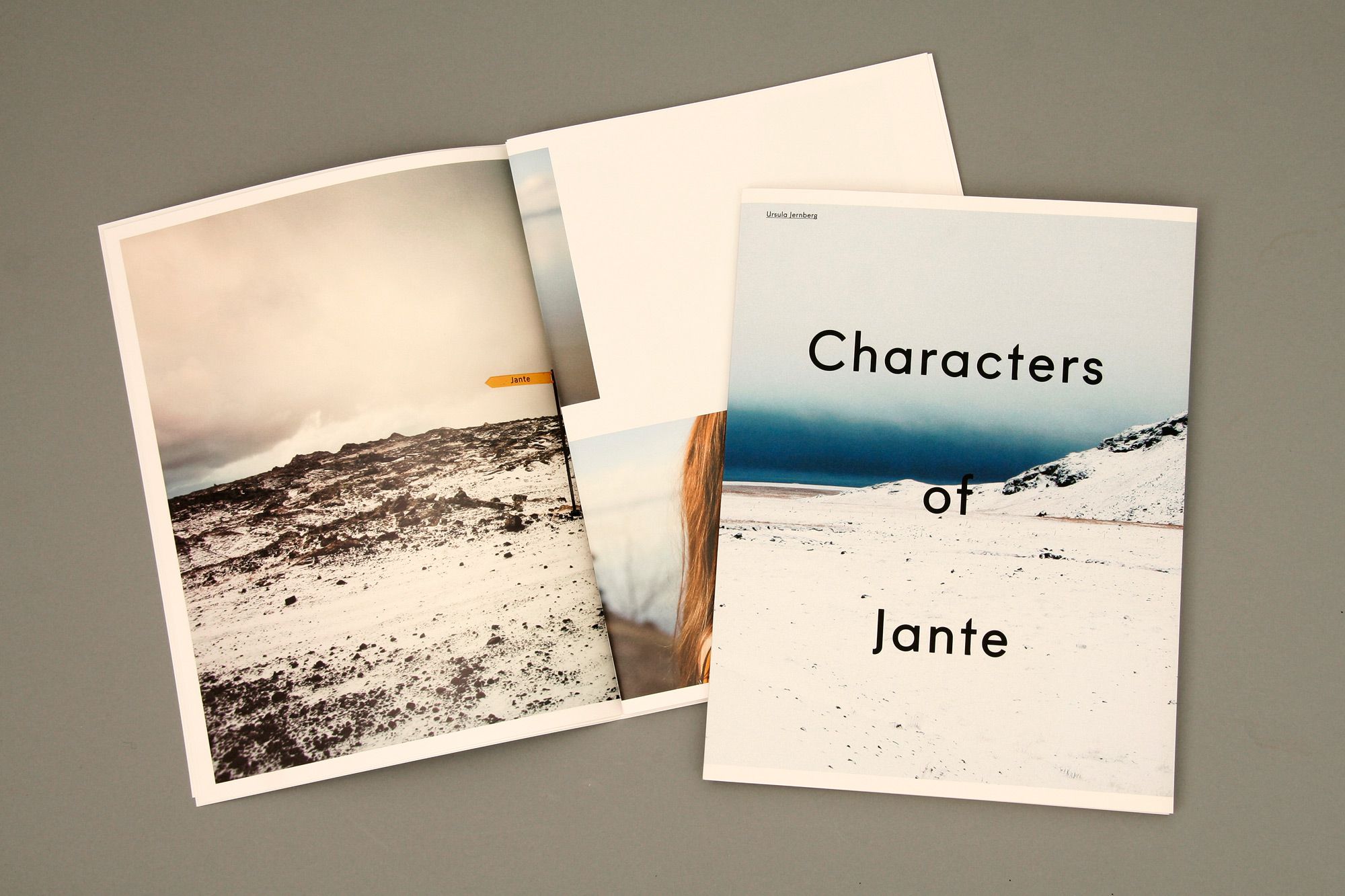
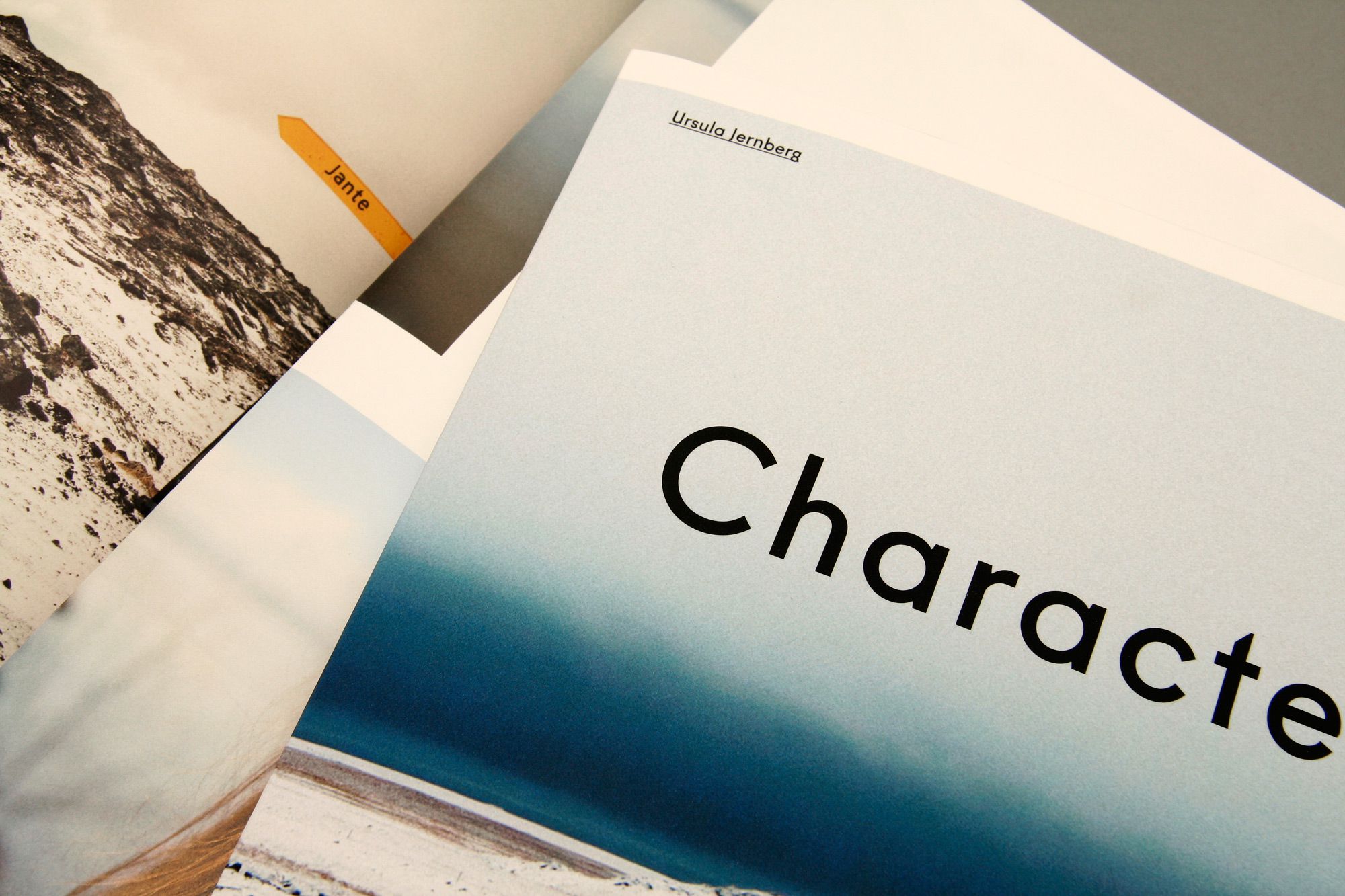
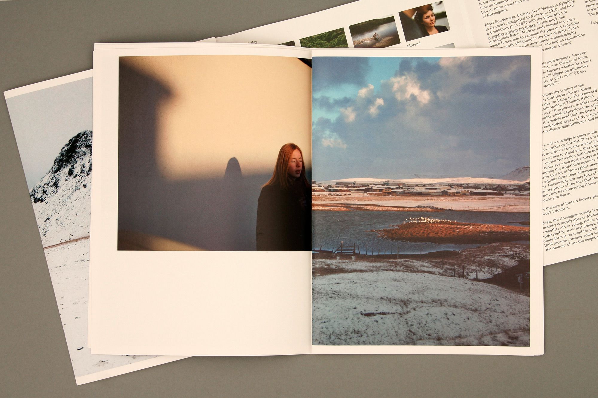
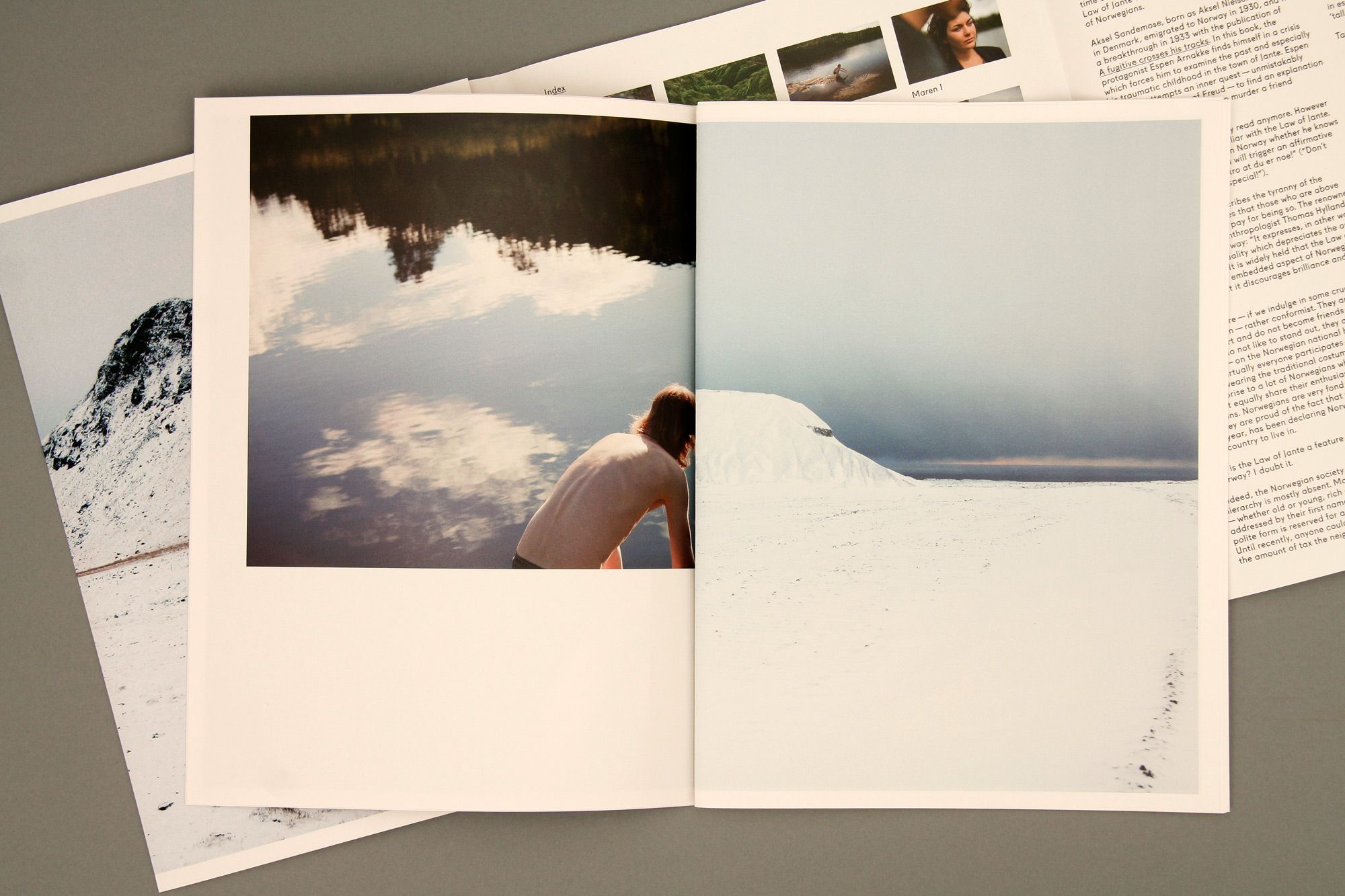
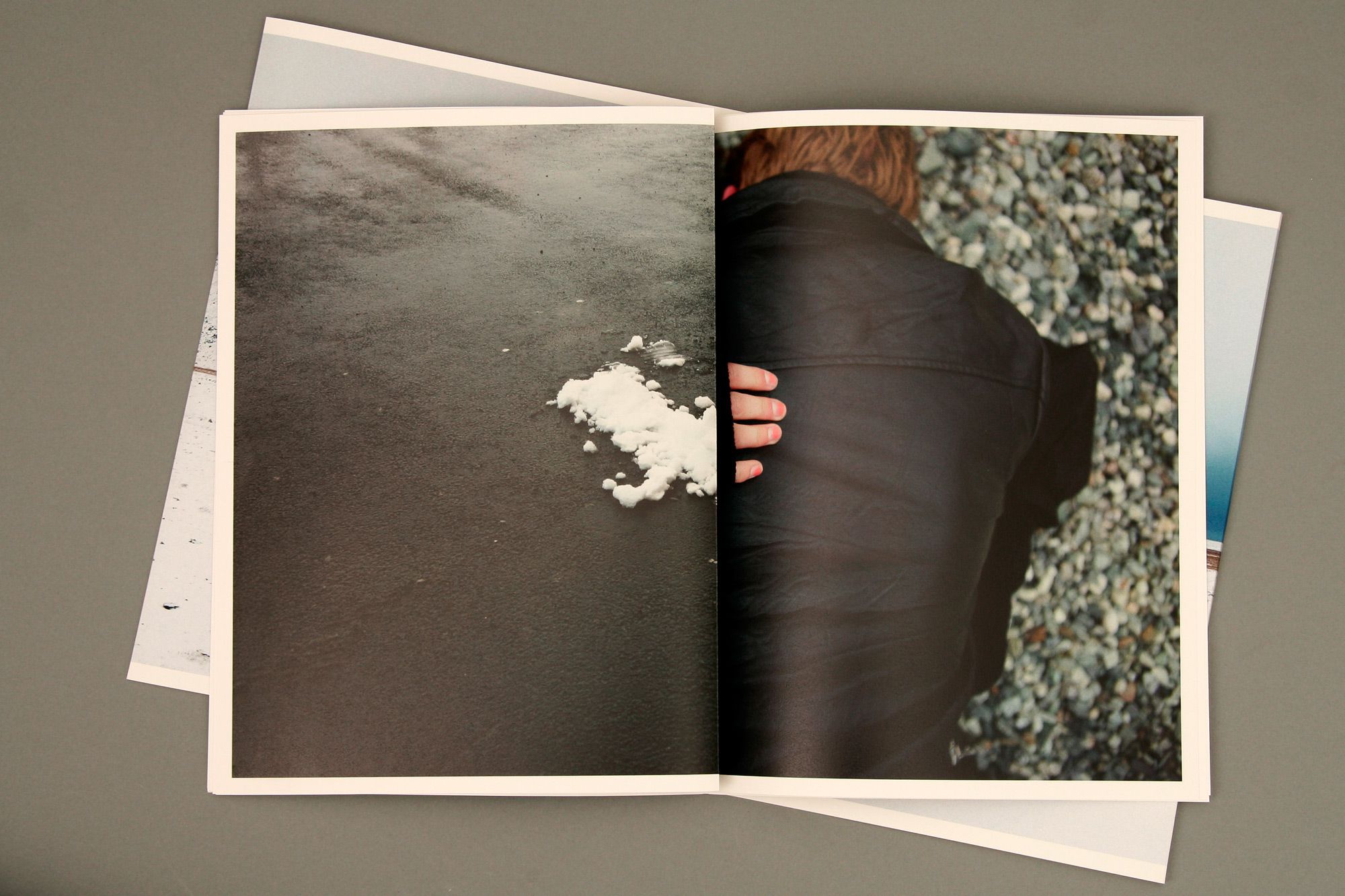
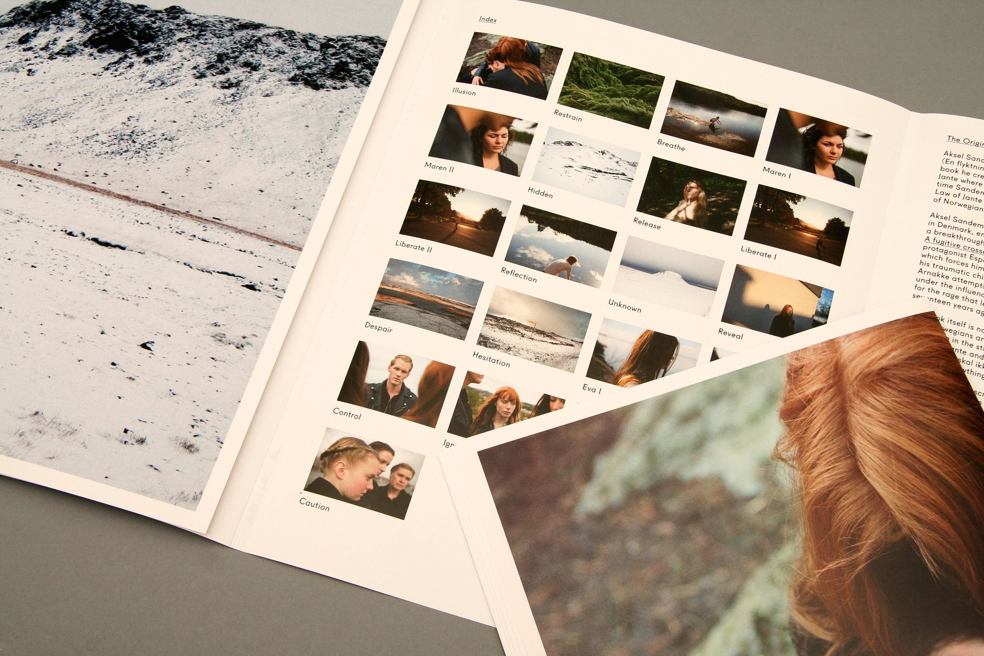
CHARACTERS OF JANTE
--------------------------------------
Book design for photographer Ursula Jernberg. 'Characters of Jante'
features a series of photographs
about the infamous and ever present
‘Law of Jante’ that is deeply embedded in Scandinavian culture. The publication is a 4 page fold-around with a 36 page unbound book on the inside.
--------------------------------------
features a series of photographs
about the infamous and ever present
‘Law of Jante’ that is deeply embedded in Scandinavian culture. The publication is a 4 page fold-around with a 36 page unbound book on the inside.
--------------------------------------
--------------------------------------
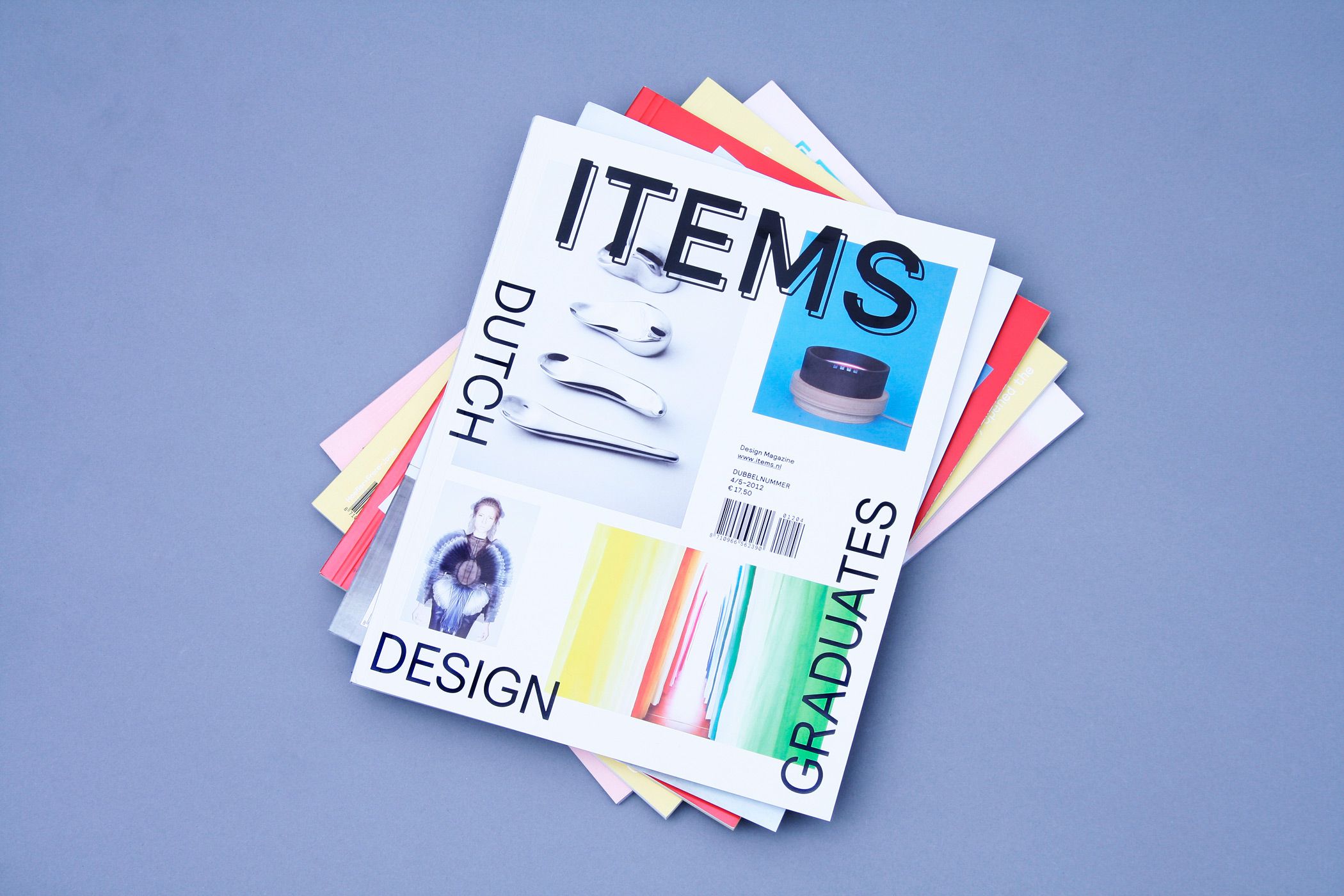
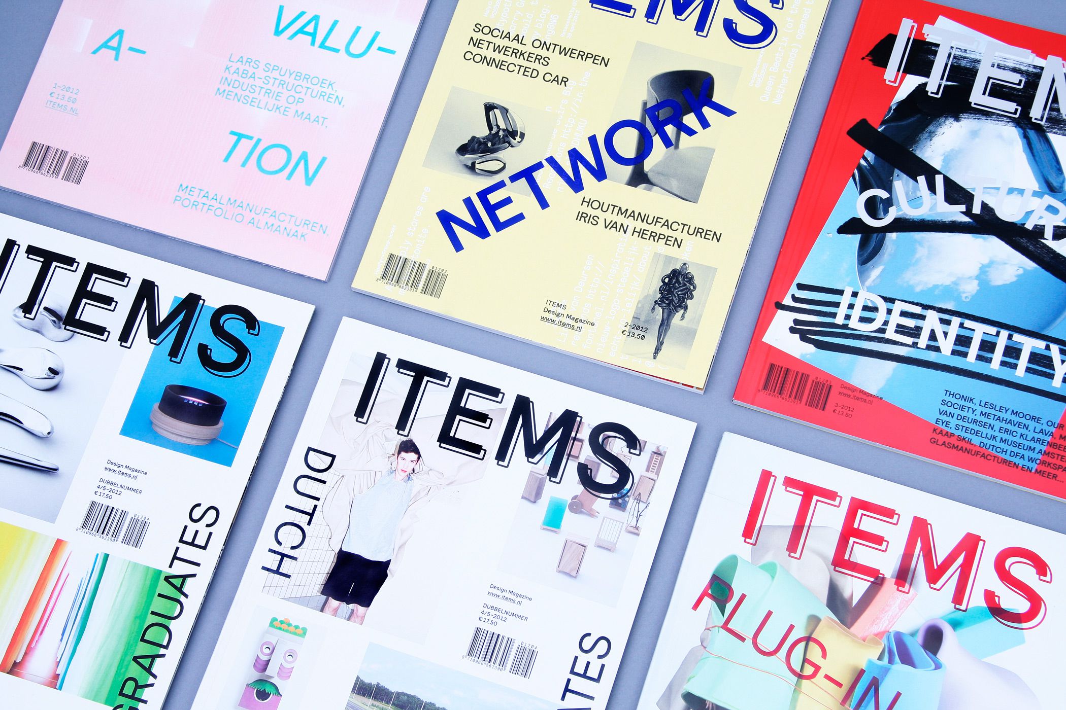
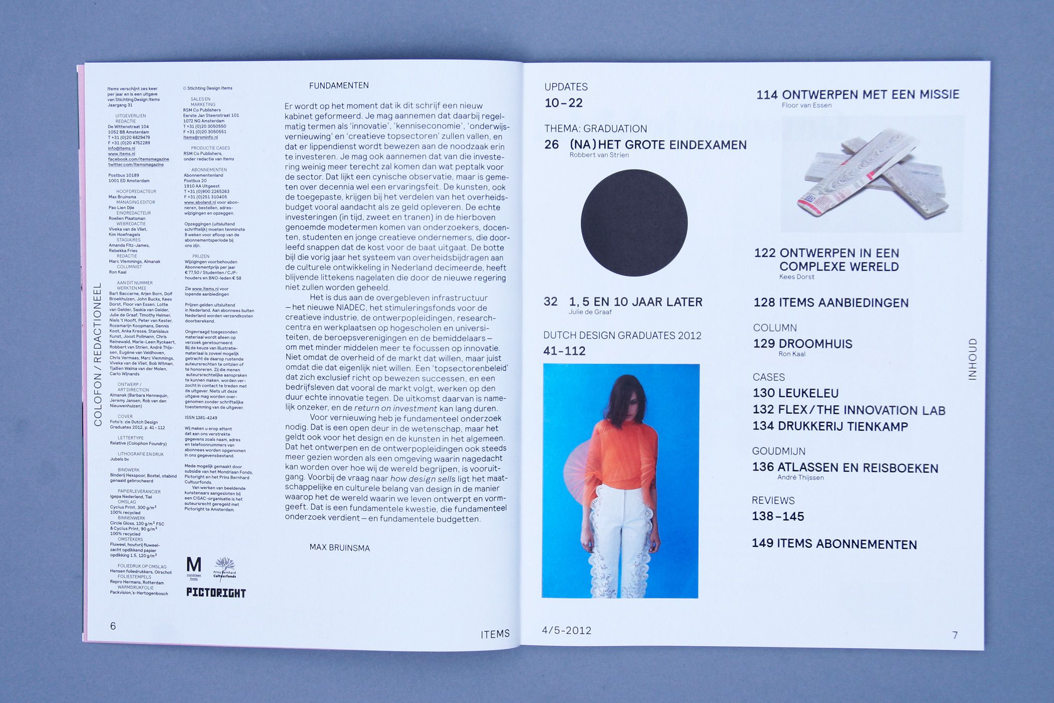
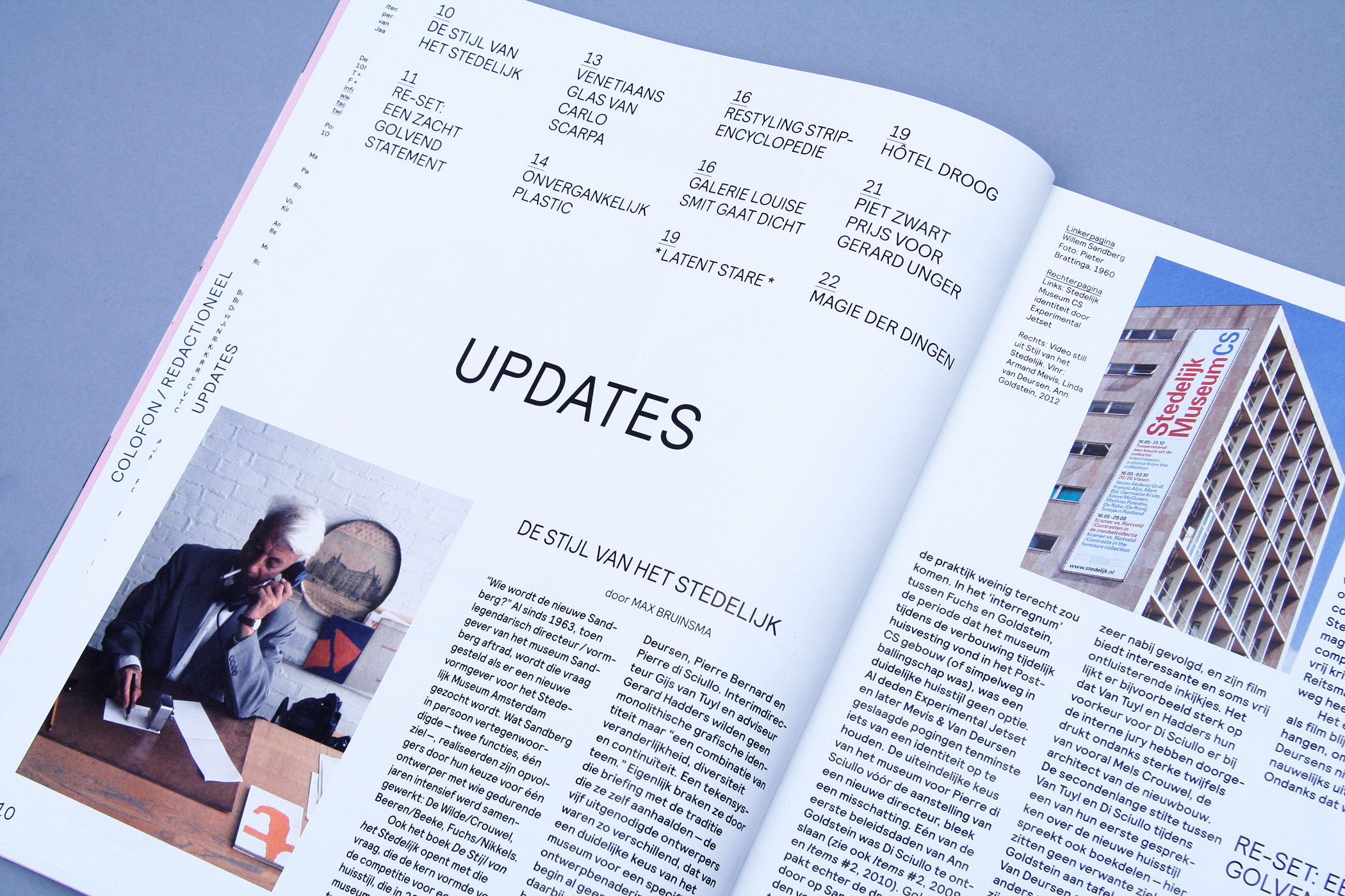
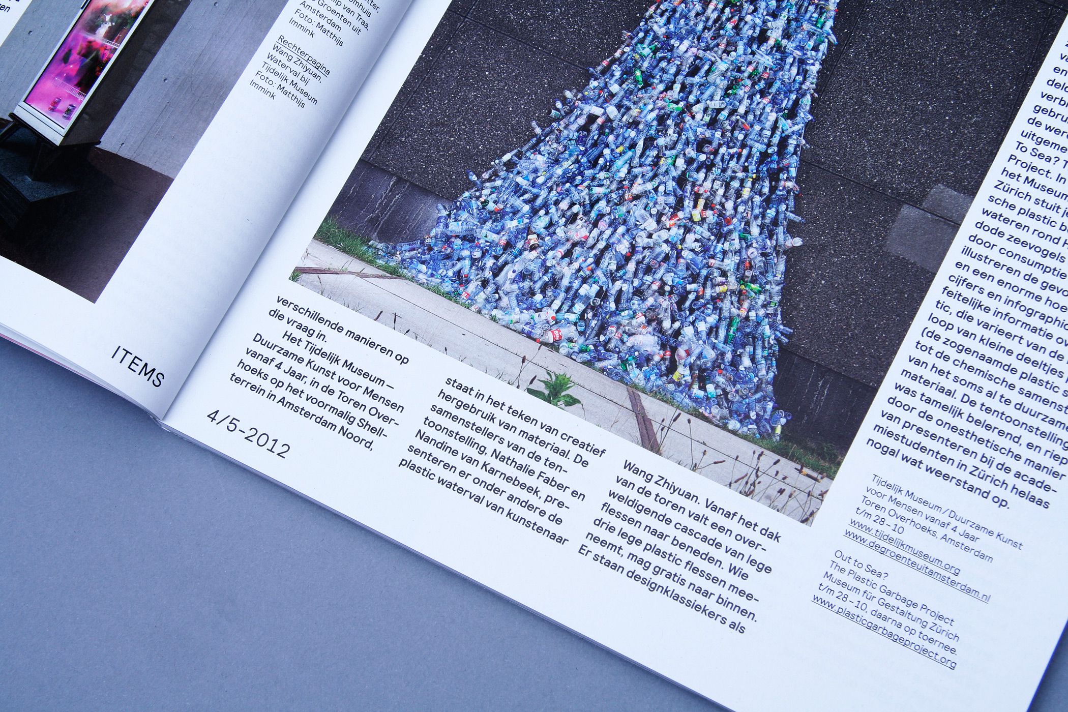
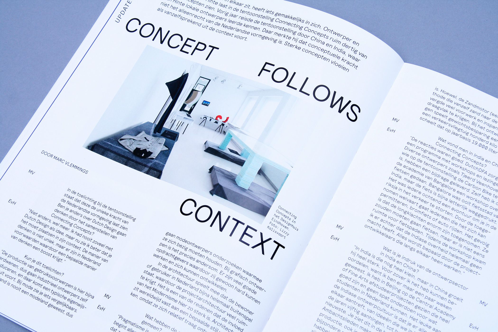
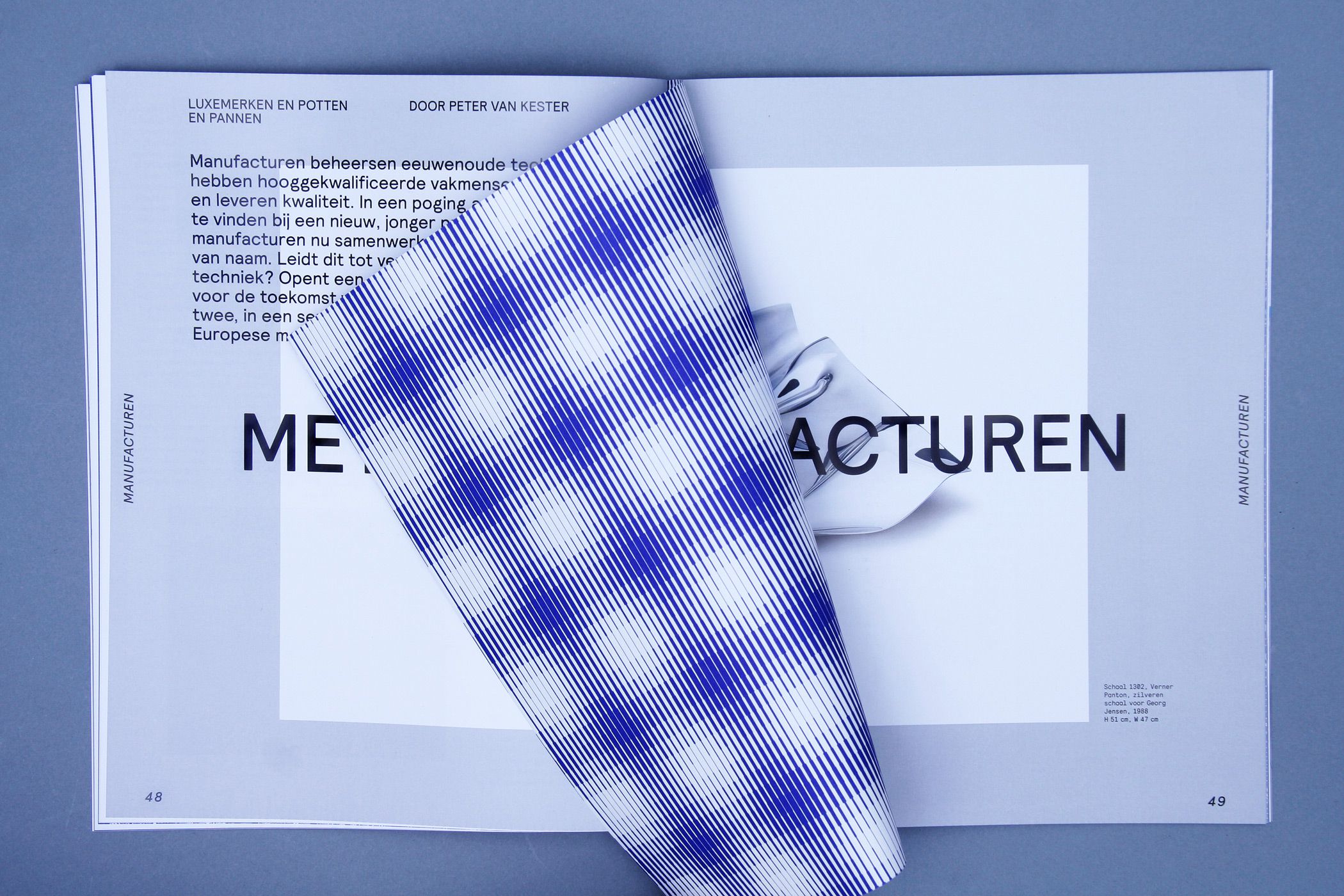
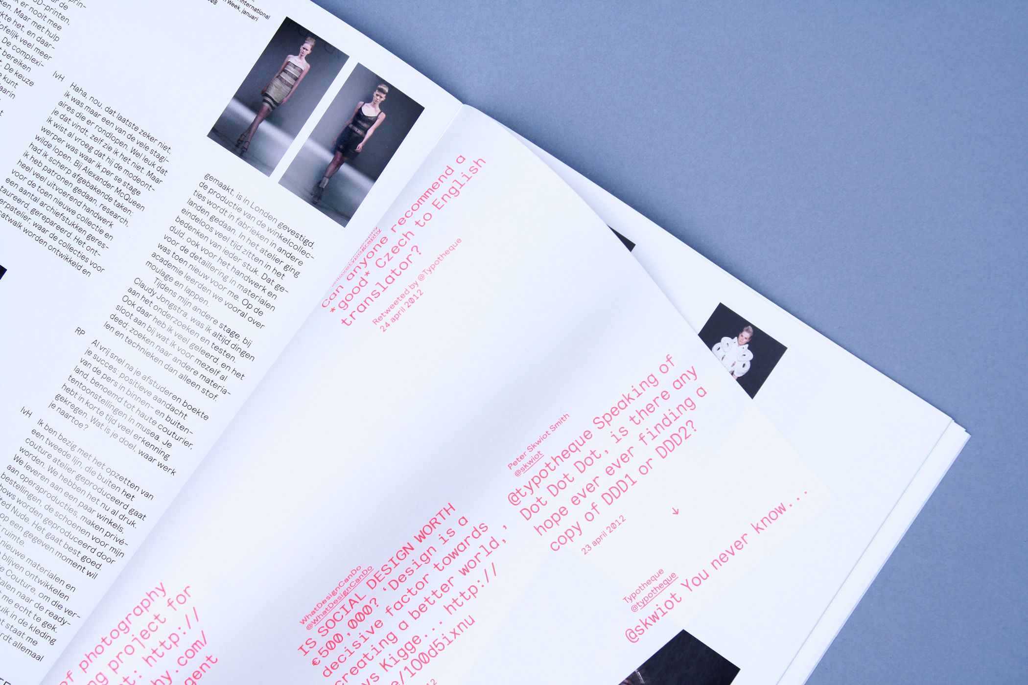
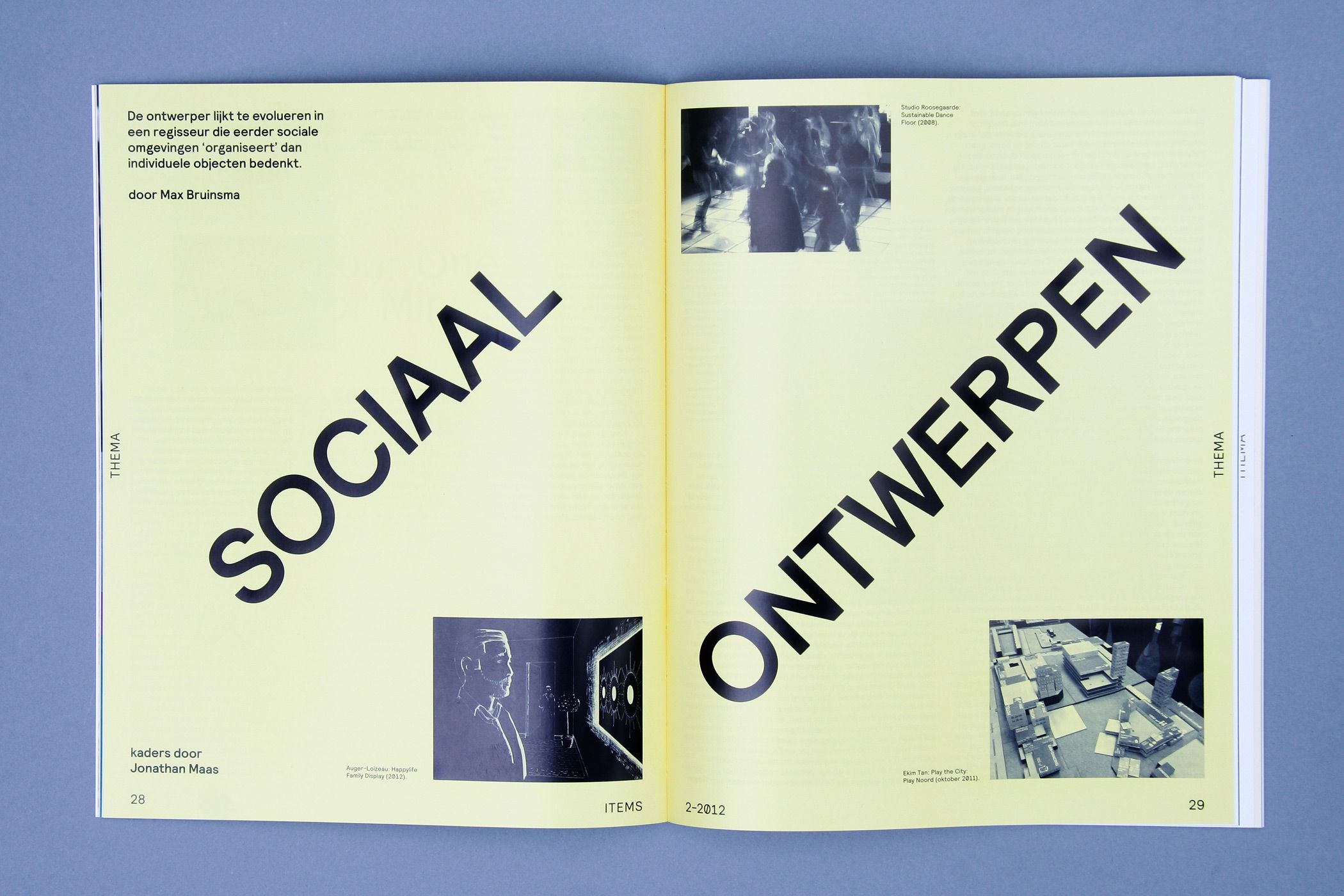
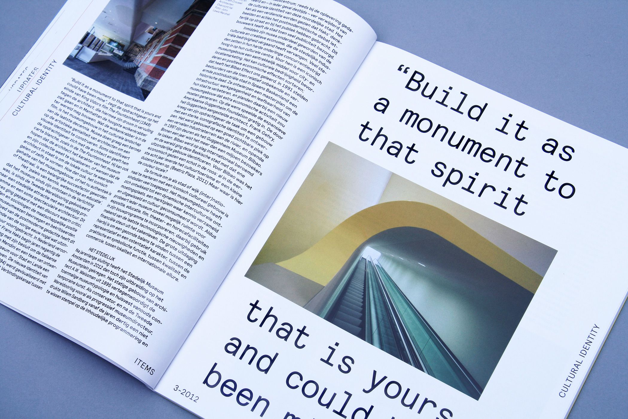
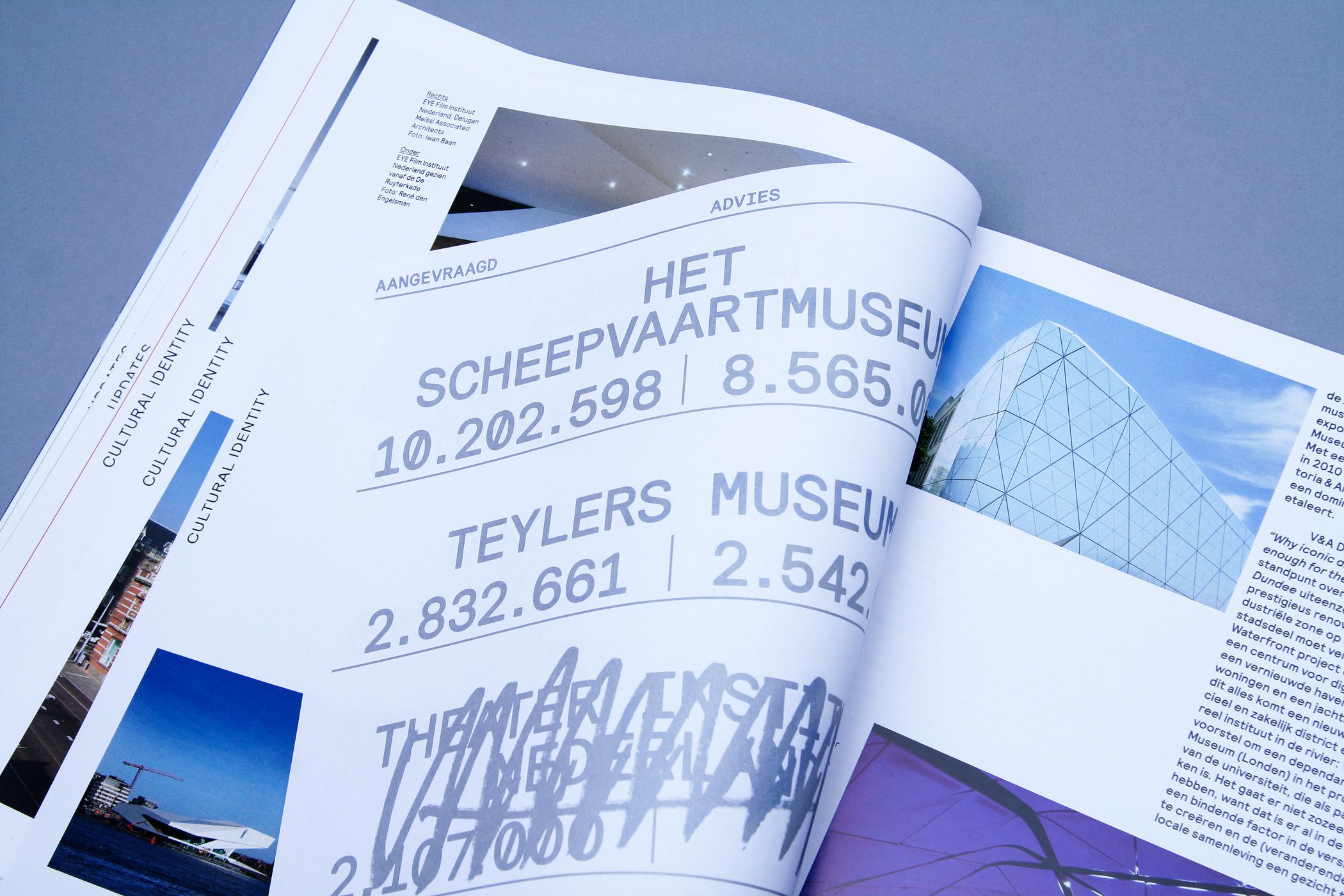
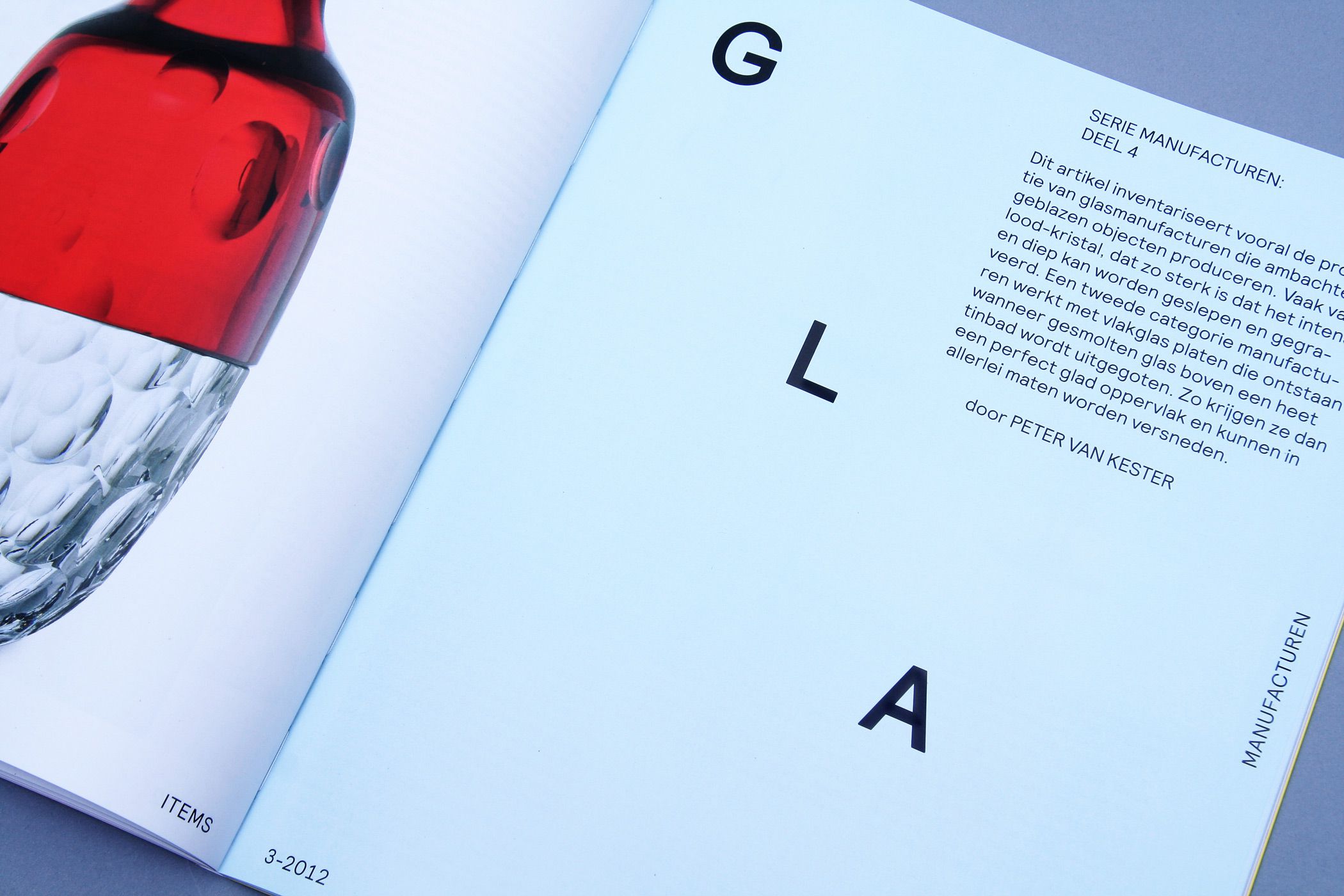
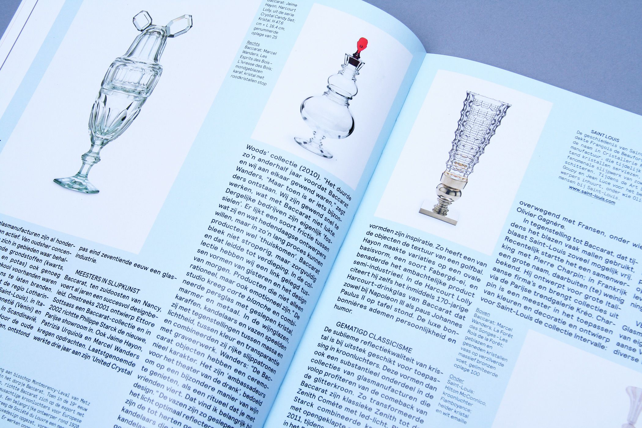
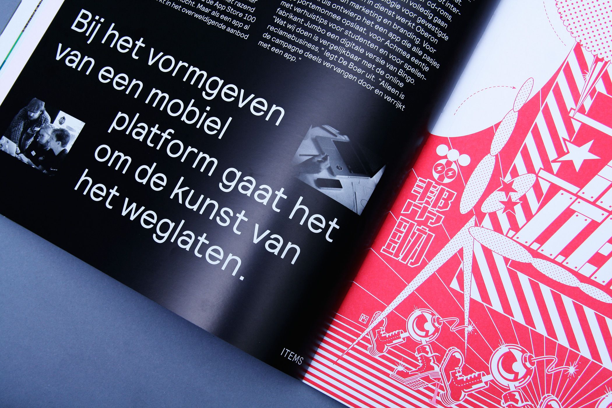
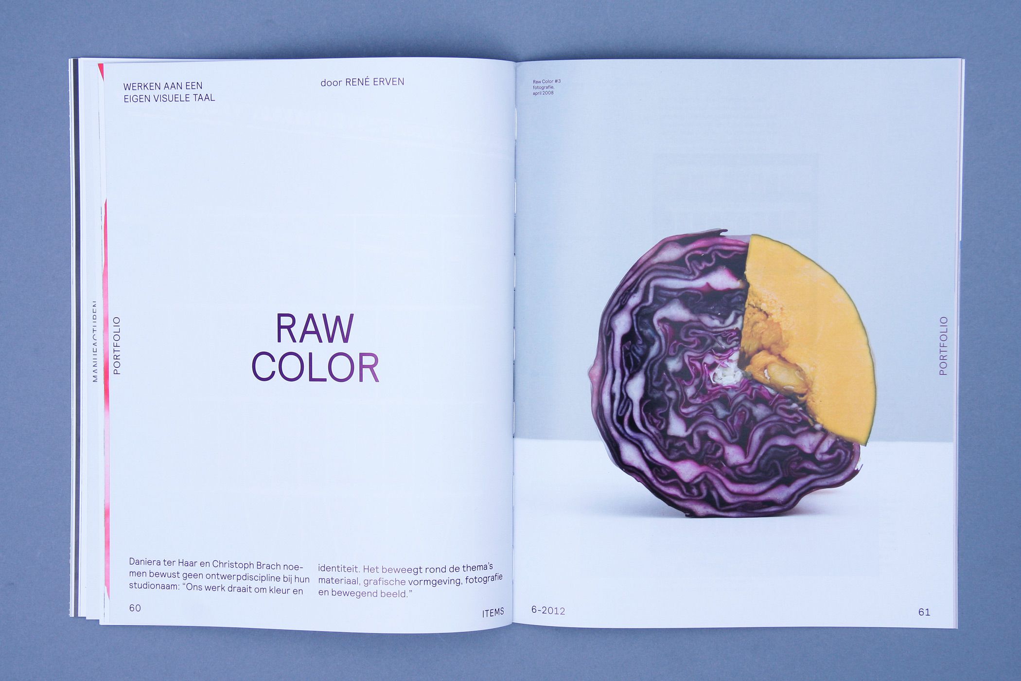
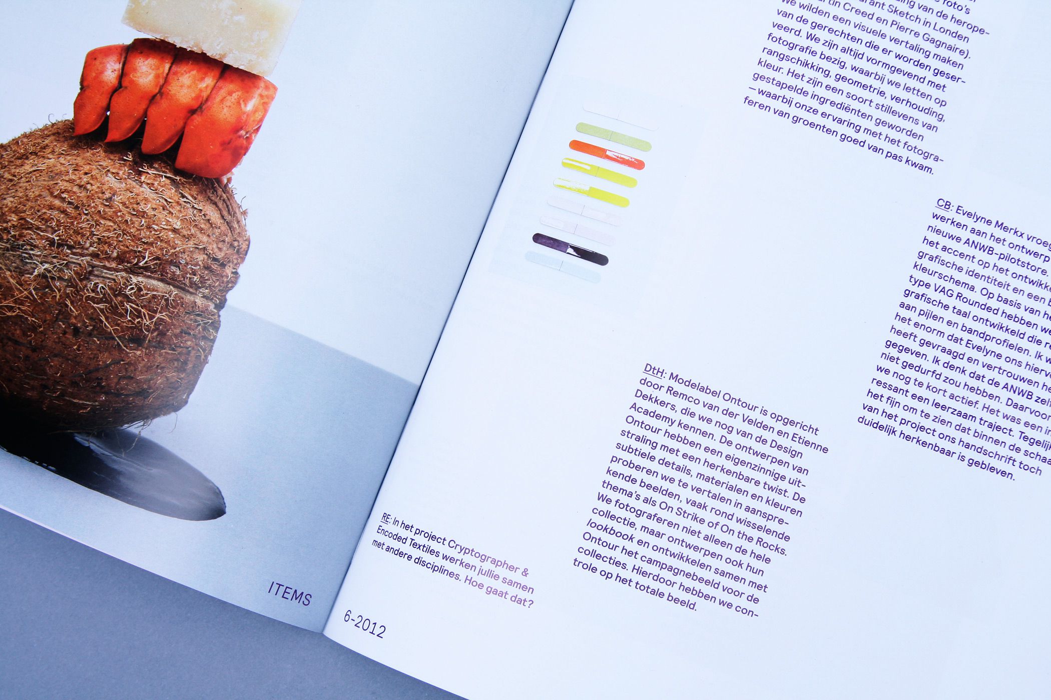
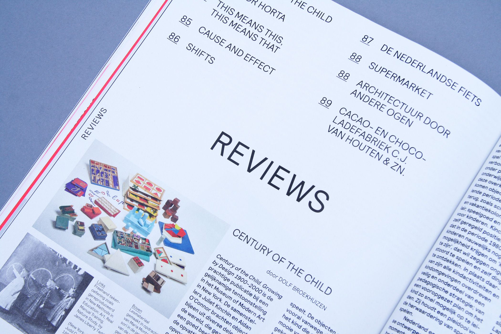
ITEMS DESIGN MAGAZINE
--------------------------------------
(Re)design of ITEMS Design Magazine (2012 editions). Design in collaboration with Rob van den Nieuwenhuizen and Jeremy Jansen.
--------------------------------------
--------------------------------------
--------------------------------------
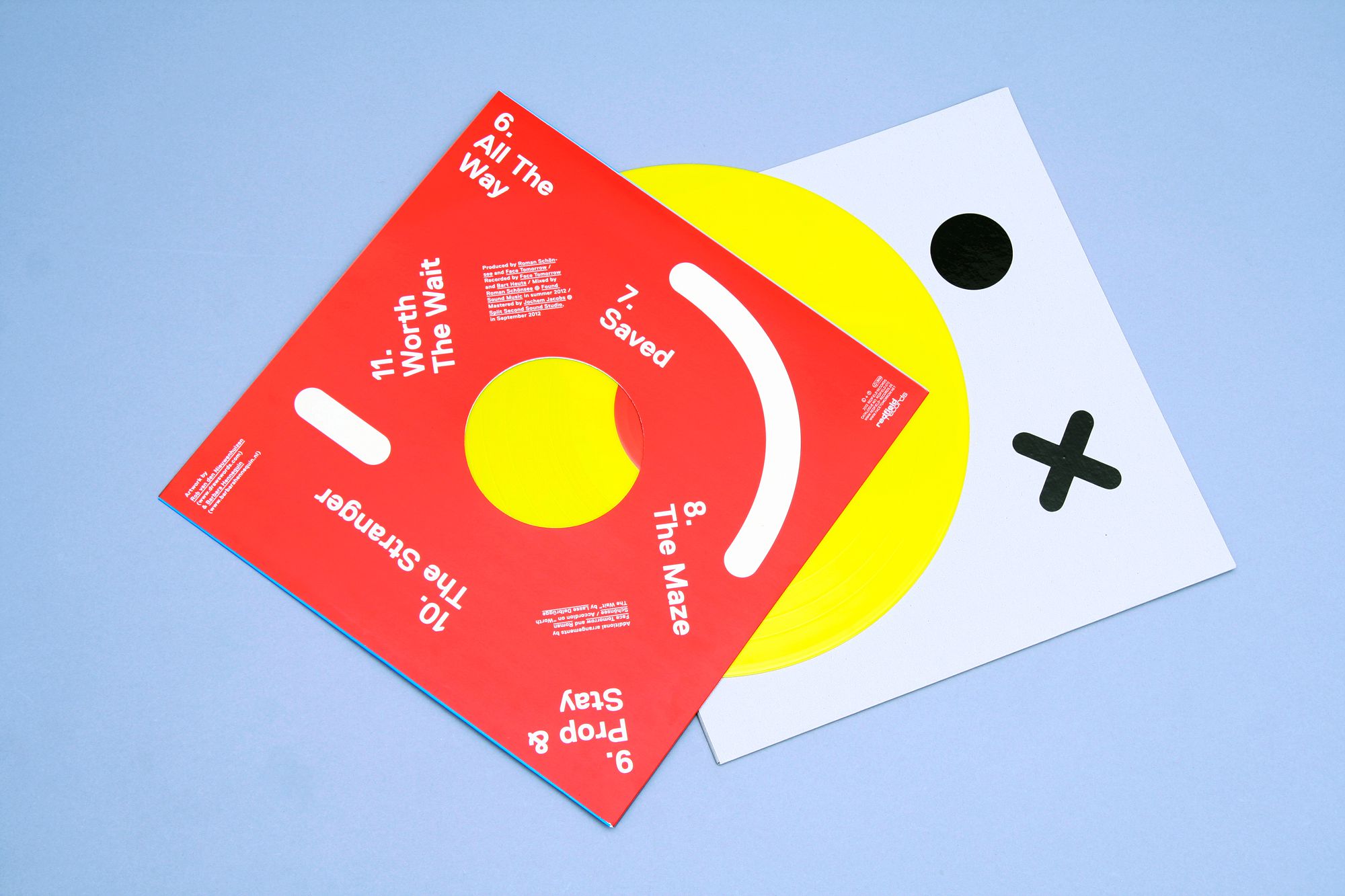
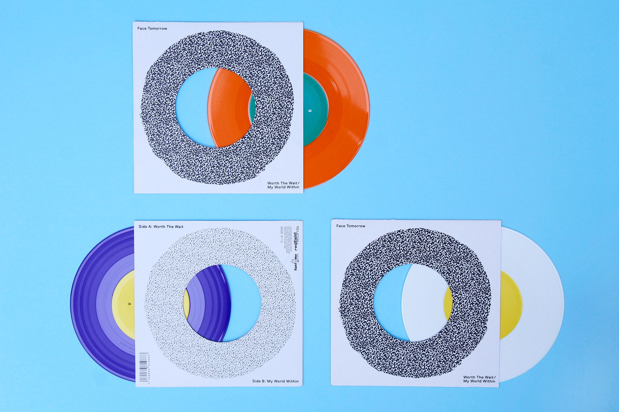
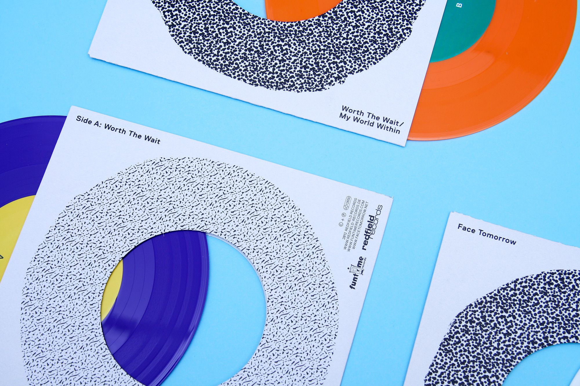
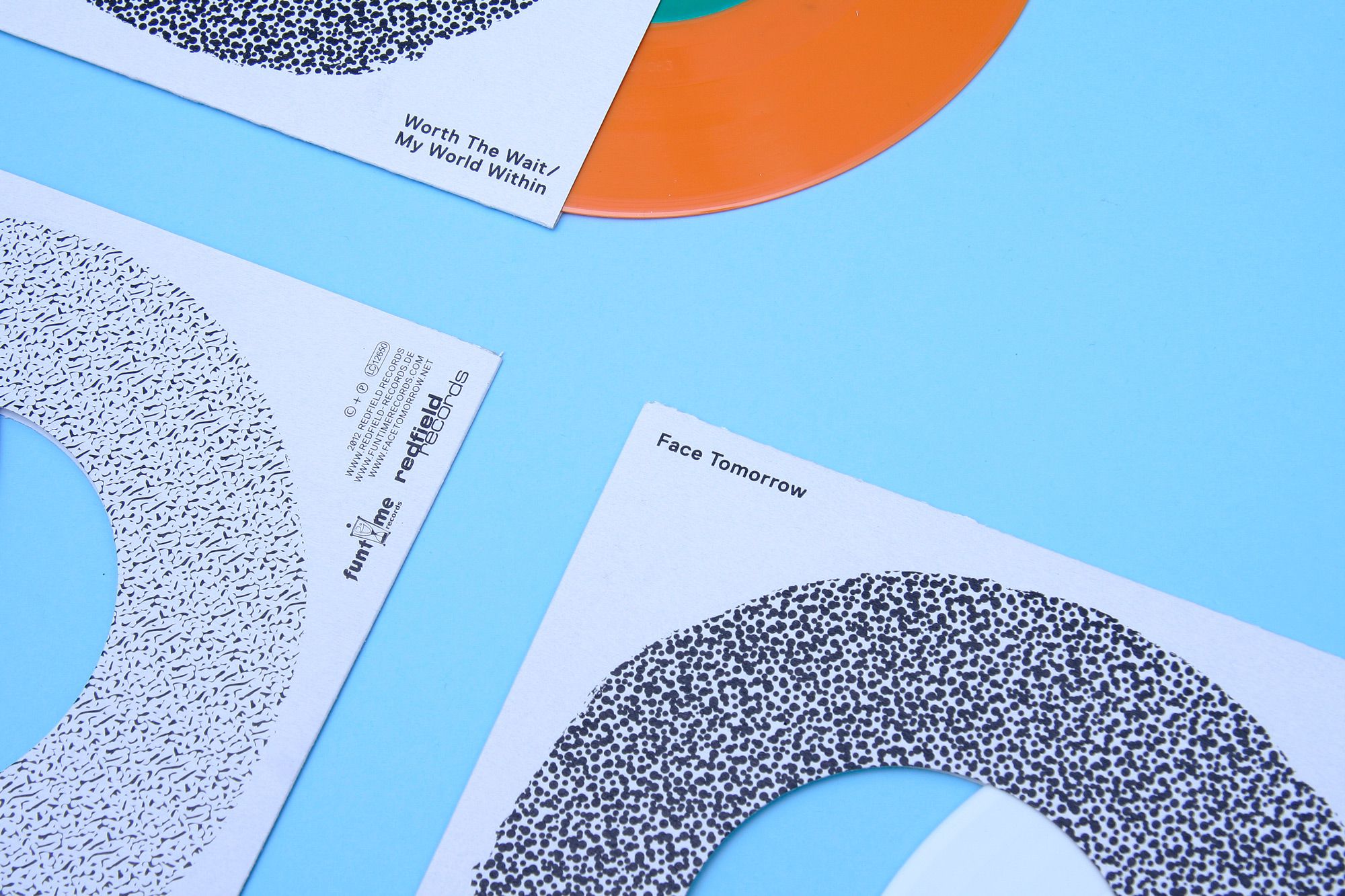
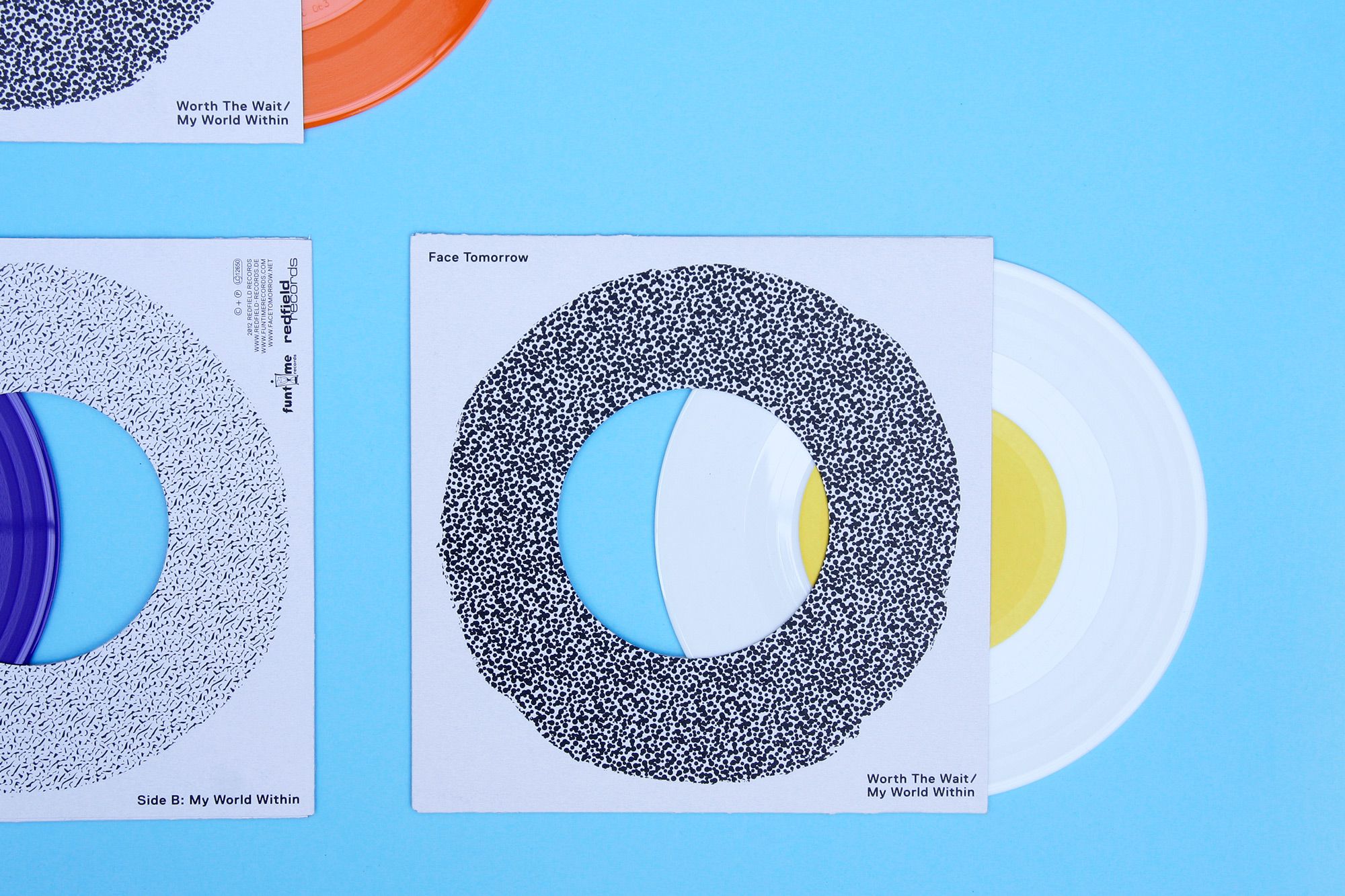
FACE TOMORROW 7” WORTH THE WAIT
--------------------------------------
Artwork for Face Tomorrow’s acoustic 7”. Available in three vinyl colours:
white, purple (Special edition for Record Store Day 2012) and orange (Special edition for Groezrock 2012). Design in collaboration with Rob van
den Nieuwenhuizen.
--------------------------------------
white, purple (Special edition for Record Store Day 2012) and orange (Special edition for Groezrock 2012). Design in collaboration with Rob van
den Nieuwenhuizen.
--------------------------------------
--------------------------------------
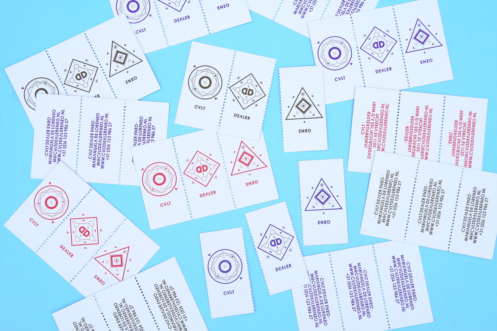
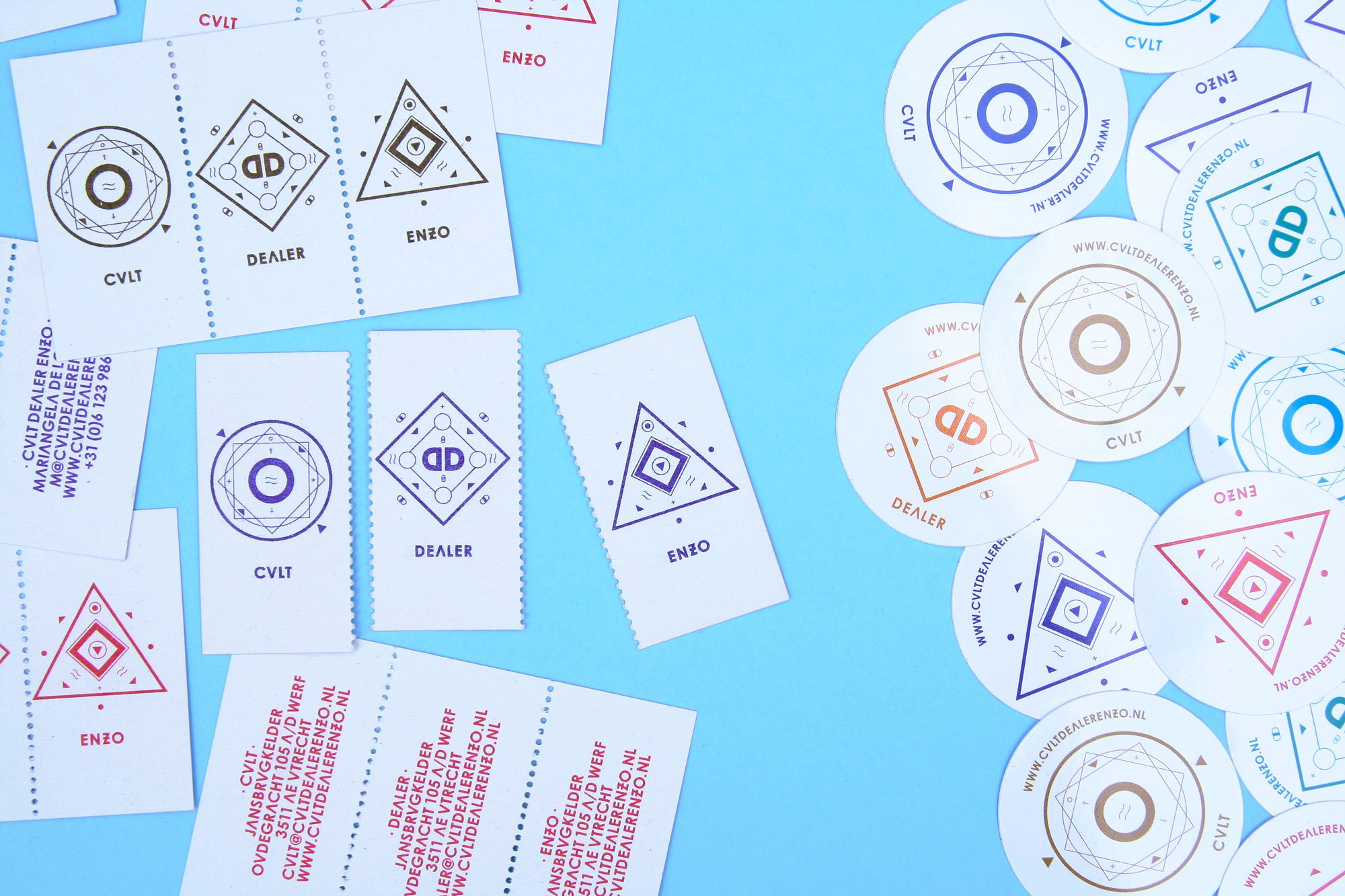
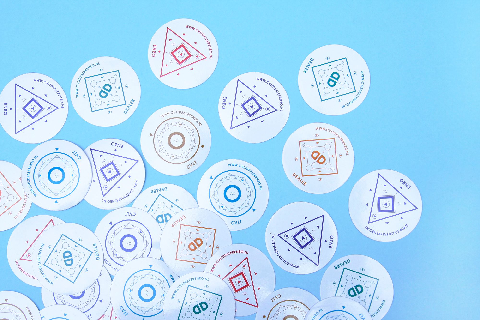
CULT DEALER ENZO
--------------------------------------
Identity for Cult Dealer Enzo, an experimental lab for creative talent in Utrecht, the Netherlands. Consisting of three counterparts, Cult, Dealer and Enzo, each part has its own cult-like icon that can be used separately or in any preferred combination. Design in collaboration with Rob van den Nieuwenhuizen.
--------------------------------------
--------------------------------------
--------------------------------------
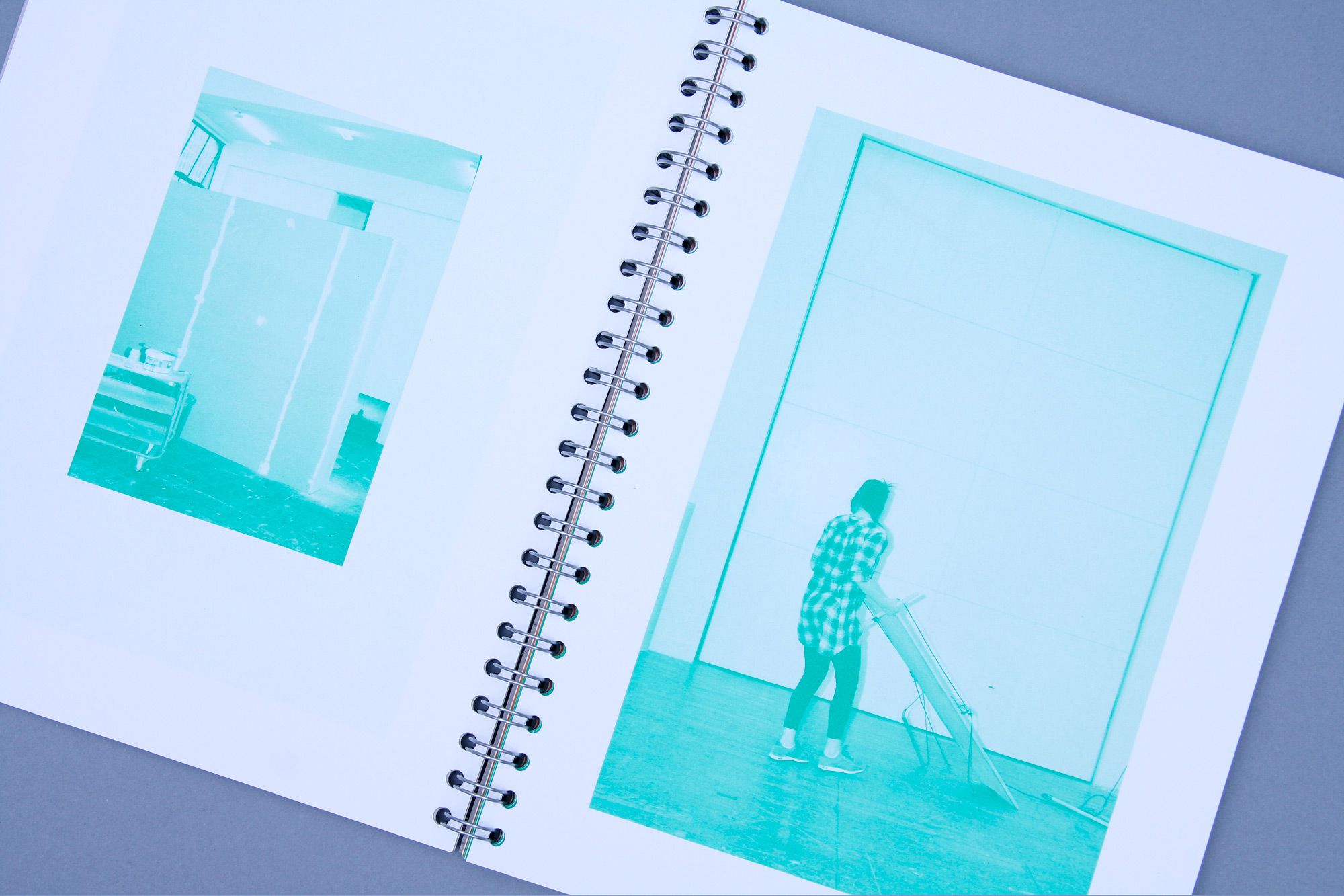
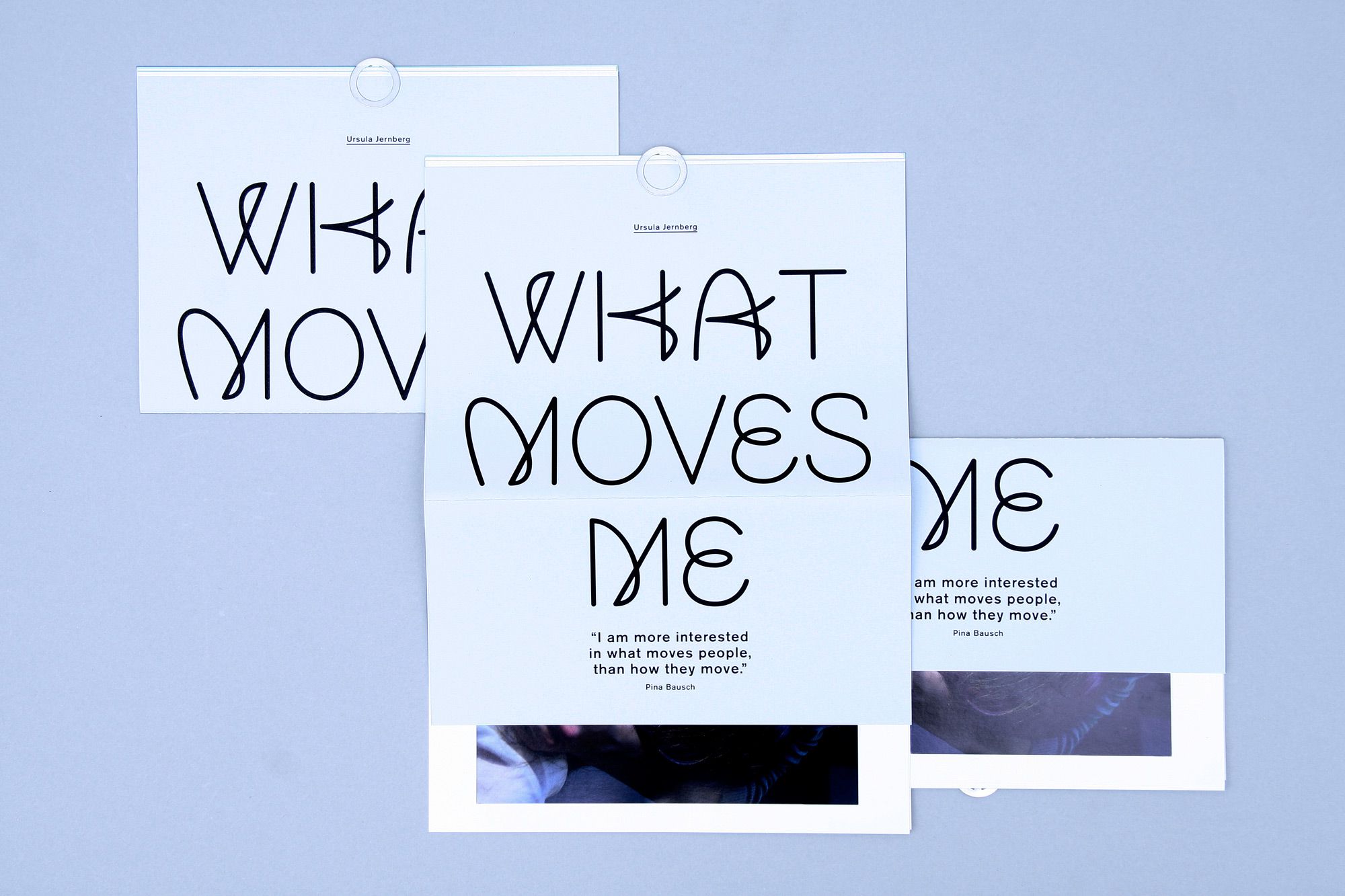
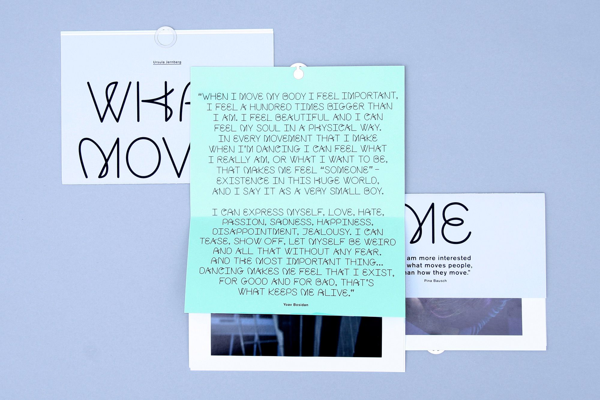
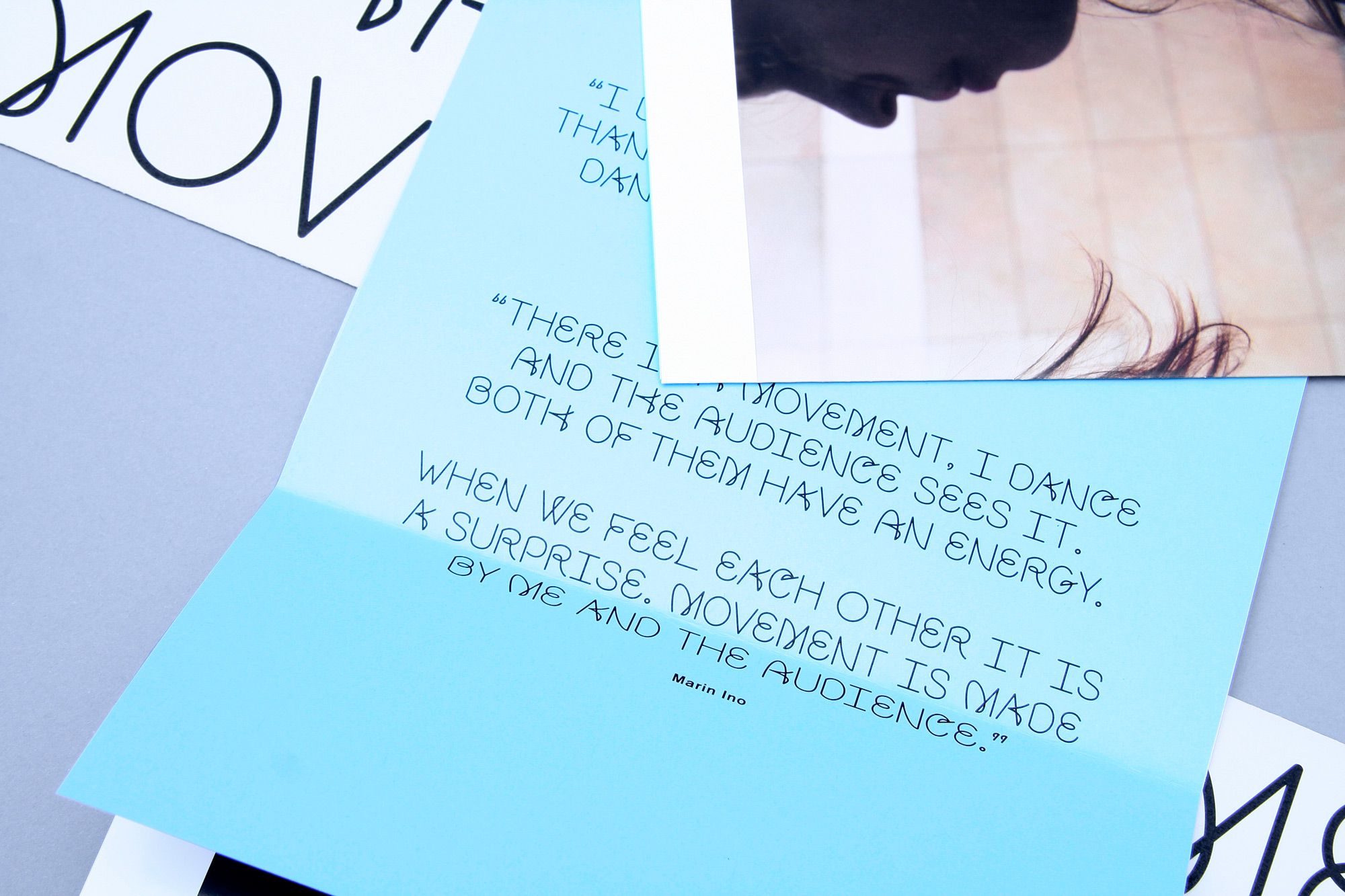
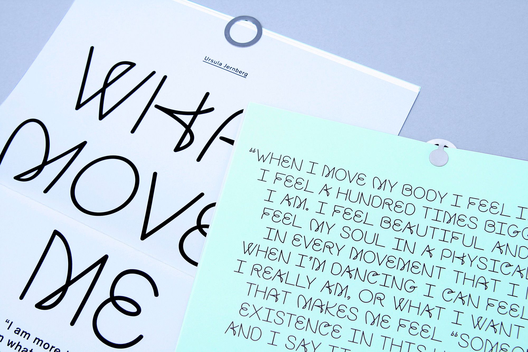
WHAT MOVES ME
--------------------------------------
'What Moves Me' is a collaborative project with photographer Ursula Jernberg for Het Nutshuis in The Hague. The font 'Move' was designed for this project specifically. The publication features a number of photographs and quotes by dancers of the Royal Conservatory of The Hague.
--------------------------------------
--------------------------------------
--------------------------------------
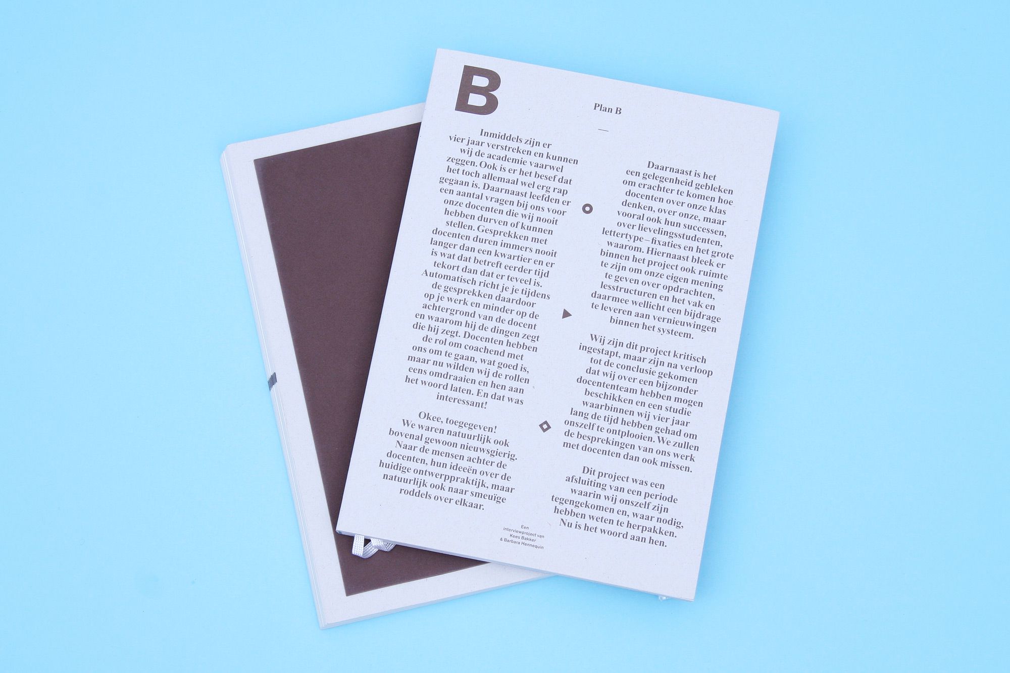
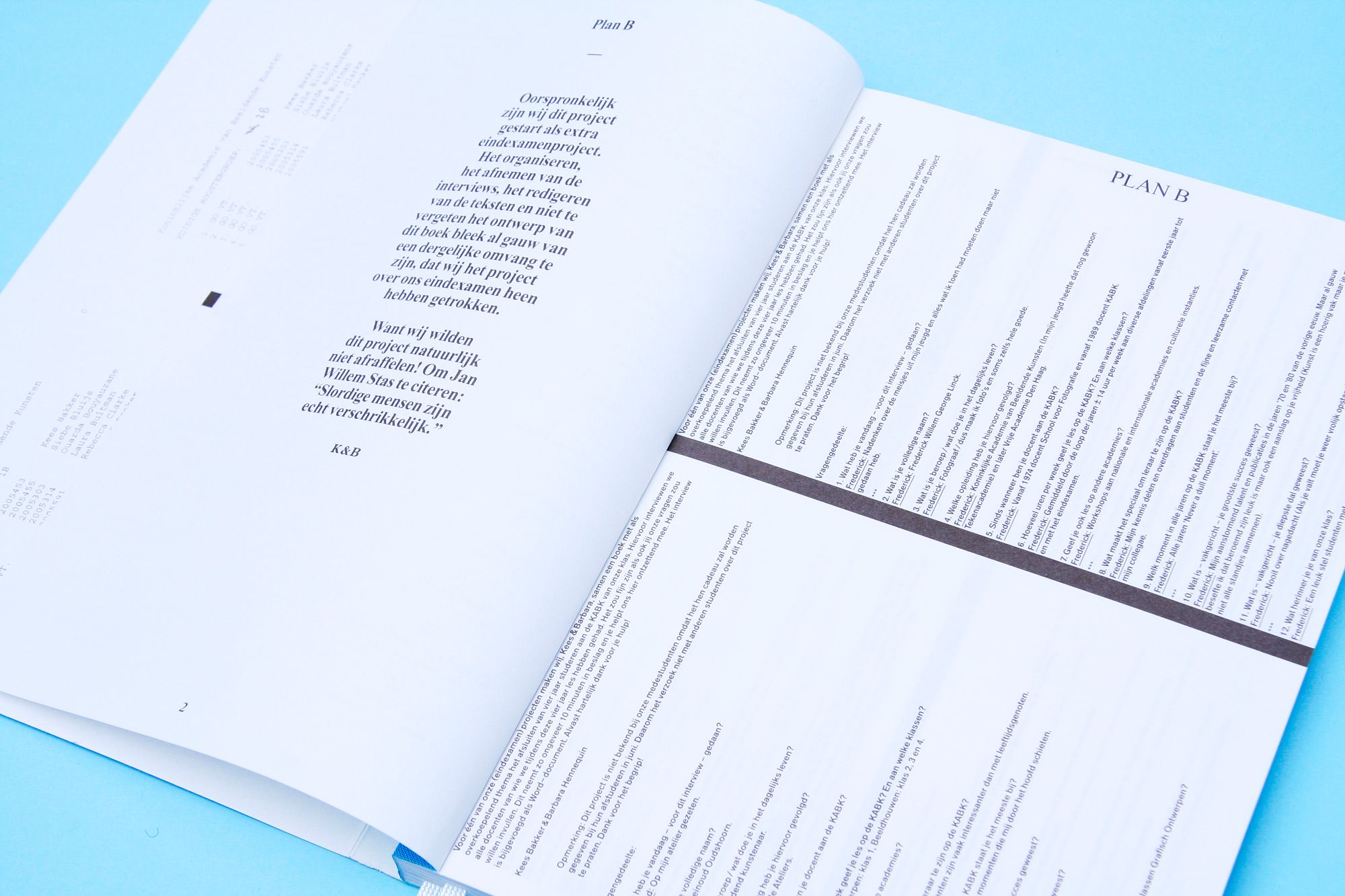
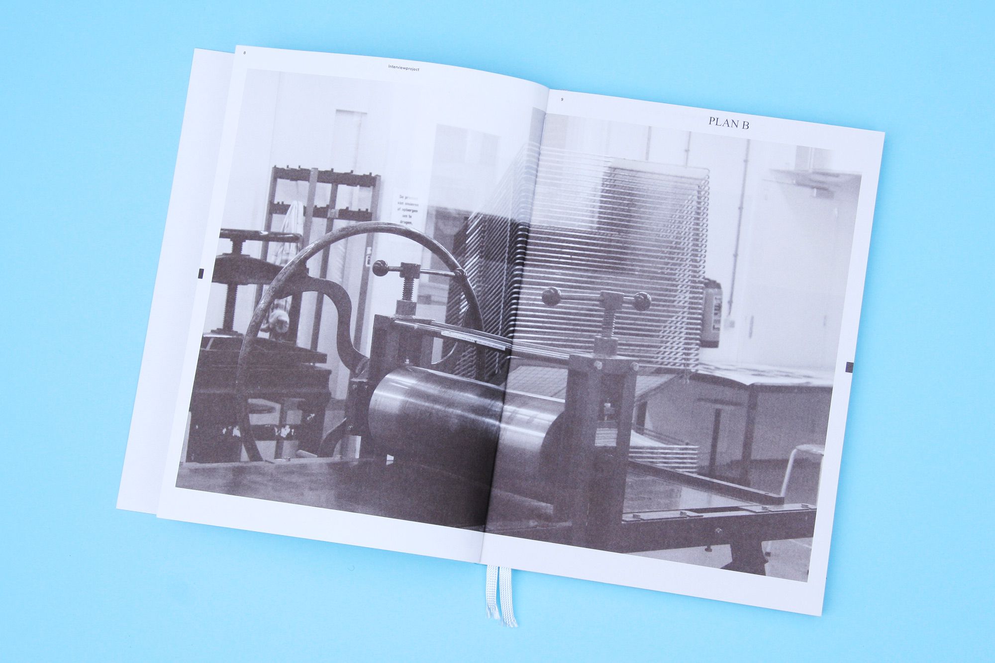
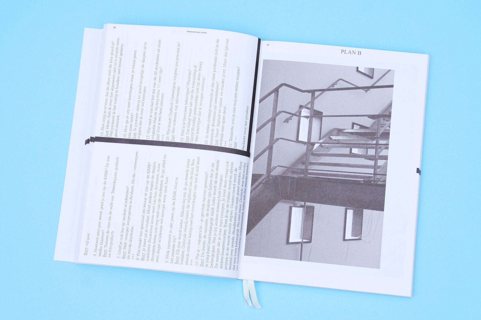
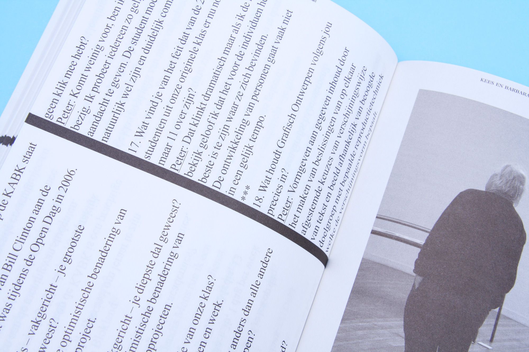
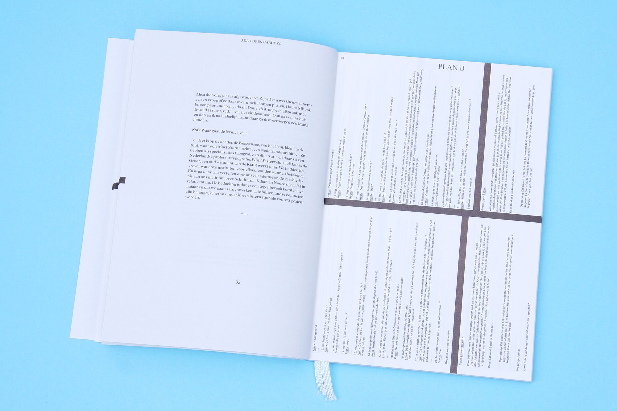
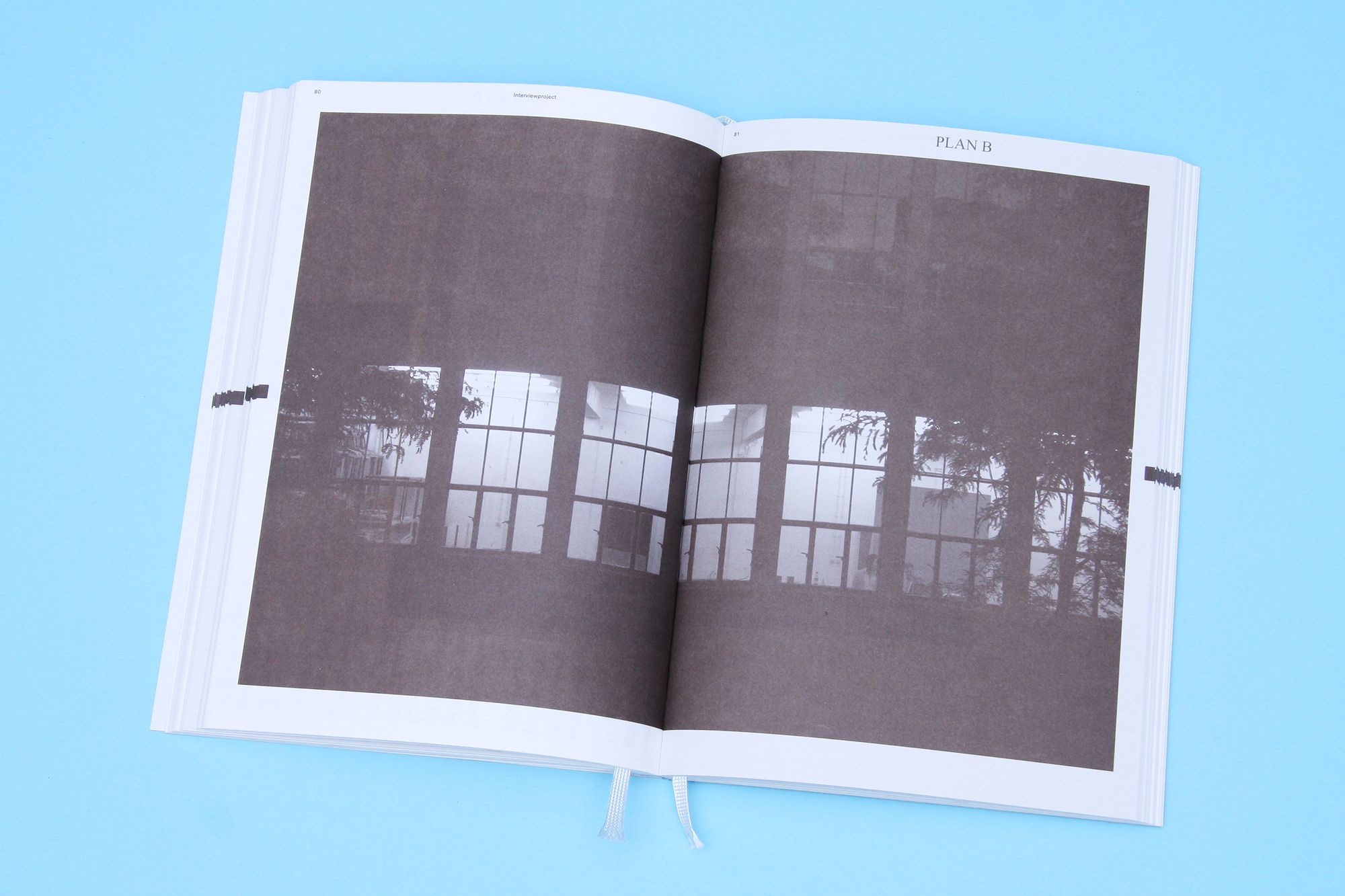
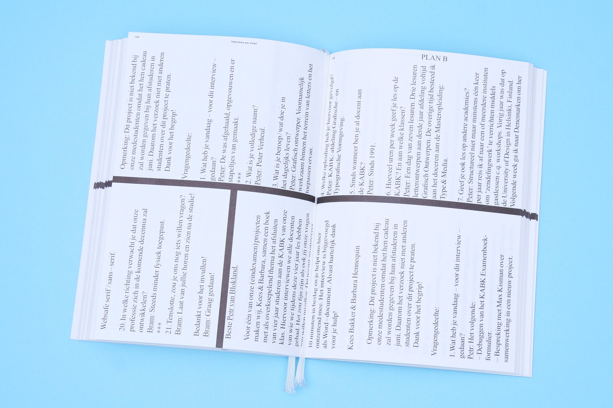
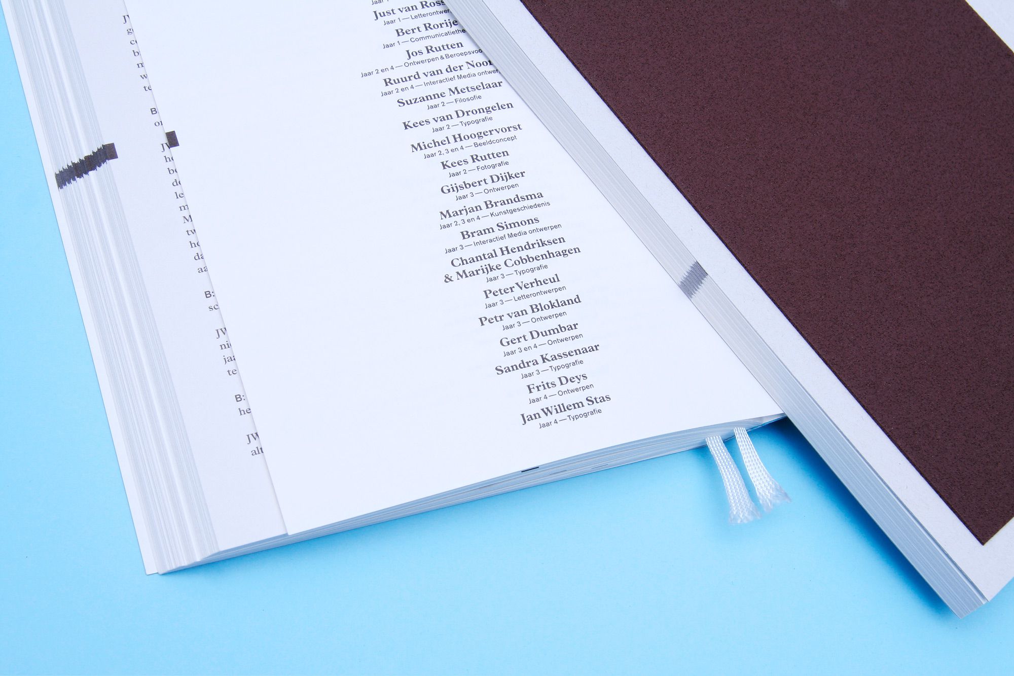
PLAN B
--------------------------------------
Plan B is a book featuring 28 interviews with teachers of the Graphic Design department of the Royal Academy of Arts (KABK) in The Hague. They talk about their vision on graphic design today, their own work, their successes and setbacks, the influence of teaching on their own work, ideals, and other interests. Design in collaboration with Kees Bakker.
--------------------------------------
--------------------------------------
--------------------------------------
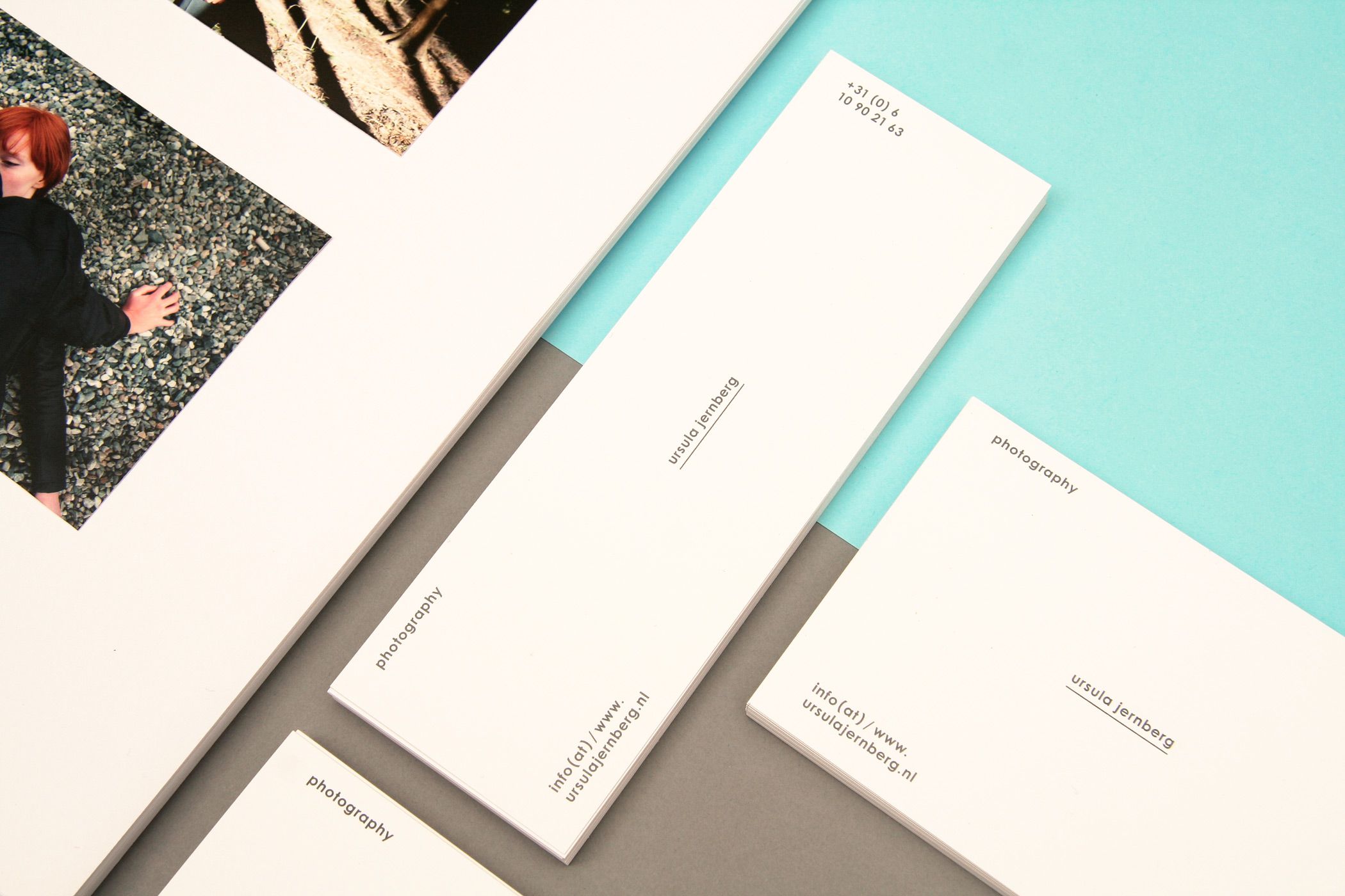
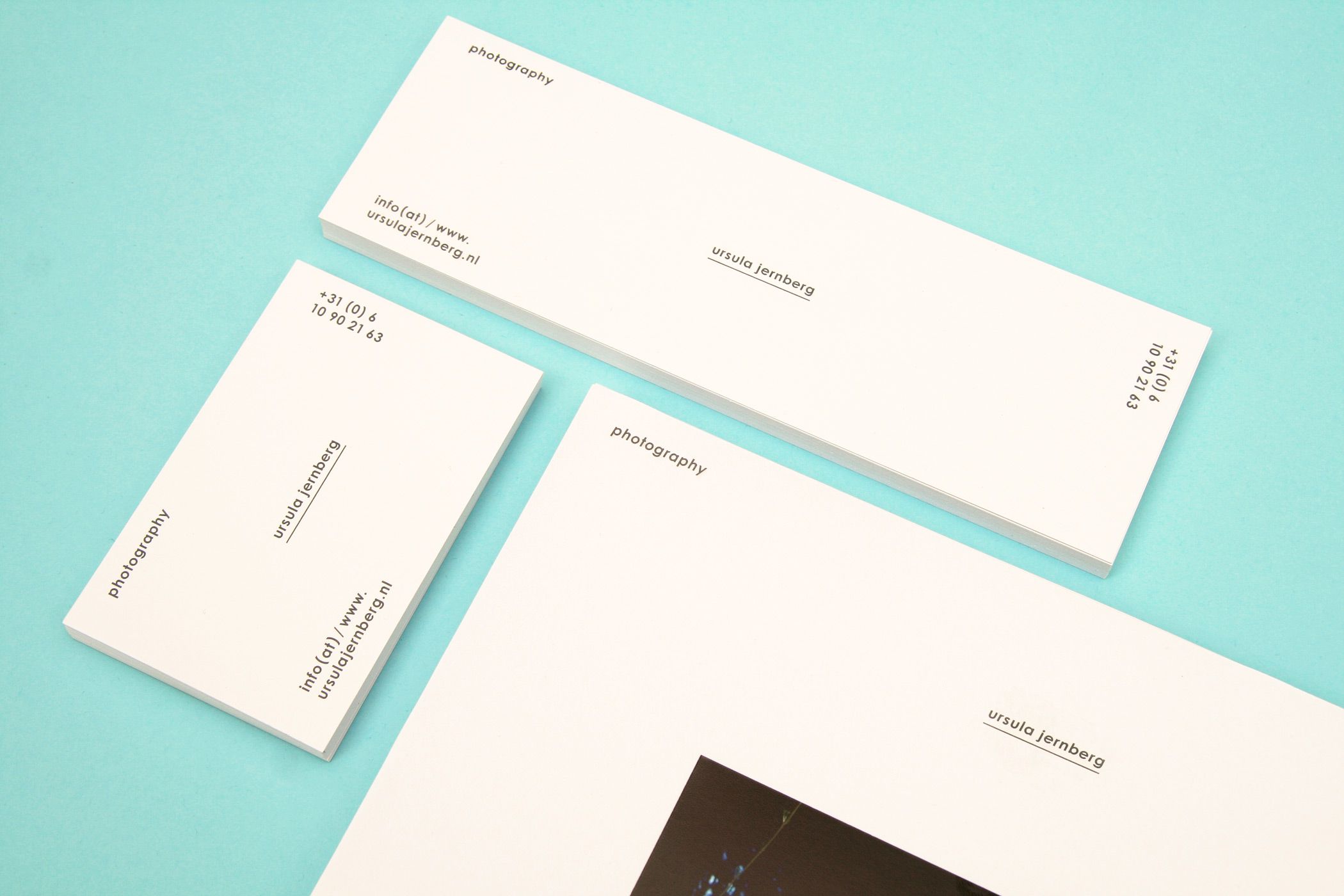
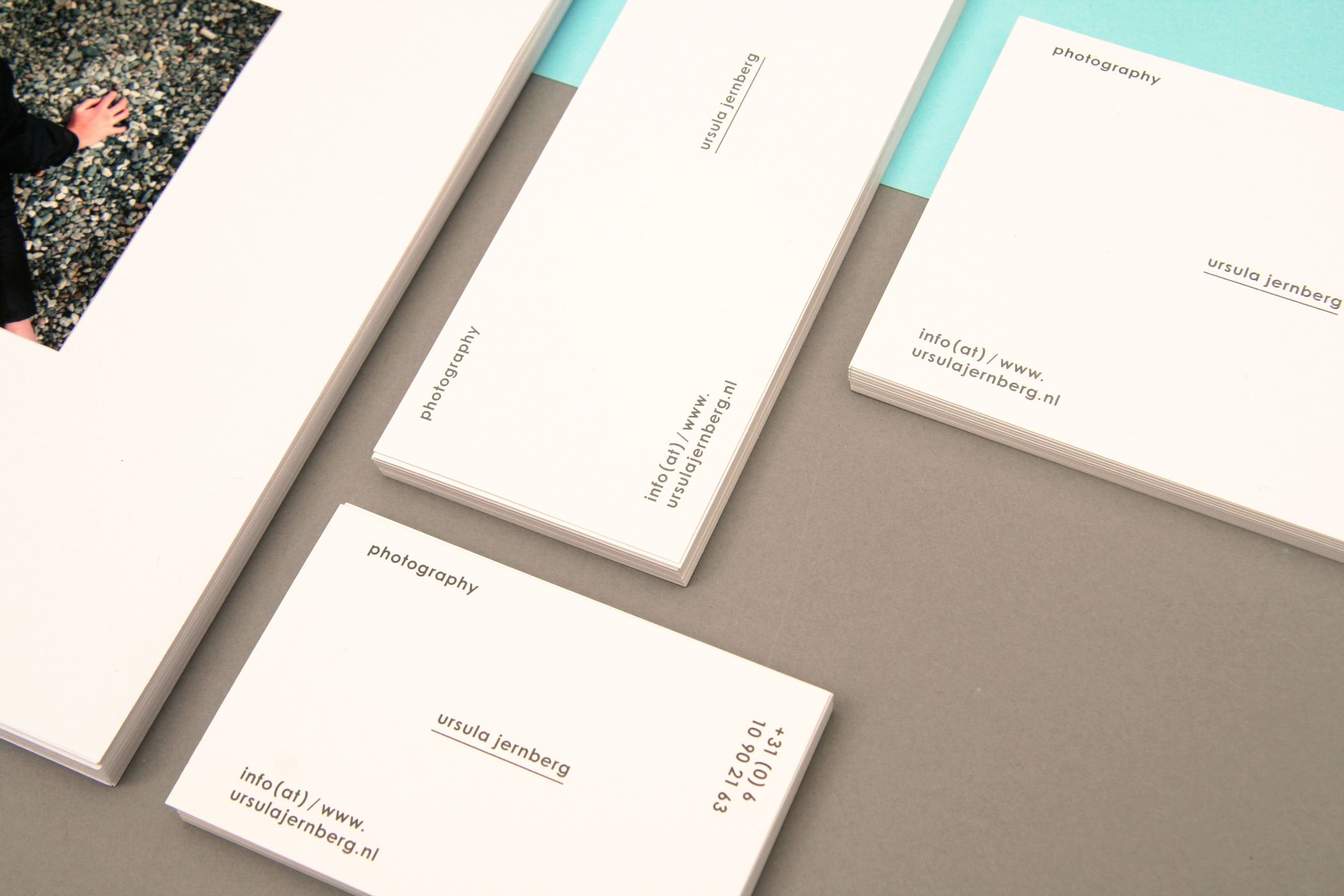
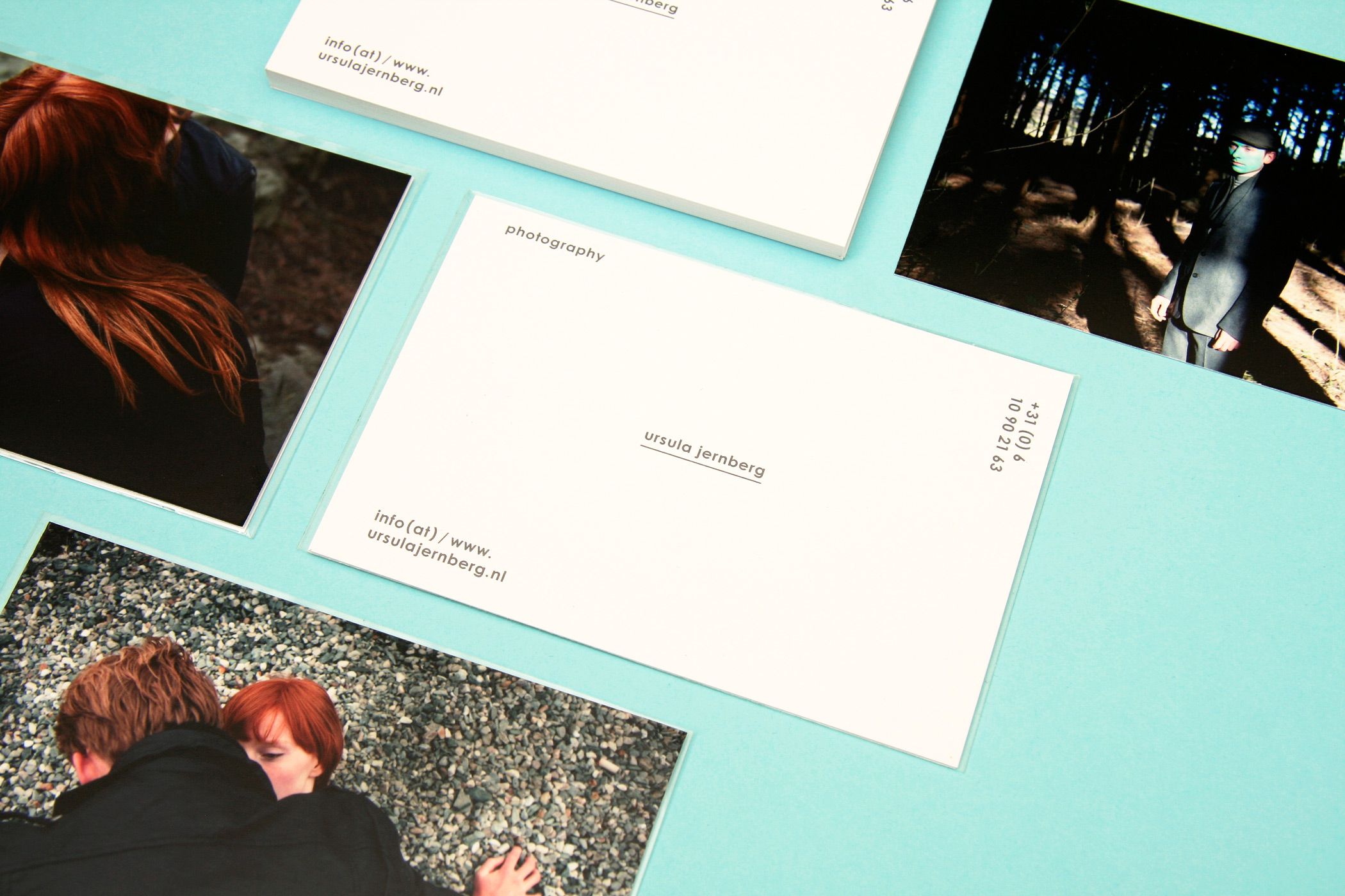
URSULA JERNBERG
--------------------------------------
Visual identity and stationary for
photographer Ursula Jernberg.
--------------------------------------
--------------------------------------
--------------------------------------
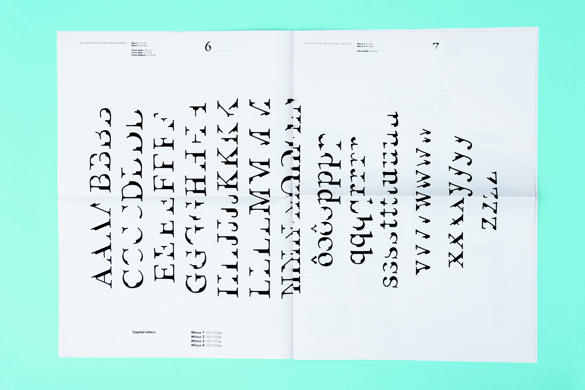
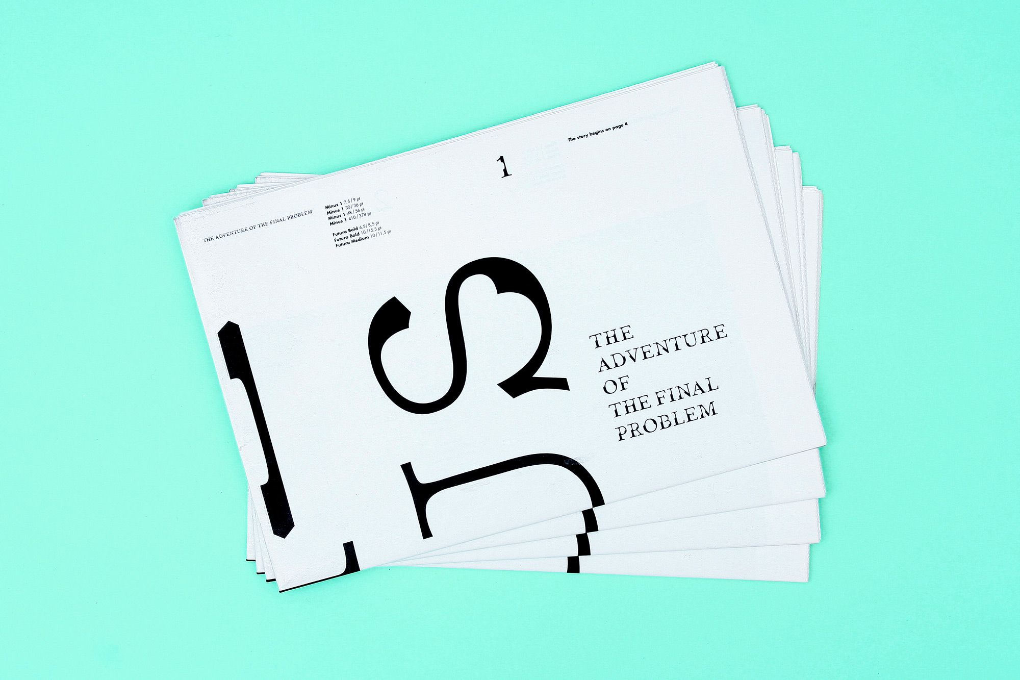
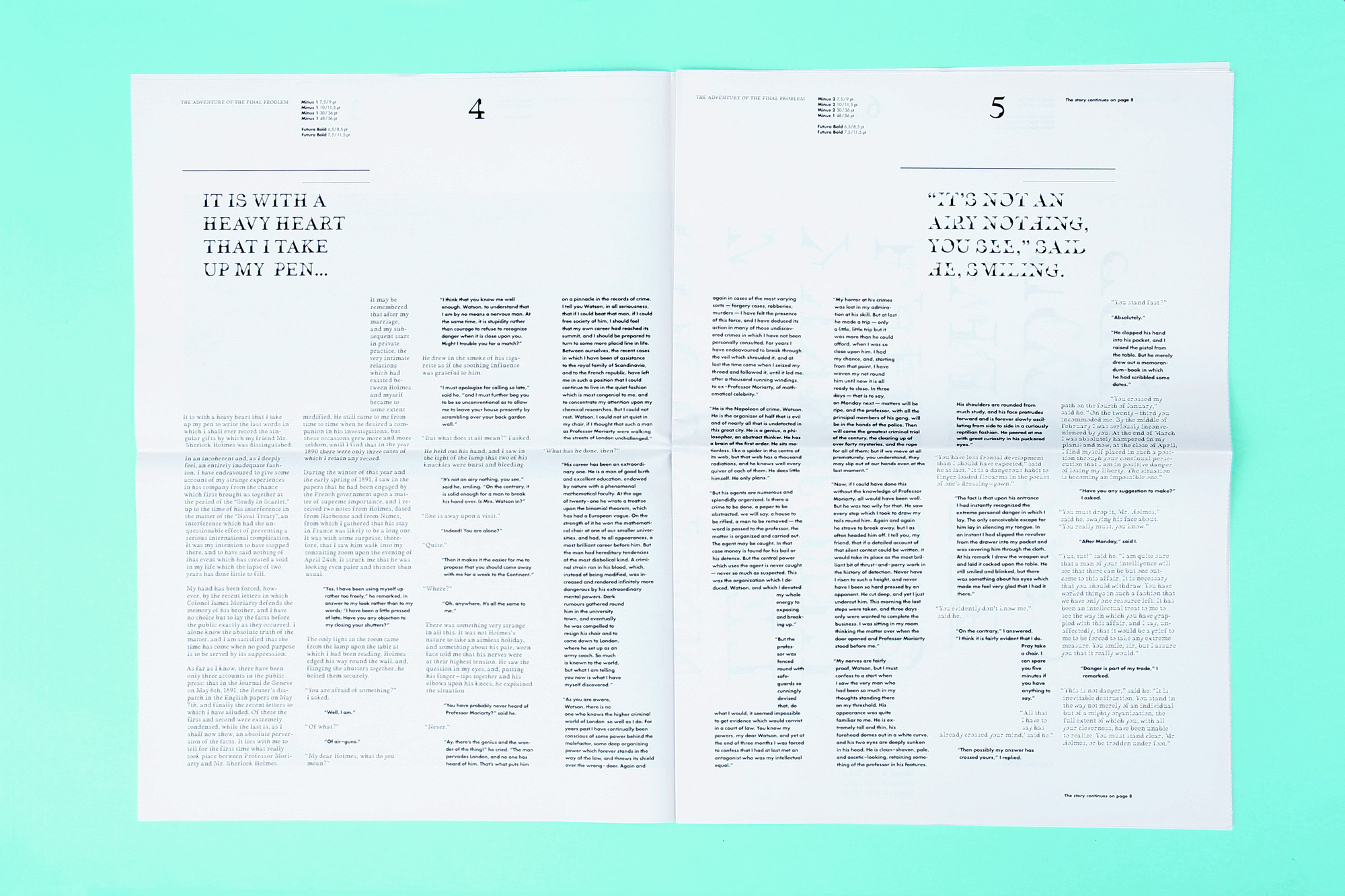
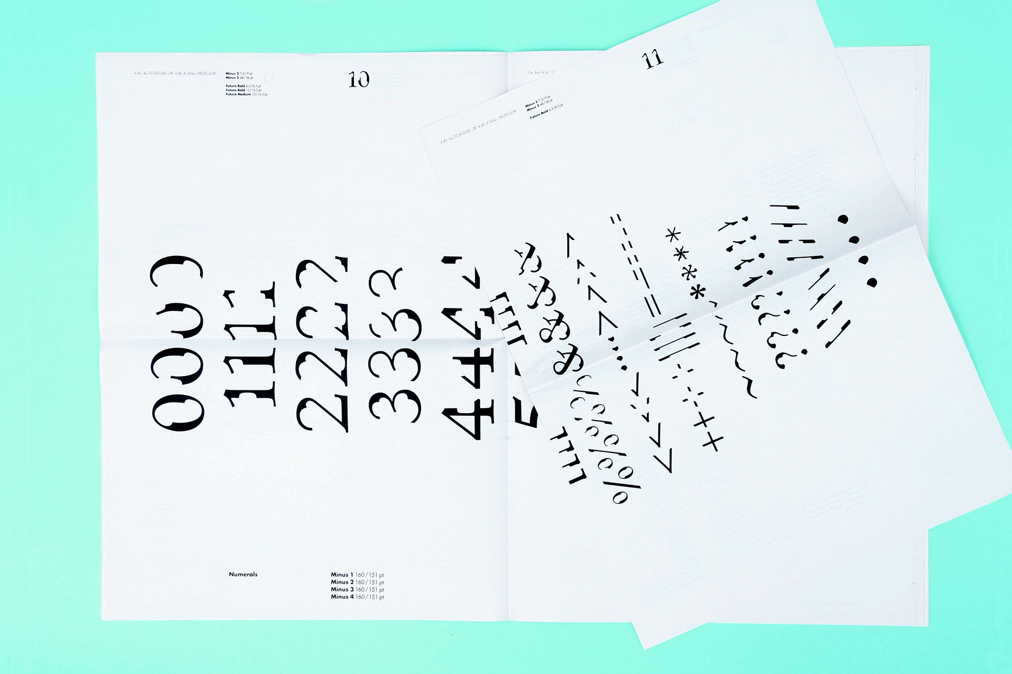
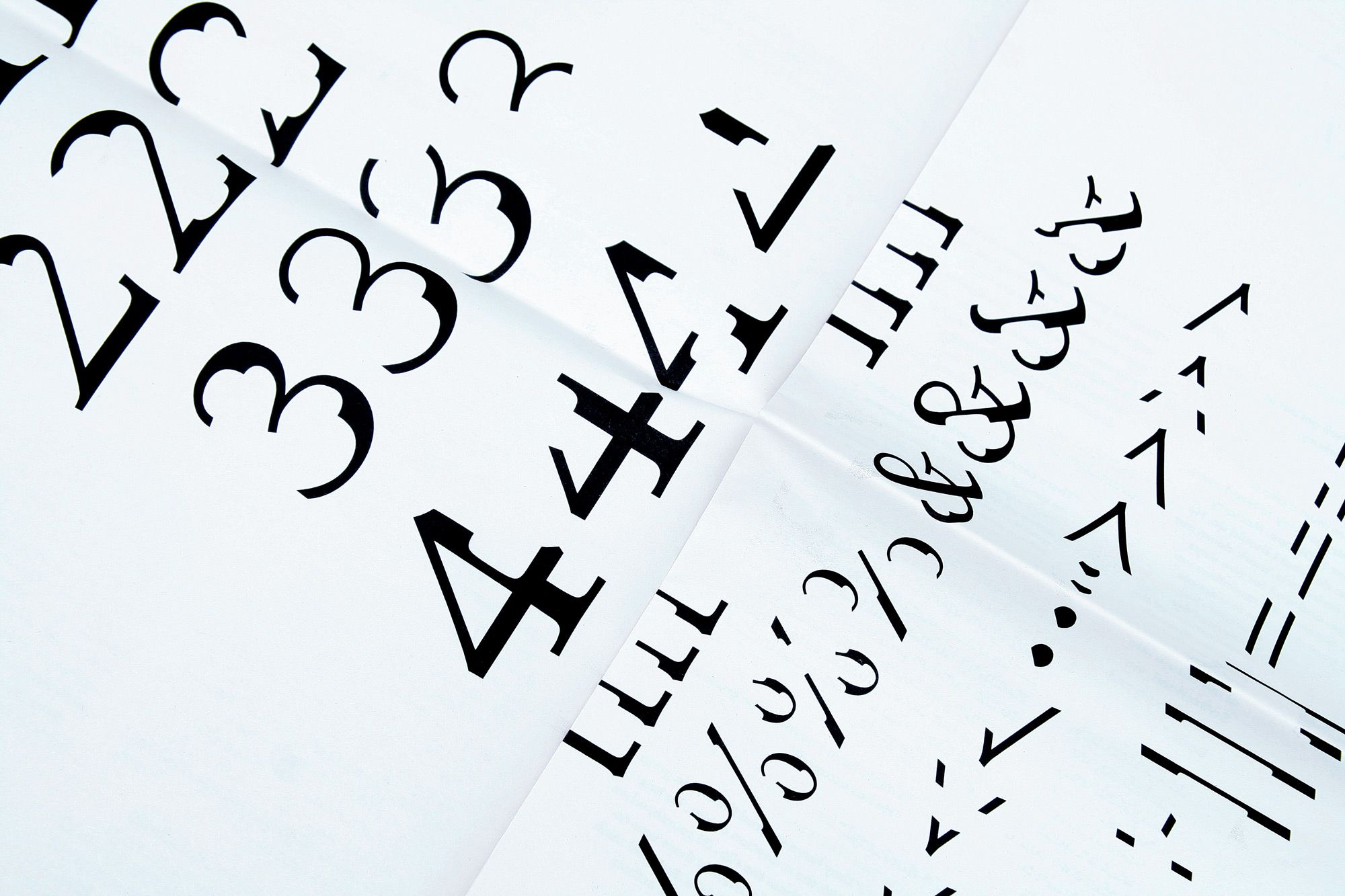
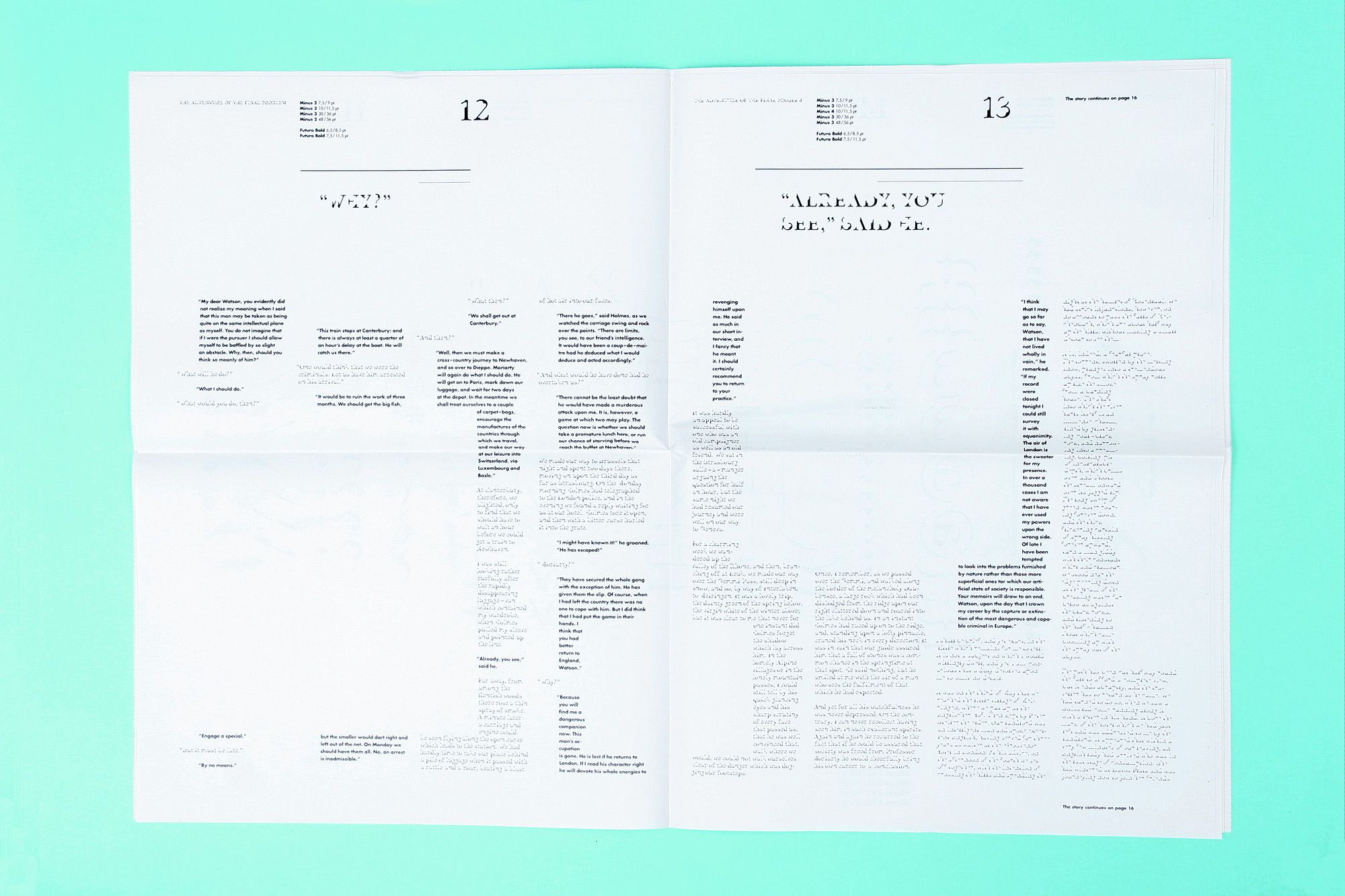
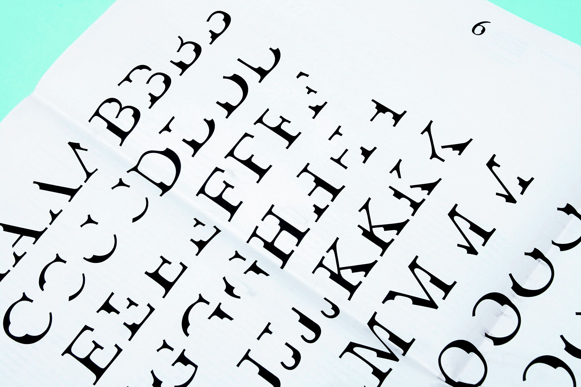
MINUS A TYPE SPECIMEN
--------------------------------------
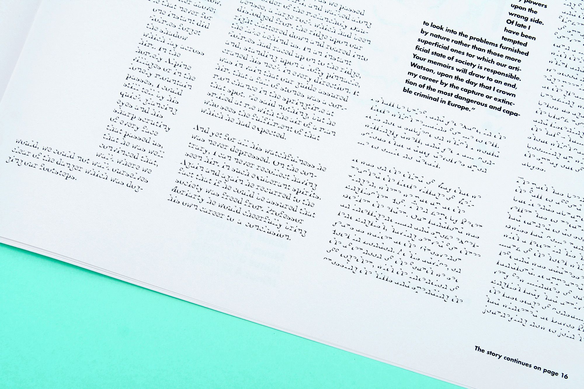
The Minus typeface consists of 4 fonts: Minus 1, 2, 3 and 4. When you read text your eyes don't see actual letters, but link multiple fragments of information about letterforms together at an overwhelming pace, creating content in your mind. Each Minus font emphasizes the most characteristic and unique parts of the letters, while retaining their basic recognisable shape. With each font, the letters are shaped more and more into a minimalistic, yet functional form. With increasing difficulty in legibility, the publication challenges you to reach the end of the story.
--------------------------------------
--------------------------------------
--------------------------------------
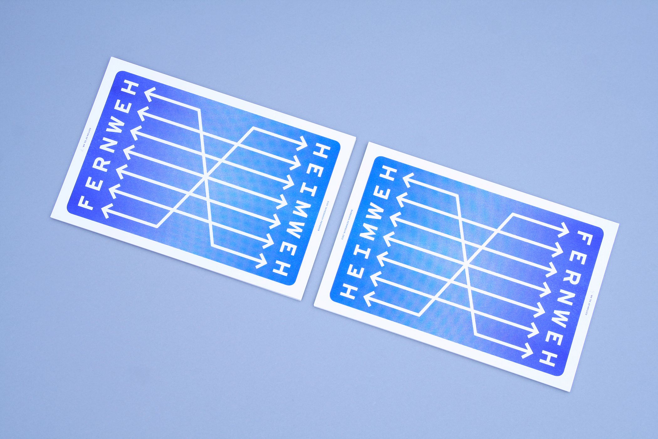
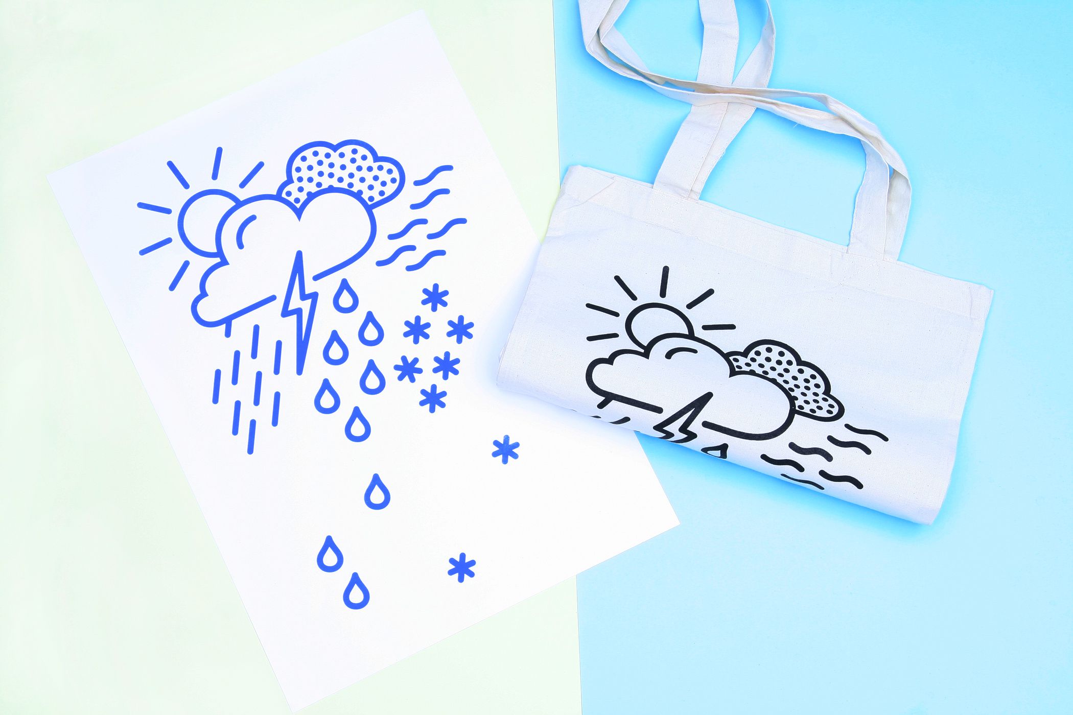
MIXED PRINTS
--------------------------------------
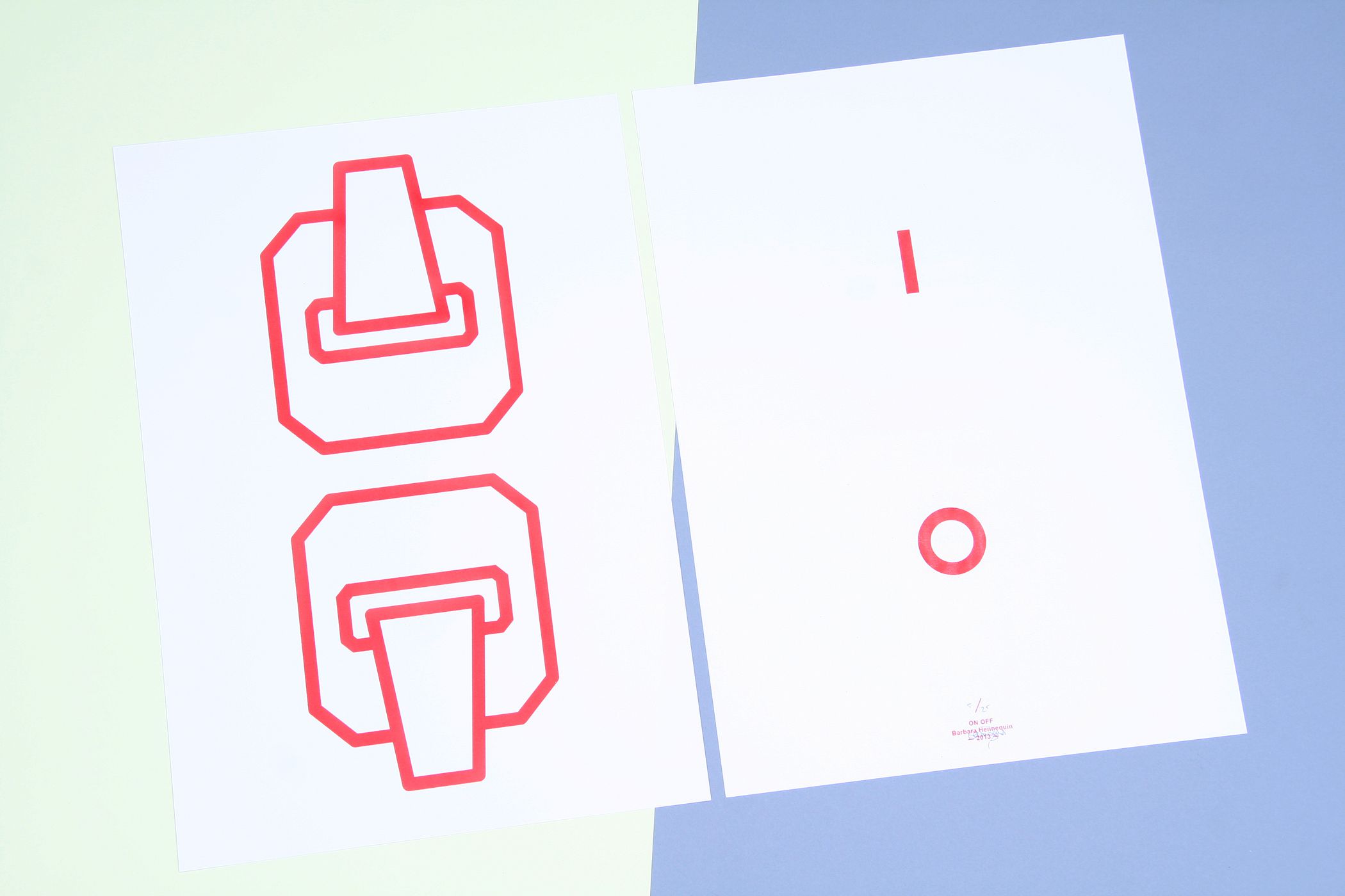
A mix of print work: a poster for project space Depot BG; FERNWEH <---> HEIMWEH, a riso print for 'Fernweh' exhibition; ALL WEATHER, a silkscreen print & tote bag for the 'International Style Station' exhibition; ON OFF, a silkscreen print for the opening of 'Kapitaal' in Utrecht.
--------------------------------------
--------------------------------------
ABOUT
--------------------------------------Studio Barbara Hennequin is a
graphic design studio in Amsterdam. Designs range from visual identities, books, and other printed matters,
to exhibition design.
Her work is characterised by clear
and structured typographic design solutions, with playful and distinct graphic shapes.
Besides her degree in Graphic Design from the Royal Academy of Art in
The Hague, she has a MA degree in Communication Studies from the University of Utrecht. This academic background in communication and
language has a big influence on the
way she approaches graphic design.
In every project, she strives for
a balance between content, concept, aesthetics and practicalities.
Feel free to contact the studio for inquiries or more information.
––––––––––––––––––––––––––––––––––––––
[email protected]
+31 (0) 6 48 76 96 68
Studio address:
Korte Zoutkeetsgracht 2
1013 MC Amsterdam
The Netherlands